19 Febbraio 2025

Condizioni generali

Condizioni di utilizzo

L'utilizzo del sito www.tecnoprimaf.it comporta l'accettazione da parte dell'utente delle Condizioni. Se non sei d'accordo con le seguenti Condizioni Generali, non sei autorizzato ad utilizzare il Sito e i servizi forniti da Tecnoprimaf s.r.l..

Contenuti del sito

Il Sito e i suoi contenuti sono di proprietà di Tecnoprimaf s.r.l. o di terzi che forniscono servizi alla Società. Tutti i diritti sono riservati, salvo diversamente indicato. Tutti i Contenuti che siano marchi, loghi o altri segni distintivi sono marchi registrati dalla Società o da terzi che ad essa hanno concesso i relativi diritti. L'utilizzo dei Contenuti non autorizzato o in contrasto con le presenti Condizioni è vietato.

Collegamento a siti di terze parti

ll Sito contiene collegamenti a siti di terzi. La Società non esercita alcun controllo su di essi e, pertanto, non è in alcun modo responsabile per i contenuti di questi siti.

Limitazione di responsabilità

Nei limiti consentiti dalle leggi applicabili, la Società non sarà responsabile per i danni di qualsiasi genere conseguenti all'utilizzo del Sito, compresi i danni diretti, indiretti, incidentali e consequenziali.

Condizioni generali di vendita

Introduzione

Le condizioni generali di vendita disciplinano la vendita di prodotti da parte di Tecnoprimaf s.r.l. (di seguito “il venditore”) tramite la propria rete di vendita.
Tutti i contratti e ordini di acquisto tra il venditore ed aziende clienti (di seguito “il cliente”) saranno regolati dalle presenti condizioni generali, le quali formano parte integrante e sostanziale degli stessi, ove non espressamente derogate per iscritto.

Prezzi

I prezzi dei prodotti sono da considerarsi I.V.A. ed eventuali oneri CONAI esclusi.

Ordini

Ordini di importo complessivo inferiore a €500 sono soggetti all’addebito di una spesa forfettaria pari a €100 come rimborso spese amministrative. Nel caso in cui non si verifichino discordanze tra condizioni di fornitura concordate tra venditore e cliente e condizioni precisate nell’ordine, lo stesso si ritiene accettato senza l’invio della relativa conferma. Eventuali discordanze di prezzi, specifiche tecniche e modalità di pagamento indicate negli ordini rispetto alle condizioni di fornitura concordate tra venditore e cliente, saranno ritenute valide solo se accettate per iscritto dal venditore. Il cliente dovrà notificare immediatamente al venditore ogni errore ed omissione nelle condizioni di pagamento e nei prezzi contenuti nel documento di conferma dell’ordine. In particolare, qualora le condizioni esposte dal venditore nell’eventuale rettifica d’ordine non fossero ritenute idonee, il cliente ha la facoltà di ricusare il contratto nel termine massimo di 48 ore (diritto di recesso). Eventuali variazioni tecniche richieste dal cliente, rispetto ai disegni forniti al venditore o alle ultime pre-campionature approvate dal cliente, dovranno essere tempestivamente comunicate per iscritto al venditore al massimo entro il 1° (primo) giorno lavorativo successivo all’invio dell’ordine da parte del cliente. Qualora il cliente richieda di ritardare i tempi di consegna rispetto a quanto indicato sull’ordine (o relativa conferma del venditore), trascorsi 30 giorni calendario dalla data iniziale prevista di consegna il cliente è tenuto a riconoscere al venditore le spese di magazzinaggio da esso sostenute. In caso di merci fatturate al cliente e giacenti presso il magazzino del venditore oltre i tempi pattuiti, queste non sono garantite per eventuali deterioramenti dovuti a qualsiasi causa o incidente, né sono assicurate contro l’incendio o altre calamità.

Termini di consegna

Le consegne sono da considerarsi franco destino, se non diversamente specificato. Eventuali costi di trasporto necessari per perfezionare tale consegna saranno esposti preventivamente. Diverse condizioni dovranno essere esplicitamente formalizzate. Qualora il cliente necessiti di particolari esigenze di confezionamento o allestimento, le stesse dovranno essere preventivamente precisate dal cliente per iscritto e da noi accettate. I termini consegna indicati in offerta devono intendersi sempre indicativi.

Forza maggiore

Nel caso di scioperi, incendi, alluvioni, guasti a macchinari, carenze di materia prima, interruzioni di energia elettrica, epidemie e in qualsiasi altro caso di forza maggiore che impedisca o limiti il regolare andamento dell’attività, è facoltà del venditore ridurre, sospendere, posporre o annullare la fornitura senza diritto da parte del cliente a compensi o risarcimenti di sorta.

Accettazione della merce

Le verifica della merce dovrà essere effettuate dal cliente al ricevimento della stessa: in caso di non conformità, il cliente potrà agire nei confronti del vettore respingendo la merce, indicando chiaramente le natura del problema riscontrato. Non saranno prese in considerazione contestazioni successive al giorno di consegna senza la riserva di accettazione apposta sul nostro documento di trasporto. In questo caso, eventuali reclami dovranno comunque essere comunicati entro 5 (cinque) giorni lavorativi dalla data di consegna. Non saranno accettate contestazioni non presentate per iscritto e circostanziate in modo da consentire al venditore un esauriente controllo. Il venditore si riserva la facoltà di accettare resi qualora i prodotti siano privi del loro imballo originale. Non saranno accettati resi sprovvisti di regolare DDT e relativa autorizzazione scritta del venditore. Il venditore si riserva la facoltà di verificare la correttezza del reclamo del cliente e, nel caso il motivo del reso risulti infondato, addebitare al cliente tutti i costi sostenuti inerenti al reso stesso. Non saranno accettati resi decorsi 60 giorni dalla data di consegna. Le quantità di consegna potranno presentare discordanze da quelle indicate nell’ordine, in ragione delle prassi in tema di tolleranze produttive dei settori industriali interessati (ad esempio: carta, plastica). Qualora tali discordanze fossero all’interno di tali prassi, questo non potrà costituire motivo di contestazioni da parte del cliente.

Limiti di responsabilità

Fatte salve le ipotesi di dolo o colpa grave del venditore, è sin d’ora convenuto che, qualora fosse accertata la responsabilità del venditore a qualsiasi titolo nei confronti del cliente, ivi compreso il caso di inadempimento totale o parziale degli obblighi assunti del venditore nei confronti del cliente per effetto dell’esecuzione di un ordine, la responsabilità del venditore non potrà superare il prezzo dei prodotti acquistati dal cliente e per i quali è nata la contestazione.

Fatturazione

Le fatture si intendono integralmente accettate ove non siano respinte entro 10 (dieci) giorni dal loro ricevimento. Tale invio potrà avvenire anche con mezzi telematici.

Incasso del credito

Il mancato pagamento, anche per cause indipendenti dalla volontà del cliente, autorizza il venditore a sospendere le forniture e a risolvere il contratto. Il ritardo nei pagamenti autorizza il venditore ad applicare interessi di mora secondo le leggi vigenti.

Protezione dei dati personali

Ogni dato personale che viene trasmesso al venditore viene trattato in conformità all’informativa prevista dalla legge 675/96 e seguenti.

Giurisdizione e legge applicabile

Le presenti condizioni generali sono regolate dalla legge italiana.

Foro competente

Tutte le controversie, anche quelle relative all’interpretazione, esecuzione e risoluzione di contratti, saranno di competenza esclusiva dell’autorità giudiziaria del foro di Milano, anche per eventuali azioni di garanzia.


Condizioni generali di acquisto

Articolo 1 – Normativa contrattuale
1.1.    Le presenti Condizioni Generali di Acquisto (in seguito definite “CGA”) di Tecnoprimaf s.r.l. con sede in San Cesario (MO), Italia, via della Meccanica, 16/18, salvo eventuali deroghe specificatamente concordate singolarmente per iscritto, disciplinano tutti gli ordini di fornitura di beni e/o servizi richiesti da Tecnoprimaf s.r.l.
1.2.    Le presenti Condizioni Generali prevarranno su eventuali condizioni generali o particolari di vendita del Fornitore (di seguito il “FORNITORE”)
1.3.    Qualsiasi modifica e aggiunta, nonché qualsiasi condizione di vendita del FORNITORE diversa in tutto o in parte dalle presenti condizioni di acquisto, sarà valida soltanto nel caso di specifica accettazione scritta di Tecnoprimaf s.r.l.
1.4.    In ogni caso, resta sin d’ora inteso che ogni eventuale integrazione e/o modifica alle CGA avrà validità unicamente per l’acquisto specifico per il quale Tecnoprimaf s.r.l ha inteso accordare, secondo le modalità di cui al punto che precede, la variazione richiesta dal FORNITORE.
1.5.    Eventuali usi e/o pratiche instaurate tra le parti non sono vincolanti per Tecnoprimaf s.r.l.
1.6.    Il FORNITORE darà esecuzione ai Contratti in totale autonomia gestionale e organizzativa. In nessun caso le CGA o gli Ordini di Acquisto potranno dare luogo a rapporti di associazione in partecipazione o società, né attribuiranno al FORNITORE alcun potere di rappresentanza in nome di Tecnoprimaf s.r.l. Parimenti, le stesse non possono in alcun modo comportare alcun diritto di esclusiva a favore del FORNITORE, né un riconoscimento a favore di quest’ultimo di un minimo di fatturato garantito, essendo Tecnoprimaf discrezionalmente libera di approvvigionarsi nei modi, nei tempi e nei quantitativi ritenuti necessari.

Articolo 2 – Ordini di acquisto
2.1    Tecnoprimaf s.r.l formulerà ordini di acquisto di beni unicamente in forma scritta.
2.2    Si considerano scritte le comunicazioni pervenute e/o ricevute tramite fax o per posta  elettronica.
2.3    Nello specifico, ogni ordine conterrà i seguenti elementi essenziali:

  • identificazione del bene;
  • quantità di acquisto;
  • tempi di consegna;
  • prezzo e modalità di pagamento;
  • termine di accettazione da parte del FORNITORE;
  • eventuali deroghe di acquisto rispetto alle presenti CGA.

2.4    Il contratto di acquisto si intenderà perfezionato fra le parti non appena Tecnoprimaf s.r.l avrà conoscenza dell’accettazione da parte del FORNITORE entro il termine di accettazione stabilito.
2.5    Sarà considerata valida l’accettazione del FORNITORE che quest’ultimo effettuerà in forma scritta.
2.6    In parziale deroga a quanto sopra, Tecnoprimaf s.r.l riterrà ugualmente accettato l’ordine di acquisto inviato, secondo le presenti CGA, qualora nel termine di accettazione di cui sopra non pervenga all’ACQUIRENTE espressa comunicazione di rifiuto dello stesso.
2.7    Tecnoprimaf avrà il diritto di revocare l’ordine di acquisto inviato al FORNITORE sino a quando non pervenga da parte di quest’ultimo espressa accettazione per iscritto ovvero di rifiutare eventuali accettazioni tardive.

Art. 3 – Modalità di consegna ed esecuzione
3.1    Le date ed i termini di fornitura sono vincolanti per il FORNITORE. Nel caso in cui il FORNITORE, per qualsiasi ragione, non fosse in grado di rispettare la tempistica di evasione del singolo ordine, avrà l’onere di fornirne pronta comunicazione a Tecnoprimaf s.r.l.
3.2    In caso di ritardo, anche non grave, Tecnoprimaf s.r.l avrà il diritto di rifiutare a sua insindacabile discrezione la ricezione del bene  nonché di chiedere al FORNITORE il risarcimento dei danni patiti.
3.3    Ugualmente, Tecnoprimaf s.r.l avrà facoltà di rifiutare la ricezione del bene ordinato che sia pervenuto presso il luogo di consegna in anticipo rispetto al termine pattuito. In caso di accettazione del bene, sarà in ogni caso imputabile al FORNITORE l’addebito di tutte le spese che Tecnoprimaf s.r.l dovrà sostenere per le spese di anticipato immagazzinamento.
3.4    Sono espressamente vietate consegne o forniture parziali, salvo che Tecnoprimaf s.r.l non le abbia previamente concordate.
3.5    In caso di ritardo nelle consegne dei beni o nell’esecuzione dei servizi, ovvero in caso di consegna o esecuzione incompleta, Tecnoprimaf s.r.l ai sensi e per gli effetti ci cui all’art. 1453 c.c. potrà domandarne nuovamente l’adempimento fissando una nuova data di consegna ovvero risolvere il contratto con il FORNITORE, salvo in ogni caso il risarcimento del danno.
3.6    Il FORNITORE, contestualmente all’effettuazione della fornitura, dovrà consegnare a Tecnoprimaf s.r.l tutta la documentazione necessaria ed idonea al suo regolare utilizzo.
3.7    In ogni caso, in aggiunta ai rimedi di cui all’art. 3.5. sopra enucleato, Tecnoprimaf s.r.l in caso di mancata o ritardata consegna e/o esecuzione del servizio ordinato, avrà facoltà di:

  • sospendere i pagamenti dovuti al Fornitore in relazione alla consegna o esecuzione ritardata, mancata, incompleta o difforme da quella concordata;
  • applicare al FORNITORE una penale per il ritardo nella misura del 1% del valore del singolo ordine per ogni giorno di ritardo, sino alla data di effettiva consegna del bene e/o ricezione del servizio;
  • chiedere al FORNITORE il risarcimento del danno patito in relazione alla consegna o esecuzione ritardata, mancata, incompleta o difforme da quella concordata.

3.8    Il FORNITORE dichiara che, in caso di utilizzo di stampi per la realizzazione di beni a favore di Tecnoprimaf s.r.l, gli stessi resteranno di proprietà esclusiva di quest’ultima, e che gli stessi verranno prontamente restituiti dietro semplice richiesta di Tecnoprimaf s.r.l.

Articolo 4 – Oneri ulteriori del FORNITORE e garanzia di qualità
4.1    I servizi devono essere eseguiti in conformità con l’oggetto del contratto e lo scopo della prestazione.
4.2    I beni forniti dovranno essere qualitativamente idonei all’uso per il quale sono stati ordinati da Tecnoprimaf s.r.l.
4.3    Il FORNITORE espressamente garantisce che la qualità dei beni forniti saranno conformi alle specifiche tecniche funzionali al loro utilizzo e/o alla loro fruizione.
4.4    Il FORNITORE garantisce altresì che i beni acquistati da Tecnoprimaf s.r.l saranno conformi alla normativa applicabile e agli standard di sicurezza previsti dalla legge per il loro utilizzo. In particolare, i beni ed i servizi forniti dal FORNITORE sono garantiti da quest’ultimo per i vizi e difetti di funzionamento e sono quindi assistiti dalla garanzia per i vizi prevista dall’art. 1490 cod. civ.
4.5    L’accettazione dei beni è soggetta e subordinata ad ispezione e/o controllo da parte di Tecnoprimaf s.r.l al fine di verificare l’assenza di vizi e difetti, la completezza e regolarità della fornitura. Tecnoprimaf s.r.l darà notizia senza indugio di qualsiasi vizio dal momento della sua scoperta. A questo proposito il FORNITORE rinuncia a qualsiasi contestazione in tema di ritardo nella notifica dei vizi.
4.6    In caso di difetto e/o carenza delle qualità garantite, Tecnoprimaf s.r.l, a propria insindacabile discrezione potrà alternativamente:

  • trattenere il bene ricevuto previa riduzione del prezzo di acquisto;
  • chiedere l’eliminazione dei difetti riscontrati a spese integralmente a carico del FORNITORE. In tal caso, quest’ultimo dovrà adoperarsi con la massima celerità per eliminare integralmente le non conformità riscontrate;
  • risolvere il contratto ed agire per il risarcimento del danno patito.

4.7    Tutte le spese sostenute da Tecnoprimaf s.r.l a causa della difettosità della fornitura ricevuta saranno riaddebitati per intero al FORNITORE.
4.8    Il FORNITORE, nell’esecuzione delle proprie attività a favore di Tecnoprimaf s.r.l, sarà tenuto al rigoroso rispetto di ogni normativa ambientale applicabile, nonché al corretto assolvimento di tutti gli obblighi retributivi, contributivi ed assicurativi nei confronti dei propri dipendenti e/o collaboratori che partecipino alle commesse di Tecnoprimaf s.r.l. Qualora il FORNITORE dovesse riscontrare delle incongruenze o delle incoerenze nei disegni e negli schemi affidatigli da Tecnoprimaf s.r.l per la realizzazione della commessa, dovrà prontamente segnalarlo a Tecnoprimaf s.r.l che avrà facoltà di decidere le sorti della fornitura.

Articolo 5 – Luogo di consegna dei beni
5.1    La consegna dovrà avvenire negli orari di scarico indicati da Tecnoprimaf s.r.l e di apertura del magazzino di ricezione merci, e con imballo adeguato alla corretta custodia dei beni recapitati.
5.2    La responsabilità dei beni ordinati passerà a Tecnoprimaf s.r.l unicamente al perfezionarsi della consegna degli stessi purché avvenga nelle modalità descritte ai punti che precedono.

Articolo 6 - Prezzi e termini di pagamento
6.1    I prezzi concordati non potranno essere modificati, salvo diversa pattuizione scritta, espressa caso per caso.
6.2    Valgono i termini di pagamento presenti nell’ordine/contratto di acquisto. Il pagamento è subordinato al controllo della fattura da parte di Tecnoprimaf s.r.l.

Articolo 7 – Responsabilità del FORNITORE
7.1    Il FORNITORE si impegna a tenere indenne l’ACQUIRENTE ed a stipulare adeguata polizza assicurativa per qualsiasi evento e conseguenza patrimoniale derivante da eventuali azioni di terzi e relativi all’ipotesi di responsabilità per danno da prodotto difettoso.
7.2    Il FORNITORE conferisce l’autorizzazione a Tecnoprimaf s.r.l affinché possa accedere, anche per mezzo di propri delegati, presso la propria sede al fine di eseguire audit ispettivi finalizzati alla verifica del corretto assolvimento degli obblighi di fornitura.

Articolo 8 – Diritto di recesso e risoluzione
8.1.    Oltre ai diritti di recesso e risoluzione previsti per legge, Tecnoprimaf s.r.l ha la facoltà di recedere dal contratto o risolvere il contratto con effetto immediato se:

  • il FORNITORE ritarda nella consegna dei beni e/o nella fornitura dei servizi ordinati, anche in caso di ritardo non grave;
  • le condizioni patrimoniali/finanziarie del FORNITORE peggiorino in costanza di rapporto, mettendo a rischio in questo modo l’impegno di fornitura;
  • il FORNITORE sia divenuto insolvente in costanza di rapporto o abbia avuto accesso ad una delle procedure concorsuali previste dalla legge.


Articolo 9 –Disposizioni generali – Legge applicabile - Foro competente
9.1    Le presenti condizioni generali di vendita, come pure le singole forniture dei prodotti sono regolate unicamente dalla legge italiana; la Convenzione delle Nazioni Unite dell’11 aprile 1980 sulla vendita internazionale di beni mobili (Convenzione di Vienna / CISG), si applicherà nella misura in cui le sue disposizioni non siano in contrasto con le presenti condizioni generali di vendita. Ai fini di interpretare i termini di resa ed eventualmente gli altri termini commerciali utilizzati dalle parti, si rinvia agli INCOTERMS 2000 della Camera di Commercio Internazionale, tenendo conto della disciplina prevista nelle presenti condizioni generali.
9.2    La conclusione del contratto - e in particolare l’accordo sul foro competente e l’inclusione delle presenti condizioni generali di vendita – nonché i diritti e doveri delle parti - responsabilità precontrattuale ed obblighi accessori inclusi - e la sua interpretazione sono regolati esclusivamente dalle presenti CGA, dal codice civile italiano o, per quanto in esse non regolato, dalla Convenzione di Vienna.
9.3    Per ogni controversia relativa alla conclusione, validità, interpretazione, esecuzione e risoluzione della fornitura e dei rapporti contrattuali derivanti dalle presenti CGA sarà competente in via esclusiva l’Autorità Giudiziaria Italiana ed in particolare il Foro di Milano, con ciò avendo le parti voluto escludere la competenza di qualsiasi altra giurisdizione e di ogni altro foro eventualmente concorrente.

Articolo 10 - Riservatezza
10.1 Qualsiasi informazione produttiva e commerciale delle parti (inclusi a titolo esemplificativo e non esaustivo: informazioni tecniche, disegni, specifiche, condizioni commerciali) siano o no brevettate, dovranno essere trattate come essenzialmente confidenziali e non saranno utilizzate o divulgate in assenza di previa autorizzazione scritta.

Articolo 11 – Disposizioni finali
11.1    Qualsiasi comunicazione tra le Parti andrà inviata ai rispettivi indirizzi risultanti dalla corrispondenza commerciale intercorsa. Ogni comunicazione, dichiarazione, notifica etc. deve essere redatta in lingua italiana, salvo diverso accordo tra le parti.
11.2    Qualora Tecnoprimaf s.r.l ometta, in qualsiasi momento, fare eseguire una qualunque disposizione delle presenti CGA, ciò non potrà intendersi come rinuncia presente o futura a tale disposizione, né influirà in alcun modo sul diritto di Tecnoprimaf s.r.l a fare successivamente eseguire ognuna delle disposizioni. L'espressa rinuncia, da parte di Tecnoprimaf s.r.l, ad alcuna delle disposizioni delle presenti CGA, non costituirà rinuncia a pretenderne in futuro il rispetto da parte dell’Acquirente.

Questi impegni sono rilevanti ai fini dell'intenzione del gruppo Tecnoprimaf s.r.l di stipulare e concludere qualsiasi accordo.  


02 Febbraio 2024

Il gruppo internazionale Antalis ha acquisito il 100% del capitale della Tecnoprimaf, leader nel settore degli imballaggi su misura

Il gruppo internazionale Antalis ha acquisito il 100% del capitale della Tecnoprimaf, specializzata nella progettazione e produzione di soluzioni di imballaggio industriale. Con un fatturato consolidato di 26 milioni di euro nel 2023 e 80 dipendenti, Tecnoprimaf opera in 5 siti operativi a Modena. I venditori, la famiglia Amadori, manterranno ruoli chiave nella dinamica del progetto. Grazie a questa acquisizione, Antalis diventa leader nelle soluzioni di imballaggio su misura per il mercato italiano, mentre Tecnoprimaf entra in un contesto imprenditoriale internazionale. Maggiori informazioni nel comunicato stampa ufficiale.
11 Luglio 2022

27-29 SET FackPack 2022 @Norimberga: Tecnoprimaf ci sarà

La FachPack, Fiera per le Soluzioni di Imballaggio e Confezionamento, espone tutte le nuove tecnologie per l’imballaggio ed etichetattura.
Imballaggi di materiali e forniture, imballaggi per il riciclaggio, complementi di imballaggio, macchinari per l’imballaggio, l’etichettatura e la marca, sicurezza industriale e protezione dell’ambiente.  

Tecnoprimaf ci sarà anche quest'anno, dal 27 al 29 settembre 2022 a Norimberga, HALL 6 - STAND 6-406

Vi aspettiamo!
#fackpach2022 #wecreatethefuture #tecnoprimaf #confezionamento #stivaggio #containerizzazione #logistica #timberpack #foldybox #kerabox #vciforce #industria #produzione #imballaggi #anticorrosivi #vci #sancesario #modena #emiliaromagna #italia
16 Marzo 2022

IPACK-IMA 2022: Tecnoprimaf e VCIForce ci saranno!

Tecnoprimaf, leader negli imballaggi industriali in legno, e VCI Force, brand di anticorrosivi in rapida crescita,
saranno presenti alla FIERA IPACK-IMA edizione 2022, dal 3 al 6 maggio alla FIERA DI MILANO RHO.

Vi aspettiamo al PADIGLIONE 4 - STAND D19. Non mancate!
16 Gennaio 2022

Nuovo impianto di chiodatura semi-automatico a 4 postazioni con isola robotizzata per accatastamento pallet e relativa reggiatura

Tecnoprimaf ha installato un innovativo impianto di chiodatura semi-automatico a 4 postazioni con isola robotizzata per accatastamento pallet e relativa reggiatura.

Tecnoprimaf Industriali Imballaggi Industriali sceglie solo il meglio della tecnologia per restare al passo coi tempi e soddisfare al meglio i propri clienti.

#tecnoprimaf #confezionamento #stivaggio #containerizzazione #logistica #timberpack #foldybox #kerabox #vciforce #industria #produzione #imballaggi #anticorrosivi #vci #sancesario #modena #emiliaromagna #italia

Read More

11 Maggio 2021

Tecnoprimaf è innovazione continua: primi in Italia per stampa a colori sugli imballaggi in legno

In Tecnoprimaf è stata installata la prima stampante digitale a colori del settore imballaggi in legno in Italia.

Il passaggio al digitale permette di soddisfare la domanda della clientela in modo più rapido grazie alla maggiore produttività e con il massimo della qualità grazie alle nuove tecnologie, utilizzando inchiostri pigmentati certificati BS5609 resistenti all’acqua.

#tecnoprimaf #confezionamento #stivaggio #containerizzazione #logistica #timberpack #foldybox #kerabox #vciforce #industria #produzione #imballaggi #anticorrosivi #vci #sancesario #modena #emiliaromagna #italia

28 Aprile 2021

Tecnoprimaf cresce ancora: nuovo stabilimento 5 e aumento del capitale sociale

Nonostante l'anno difficile dovuto alla pandemia che ha colpito il mondo intero, Tecnoprimaf conferma la sua crescita anche nel 2020-2021.

E' stata infatti finalizzata nel febbraio 2021 l'acquisizione di una nuova sede in via della Meccanica 5/7 per altri 3.000 mq (STAB.5) per confezionamento e logistica, portando a 10.000 mq la superficie coperta su un totale di oltre 20.000 mq.

Inoltre il capitale sociale interamente versato passa a 500.000 euro, ulteriore segnale di solidità aziendale verso i propri clienti e fornitori.

#tecnoprimaf #confezionamento #stivaggio #containerizzazione #logistica #timberpack #foldybox #kerabox #vciforce #industria #produzione #imballaggi #anticorrosivi #vci #sancesario #modena #emiliaromagna #italia
16 Marzo 2020

COPERTURA SANITARIA COVID-19 PER I DIPENDENTI

TECNOPRIMAF ha attivato, facendosi carico del relativo costo, una polizza di copertura assicurativa COVID-19 a favore di tutti i dipendenti che risultassero contagiati dal virus.

Read More

17 Febbraio 2020

Cookie Policy


Per migliorare l’esperienza di navigazione, questo sito utilizza i “cookies”. I cookies sono piccole porzioni di dati che vengono archiviati temporaneamente nella memoria del tuo browser. I dati raccolti tramite i cookies permettono di confrontare i visitatori nuovi e quelli passati, capire come gli utenti navigano il sito web, ed in generale consentono una migliore esperienza di utilizzo del sito. I cookie non registrano alcuna informazione personale su un utente e gli eventuali dati identificabili non verranno memorizzati. Se si desidera disabilitare l’uso dei cookie è necessario personalizzare le impostazioni del proprio computer impostando la cancellazione di tutti i cookie o attivando un messaggio di avviso quando i cookie vengono memorizzati. Per procedere senza modificare l’applicazione dei cookie è sufficiente continuare con la navigazione.
Visita AboutCookies.org per ulteriori informazioni sui cookie e su come influenzano la tua esperienza di navigazione.

I TIPI DI COOKIE CHE UTILIZZIAMO

Cookie indispensabili
Questi cookie sono essenziali alla navigazione in tutto il sito ed all’utilizzo di tutte le sue funzionalità, come ad esempio accedere alle varie aree protette del sito. Senza questi cookie alcuni servizi necessari, come ad esempio la compilazione di un form per un concorso, non possono essere fruiti.

Performance cookie
Questi cookie raccolgono informazioni su come gli utenti utilizzano un sito web, ad esempio quali sono le pagine più visitate, o se si ricevono messaggi di errore da pagine web. Questi cookie non raccolgono informazioni che identificano un visitatore. Tutte le informazioni raccolte tramite cookie sono aggregate e quindi anonime. Vengono utilizzati solo per migliorare il funzionamento di un sito web. Utilizzando il nostro sito, l’utente accetta che tali cookie possono essere memorizzati sul proprio dispositivo.

Cookie di funzionalità
I cookie consentono al sito di ricordare le scelte fatte dall’utente (come il nome, la lingua o la regione di provenienza) e forniscono funzionalità avanzate personalizzate. Questi cookie possono essere utilizzati anche per ricordare le modifiche apportate alla dimensione del testo, font ed altre parti di pagine web che è possibile personalizzare. Essi possono essere utilizzati anche per fornire servizi che hai chiesto come guardare un video o i commenti su un blog. Le informazioni raccolte da questi tipi di cookie possono essere rese anonime e non in grado di monitorare la vostra attività di navigazione su altri siti web. Utilizzando il nostro sito, l’utente accetta che tali cookie possono essere installati sul proprio dispositivo.

Google Analytics
Questo sito web utilizza Google Analytics, un servizio di analisi web fornito da Google , Inc. (“Google”). Google Analytics utilizza dei “cookies” , che sono file di testo depositati sul Vostro computer per consentire al sito web di analizzare come gli utenti utilizzano il sito. Le informazioni generate dal cookie sull’utilizzo del sito web (compreso il Vostro indirizzo IP anonimo) verranno trasmesse e depositate presso i server di Google negli Stati Uniti. Google utilizzerà queste informazioni allo scopo di esaminare il Vostro utilizzo del sito web, compilare report sulle attività del sito per gli operatori dello stesso e fornire altri servizi relativi alle attività del sito web e all’utilizzo di internet. Google può anche trasferire queste informazioni a terzi ove ciò sia imposto dalla legge o laddove tali terzi trattino le suddette informazioni per conto di Google. Google non assocerà il vostro indirizzo IP a nessun altro dato posseduto da Google. Potete rifiutarvi di usare i cookies selezionando l’impostazione appropriata sul vostro browser, ma si prega di notare che se si fa questo non si può essere in grado di utilizzare tutte le funzionalità di questo sito web. Utilizzando il presente sito web, voi acconsentite al trattamento dei Vostri dati da parte di Google per le modalità ed i fini sopraindicati.

DISABILITARE I COOKIES
È possibile configurare il browser utilizzato per la navigazione per eliminare o per impedire l’installazione di cookies, ma la disattivazione di alcuni cookies potrebbe impedire il corretto funzionamento del sito. L’utente può controllare quali cookies sono istallati, qual è la loro durata ed eliminarli. i passaggi per eseguire queste operazioni differiscono da browser a browser.
19 Novembre 2019

Nuova linea di troncatura automatica PUSH 1200

Tecnoprimaf da oggi può contare su una nuova linea di troncatura completamente automatica con capacità produttiva fino a 200mtc a turno.

La PUSH 1200, prodotta dalla Bottene, provvede direttamente all’avvicendamento dei pacchi, la preparazione dei piani di tavole sovrapposte con sistema a depressione, la troncatura con lista di taglio, lo scarico con accatastamento, tutto automaticamente. Un pacco di tavole da mt.5 viene lavorato in 10 minuti.

Il posizionamento mediante cremagliera di precisione assicura un’alta velocità (180mt./1′), precisione e il mantenimento delle prestazioni a vita, senza alcun deterioramento e nessuna manutenzione.
  • Grande capacità e potenza di taglio.
  • Spintore con pinze pneumatiche e velocità fino a 180mt./1′
  • Carico a piani di tavole con sistema a depressione e recupero listelli
  • Scarico multi lunghezze con accatastamento mediante angolari mobili
  • Scarico automatico dei pacchi con cambio automatico dei pallets.

Tecnoprimaf Industriali Imballaggi Industriali sceglie solo il meglio della tecnologia per restare al passo coi tempi e soddisfare al meglio i propri clienti


Potete vedere questo macchinario all'avanguardia all'opera nel video qui sotto:
29 Luglio 2019

Contatti con Mappa

TECNOPRIMAF S.R.L. con socio unico
via della Meccanica, 16/18 - 41018 San Cesario sul Panaro (Modena) ITALY
Telefono: +39 059 920010 - Fax: +39 059 921415

13 Giugno 2019

Privacy policy

La tutela della Vostra Privacy è uno dei nostri principali obiettivi.

La presente informativa è resa, nel rispetto degli artt. 13 e 14 del Regolamento UE 679/2016 (di seguito “Regolamento”), agli utilizzatori (di seguito: “Utenti” oppure “Utente”) del sito in versione desktop e mobile, (di seguito: “Sito”) di proprietà di Tecnoprimaf s.r.l., P.IVA 01840130361, in persona del legale rappresentante pro-tempore, con sede in Via della Meccanica 16/18 - Z.I. Graziosa, 41018 San Cesario S.P. (MO), in qualità di Titolare del Trattamento dei dati personali (di seguito: “Titolare”) ed ha lo scopo di descrivere le modalità di gestione di Sito con riferimento al trattamento dei dati personali, nonché di consentire agli Utenti del Sito di conoscere le finalità e le modalità di trattamento dei dati personali da parte del Titolare in caso di loro conferimento.

Questo documento Le permetterà di conoscere la nostra politica sulla privacy per capire come le Sue informazioni personali vengono gestite quando utilizza i nostri servizi e per consentirLe, se del caso, di prestare un consenso al trattamento dei suoi dati personali, espresso e consapevole, nelle sezioni del sito ove viene richiesto di fornire i dati personali.

Le ricordiamo che nelle varie sezioni del sito web www.tecnoprimaf.it ove raccogliamo i Suoi dati personali sono pubblicate specifiche informative ai sensi dell'art. 13 del Regolamento EU 2016/679 per Sua necessaria presa visione prima della fornitura dei dati richiesti. Le informazioni ed i dati da Lei forniti o altrimenti acquisiti nell'ambito della fruizione dei vari servizi di tecnoprimaf.it, saranno oggetto di trattamento nel rispetto delle disposizioni del Regolamento e degli obblighi di riservatezza. Secondo le norme del Regolamento, i trattamenti effettuati dal Titolare saranno improntati ai principi di liceità, correttezza, trasparenza, limitazione delle finalità e della conservazione, minimizzazione dei dati, esattezza, integrità e riservatezza.

INDICE

  1. Titolare del trattamento
  2. I dati personali oggetto di trattamento
    1. Dati di navigazione
    2. Dati forniti volontariamente dall’interessato
    3. Cookie
    4. Dati di utilizzo
  3. Finalità del trattamento
  4. Base legale e natura obbligatoria o facoltativa del trattamento
  5. Destinatari dei dati personali
  6. Esistenza di un processo decisionale
  7. Luogo di conservazione
  8. Modalità di trattamento e misure di sicurezza
  9. Periodo di conservazione
  10. Diritti degli interessati


  1. Titolare del trattamento dati

Il Titolare dei trattamenti svolti attraverso il Sito è Tecnoprimaf s.r.l., P.IVA 01840130361, in persona del legale rappresentante pro-tempore, con sede in Via della Meccanica 16/18 - Z.I. Graziosa, 41018 San Cesario S.P. (MO).

L’elenco aggiornato dei responsabili e degli incaricati al trattamento è custodito presso la sede legale del Titolare del trattamento.

  1. I dati personali oggetto del trattamento

Per trattamento di dati personali intendiamo qualsiasi operazione o insieme di operazioni, compiute con o senza l'ausilio di processi automatizzati e applicate a dati personali o insiemi di dati personali, come la raccolta, la registrazione, l'organizzazione, la strutturazione, la conservazione, l'adattamento o la modifica, l'estrazione, la consultazione, l'uso, la comunicazione mediante trasmissione, diffusione o qualsiasi altra forma di messa a disposizione, il raffronto o l'interconnessione, la limitazione, la cancellazione o la distruzione. 
La informiamo che i dati personali oggetto di trattamento saranno costituiti da un identificativo come il nome, l'indirizzo email, un numero di identificazione, dati relativi all'ubicazione, un identificativo online e altri dati idonei a renderLa identificato/a o identificabile, a seconda del tipo di Servizi richiesti (di seguito solo "Dati Personali").

In particolare, i Dati Personali trattati attraverso il Sito sono i seguenti:

  1. Dati di navigazione

I sistemi informatici e le procedure software preposte al funzionamento del Sito acquisiscono, nel corso del loro normale esercizio, alcuni Dati Personali la cui trasmissione è implicita nell'uso dei protocolli di comunicazione di Internet. Si tratta di informazioni che non sono raccolte per essere associate a interessati identificati, ma che per loro stessa natura potrebbero, attraverso elaborazioni ed associazioni con dati detenuti da terzi, permettere di identificare gli utenti. In questa categoria di dati rientrano gli indirizzi IP o i nomi a dominio dei computer utilizzati dagli utenti che si connettono al Sito, gli indirizzi in notazione URI (Uniform Resource Identifier) delle risorse richieste, l'orario della richiesta, il metodo utilizzato nel sottoporre la richiesta al server, la dimensione del file ottenuto in risposta, il codice numerico indicante lo stato della risposta data dal server (buon fine, errore, etc.) ed altri parametri relativi al sistema operativo e all'ambiente informatico dell'utente. Questi dati vengono utilizzati al solo fine di ricavare informazioni statistiche anonime sull'uso del Sito e dei siti dei nostri clienti e per controllarne il corretto funzionamento, per identificare anomalie e/o abusi, e vengono cancellati immediatamente dopo l'elaborazione. I dati potrebbero essere utilizzati per l'accertamento di responsabilità in caso di ipotetici reati informatici ai danni del sito o di terzi.

  1. Dati forniti volontariamente dall'interessato

L'invio facoltativo, esplicito e volontario di posta elettronica agli indirizzi indicati sul Sito comporta la successiva acquisizione dei dati personali forniti.

L’inserimento dei dati personali per usufruire degli specifici servizi offerti dal Sito (come per il form di contatto, iscrizione alla newsletter o per la proposizione di una candidatura) comporta l’acquisizione dei dati personali forniti.

In ogni caso, specifiche informative in merito ai dati forniti saranno contenute con riferimento a specifici servizi offerti nel Sito.

  1. Cookie

Questo Sito usa cookie, web beacon, identificatori univoci e altre analoghe tecnologie per raccogliere Dati sulle pagine, sui collegamenti visitati e sulle altre azioni eseguite dall’Utente quando utilizza il Sito. Essi vengono memorizzati per essere poi ritrasmessi agli stessi siti alla successiva visita del medesimo Utente.

L’Utente può prendere visione della Cookie Policy nell’apposita sezione.

  1. Dati di utilizzo

Possono essere raccolti anche Dati relativi all’utilizzo del Sito da parte dell’Utente, quali ad esempio le pagine visitate, le azioni compiute, le funzionalità e i servizi utilizzati.

  1. Finalità del trattamento

Il Titolare informa gli Utenti del Sito che i dati raccolti saranno trattati lecitamente ai sensi dell’art. 6 del Regolamento, e dietro Suo specifico consenso ove necessario, esclusivamente per le seguenti finalità:

  1. Consentire la navigazione e la consultazione del Sito;
  2. Rispondere a richieste di assistenza o di informazioni, che riceveremo via e-mail, telefono o attraverso la pagina "Contattaci" del nostro Sito;
  3. Esigenze di tipo operativo, organizzativo e gestionale;
  4. Elaborare studi, ricerche, statistiche di mercato;
  5. Per esclusive finalità di sicurezza e prevenzione di condotte fraudolente il Titolare pone in essere un sistema di controllo automatico che comporta il rilevamento e l'analisi di comportamenti degli utenti sul sito associata al trattamento di Dati Personali tra cui l’indirizzo IP.
  1. Base legale e natura obbligatoria o facoltativa del trattamento

Il Titolare tratta Dati Personali relativi all’Utente in caso sussista una delle seguenti condizioni:

  • L’Utente ha prestato il consenso per una o più finalità specifiche:
  • Il trattamento è necessario all’esecuzione di un contratto con l’Utente e/o all’esecuzione di misure precontrattuali;
  • Il trattamento è necessario per adempiere un obbligo legale al quale è soggetto il Titolare;
  • Il trattamento è necessario per l’esecuzione di un compito di interesse pubblico o per l’esercizio di pubblici poteri di cui è investito il Titolare;
  • Il trattamento è necessario per il perseguimento del legittimo interesse del Titolare o di terzi.

È comunque sempre possibile richiedere al Titolare di chiarire la concreta base giuridica di ciascun trattamento.

Il conferimento dei dati personali da parte dell’Utente è sempre facoltativo, ma è indispensabile, relativamente a quei dati indicati come obbligatori e contrassegnati con un asterisco (*) tramite moduli di richiesta. Un eventuale rifiuto, seppur legittimo, a fornire in tutto o in parte i dati richiesti, potrebbe compromettere il regolare svolgimento del rapporto ed in particolare, per i dati personali su definiti come indispensabili, potrebbe comportare l’impossibilità da parte nostra di effettuare i la regolare erogazione dei servizi richiesti.

  1. Destinatari dei dati personali

I Dati Personali che verranno forniti potranno essere conosciuti e utilizzati dai dipendenti e/o collaboratori del Titolare, incaricati di gestire il Sito e le richieste degli Utenti, al solo scopo di espletare le attività strettamente funzionali al raggiungimento delle finalità dichiarate al precedente art. 3.
I Dati Personali degli Utenti potranno, inoltre, essere comunicati a soggetti terzi, incaricati al lecito trattamento per conto del Titolare, in veste di Responsabili Esterni del Trattamento o di Autonomi titolari del Trattamento.

Gli Utenti, a semplice richiesta indirizzata al Titolare, potranno ottenere la lista degli eventuali Responsabili Esterni del Trattamento incaricati.

  1. Esistenza di un processo decisionale automatizzato

Non è presente un processo decisionale automatizzato. I dati non saranno oggetto di profilazione.

  1. Luogo di conservazione dei dati

I Dati sono trattati presso le sedi operative del Titolare ed in ogni altro luogo in cui le parti coinvolte nel trattamento siano localizzate. Per ulteriori informazioni, contatta il Titolare al seguente indirizzo email info@tecnoprimaf.it

I Dati Personali saranno trattati esclusivamente nel territorio dell’UE.

Qualora si renda necessario procedere al trattamento dei dati al di fuori del territorio dell’UE, il Titolare assicura che il trattamento suoi Dati Personali da parte di questi Destinatari avviene nel rispetto del Regolamento. Invero, i trasferimenti si possono basare su una decisione di adeguatezza o sulle Standard Contractual Clauses approvate dalla Commissione Europea. Maggiori informazioni sono disponibili presso il Titolare.

  1. Modalità di trattamento e misure di sicurezza

Il trattamento dei Dati Personali viene effettuato mediante strumenti informatici e/o telematici, con modalità organizzative e con logiche strettamente correlate alle finalità indicate.

Il Trattamento viene effettuato secondo modalità e con strumenti idonei a garantire la sicurezza e la riservatezza dei dati stessi in conformità a quanto stabilito dall’art. 32 del Regolamento Europeo 2016/679.

Nello svolgimento delle operazioni di trattamento saranno, comunque, sempre adottate tutte le misure tecniche, informatiche, organizzative, logistiche e procedurali di sicurezza, adeguate a garantire il livello minimo di protezione dei dati previsto dalla legge.

  1. Periodo di conservazione

Il Titolare tratterà i Dati Personali per il tempo necessario ad adempiere alle finalità collegate.

I Dati Personali possono essere conservati per un periodo più lungo se necessario per adempiere un obbligo di legge o per ordine di un’autorità.

Tutti i Dati Personali saranno cancellati alla scadenza del periodo di conservazione. Allo spirare di tale termine il diritto di accesso, cancellazione, rettificazione ed il diritto alla portabilità dei Dati non potranno più essere esercitati.

  1. Diritti degli interessati

Gli Utenti possono esercitare determinati diritti con riferimento ai Dati trattati dal Titolare. In particolare, l’Utente ha il diritto di:

  • Revocare il consenso in ogni momento;
  • Opporsi al trattamento dei propri Dati;
  • Accedere ai propri Dati (Art. 15 GDPR);
  • Verificare e chiedere la rettificazione (Art. 16 GDPR);
  • Ottenere la limitazione del trattamento (Art. 18 GDPR);
  • Ottenere la cancellazione o rimozione dei propri Dati Personali (Art. 17 GDPR);
  • Ricevere i propri Dati o farli trasferire ad altro titolare (Art. 20 GDPR);
  • Proporre reclamo all’autorità di controllo della protezione dei dati personali e/o agire in sede giudiziale.

Per esercitare i propri diritti, gli Utenti possono indirizzare una richiesta al seguente indirizzo mail info@tecnoprimaf.it. Le richieste sono effettuate a titolo gratuito ed evase dal Titolare nel più breve tempo possibile, in ogni caso entro 30 giorni.

Data ultimo aggiornamento: 26 giugno 2019

24 Maggio 2019

FOLDYBOX - Imballaggi pieghevoli su misura

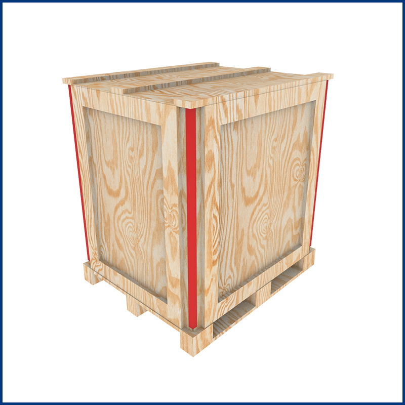
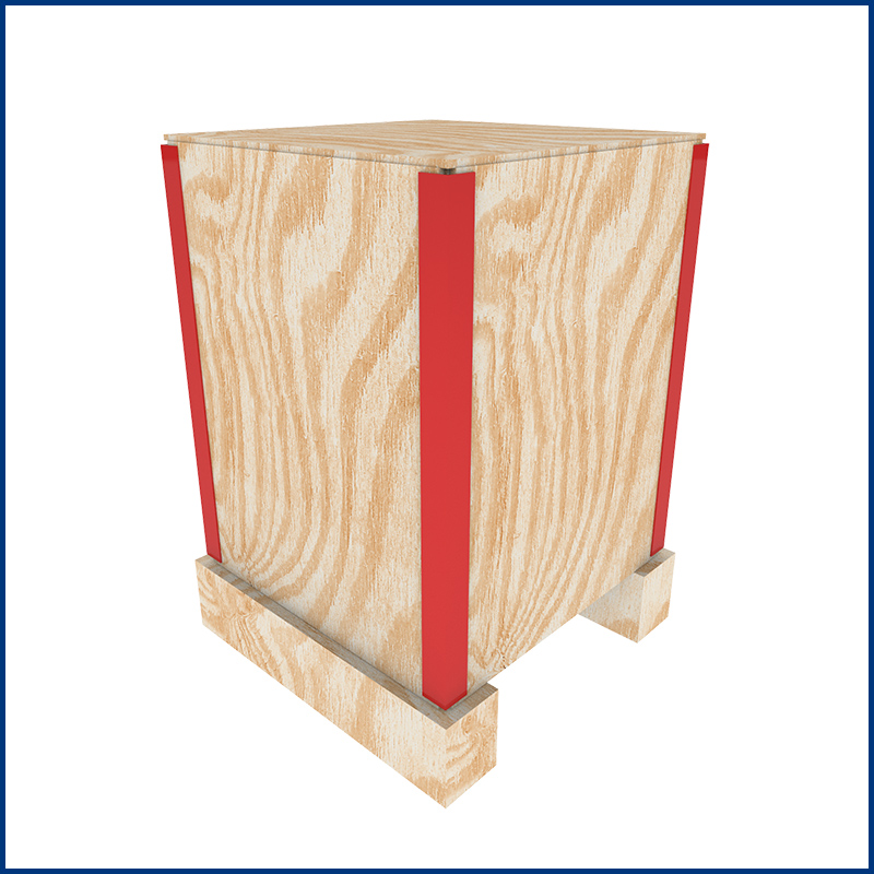
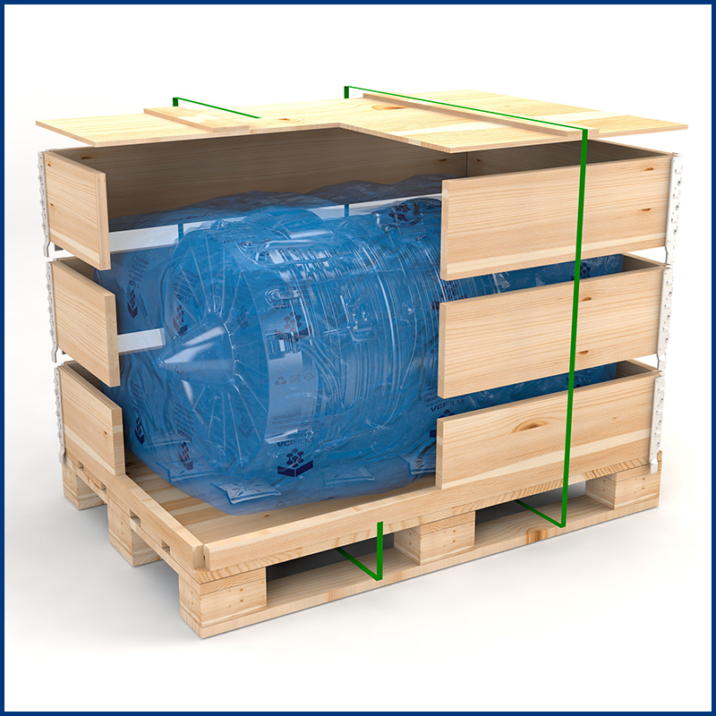
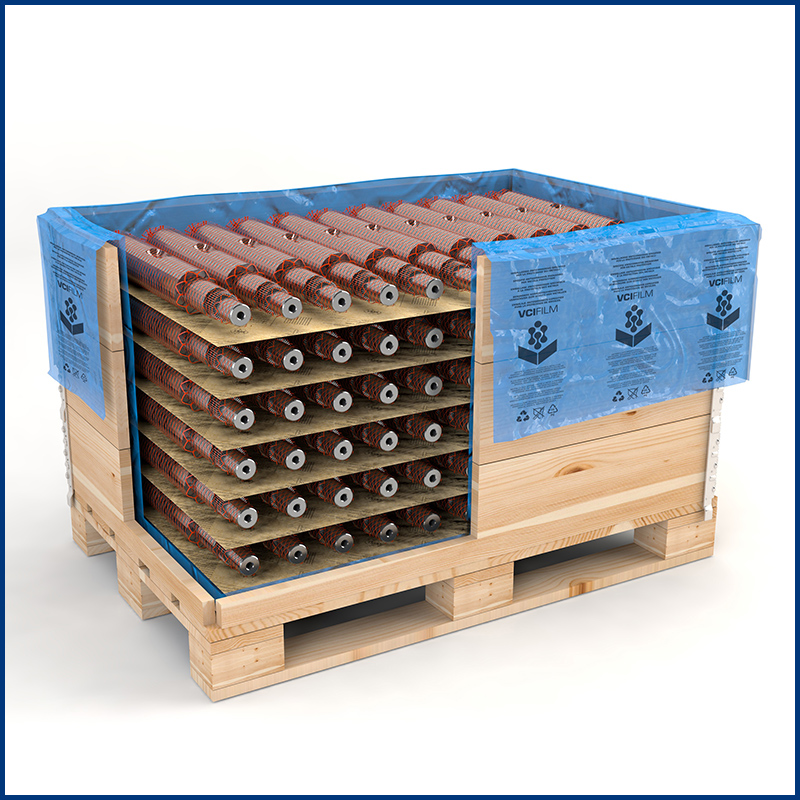
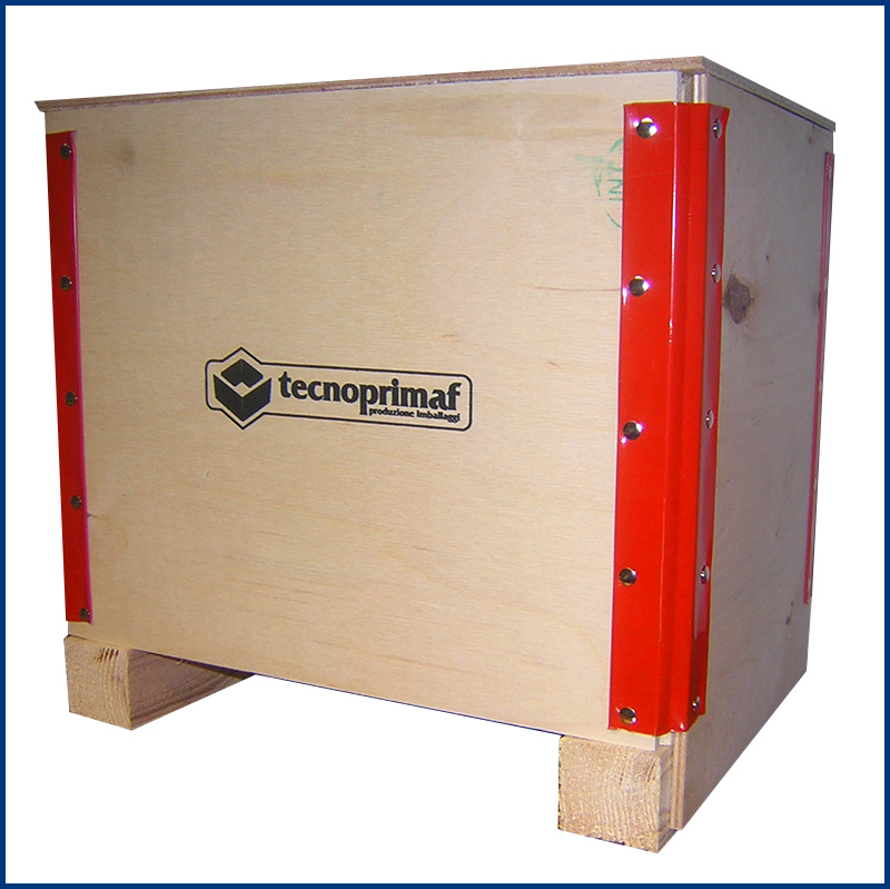
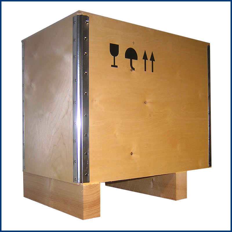
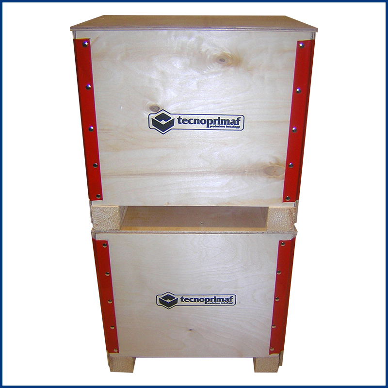
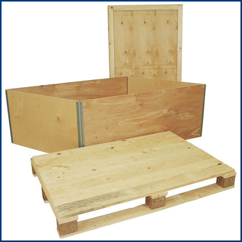
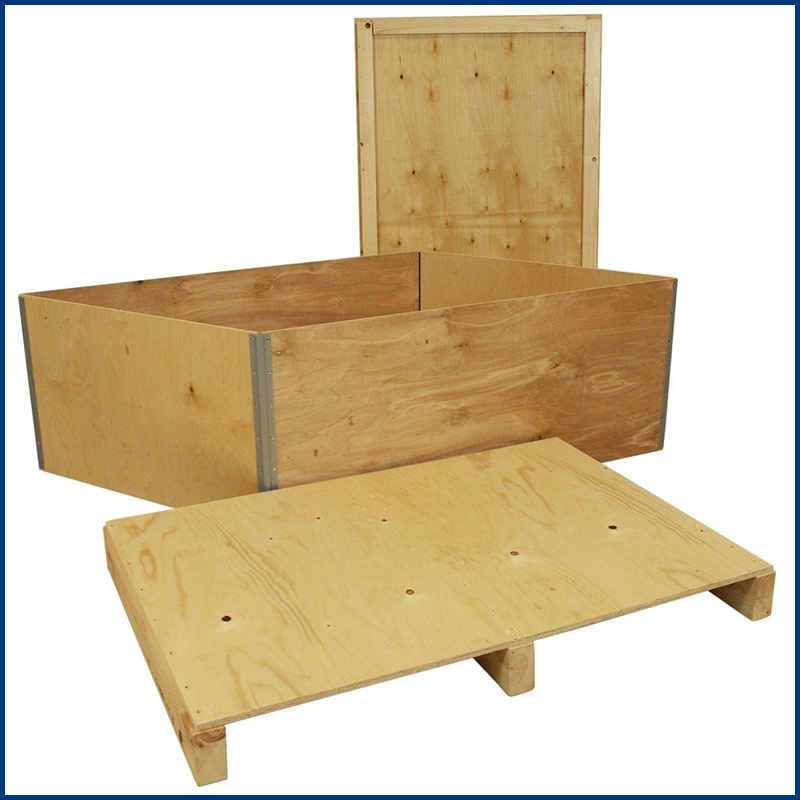
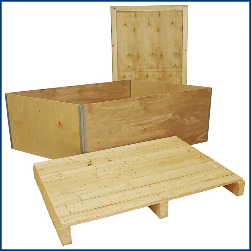
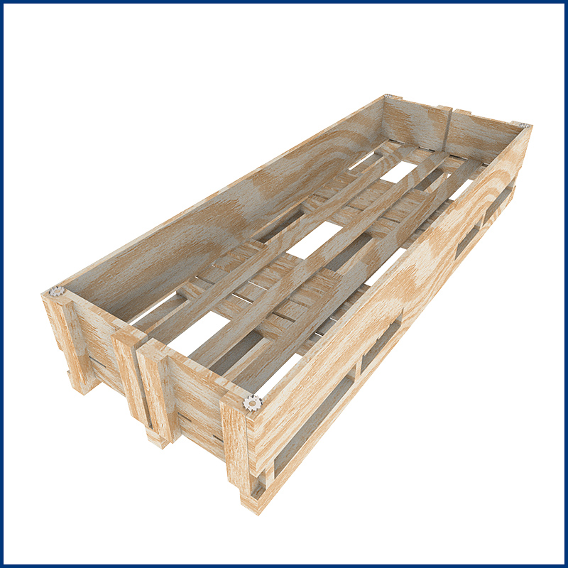
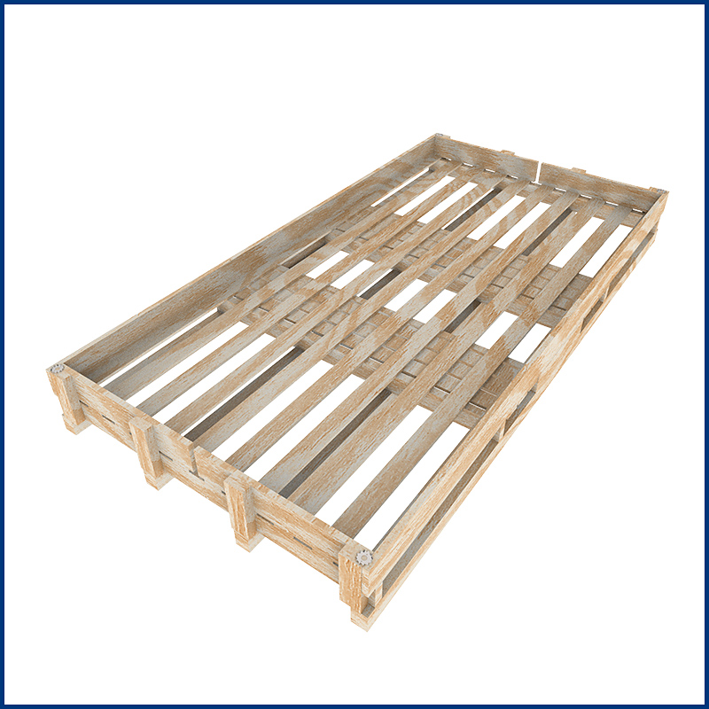
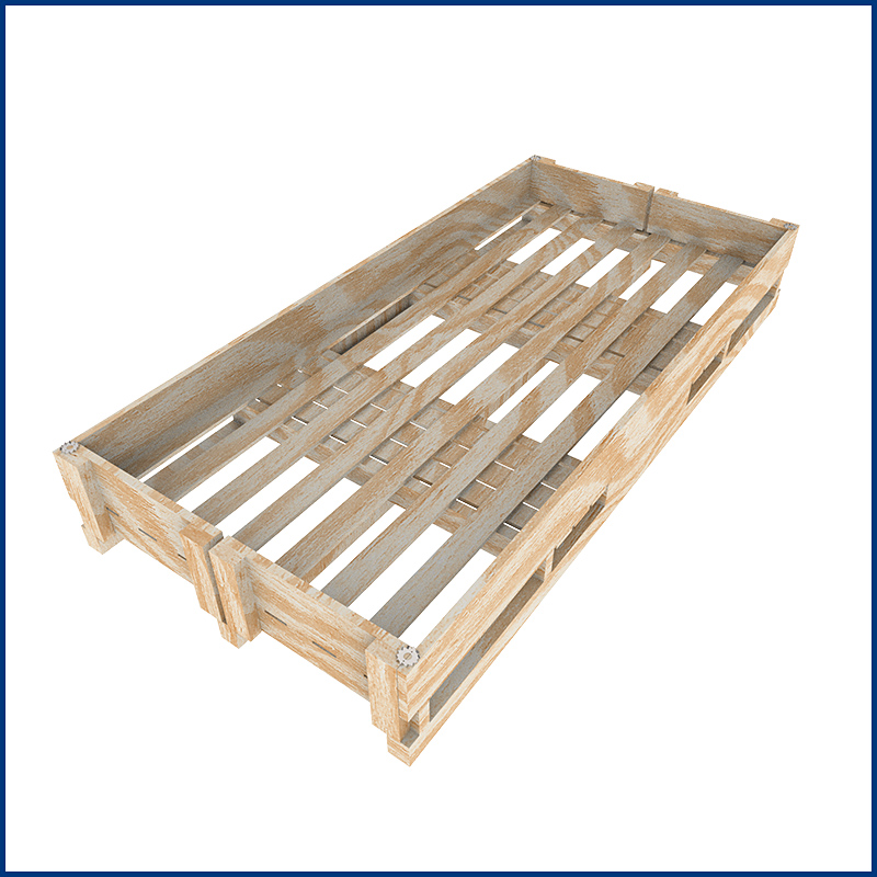
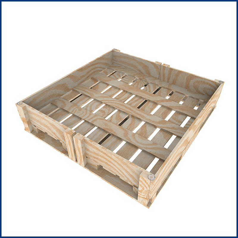
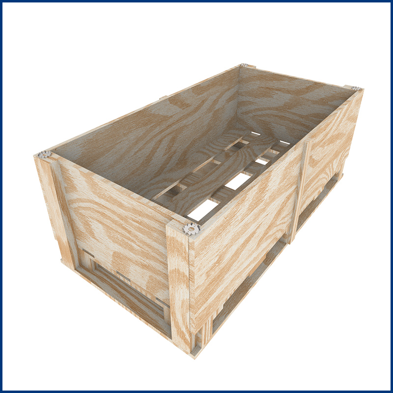
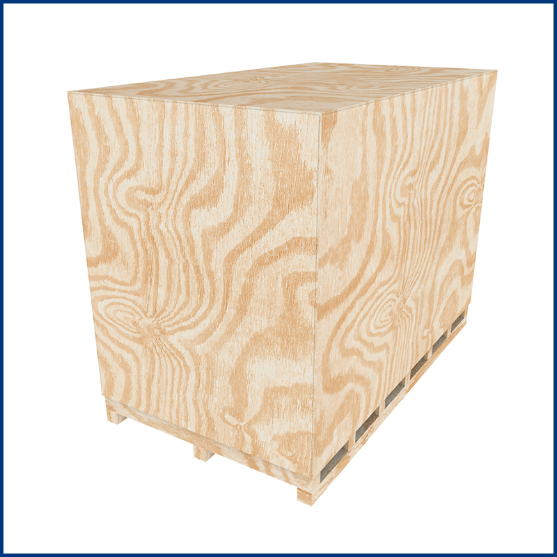
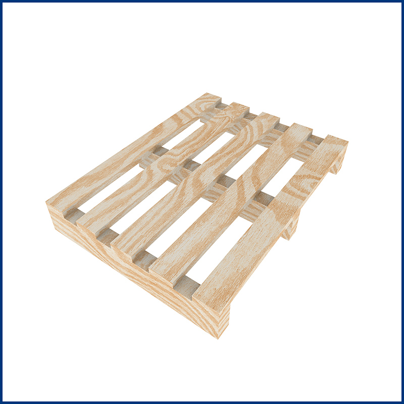
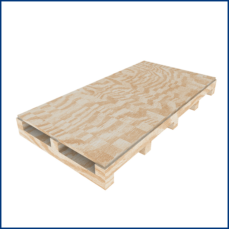
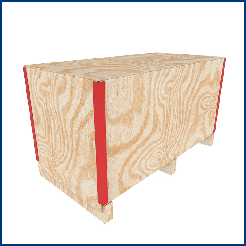
Le casse pieghevoli, nella versione standard, vengono realizzate in legno compensato di betulla da 6mm a cinque strati (a seconda delle esigenze sono disponibili anche altri spessori).
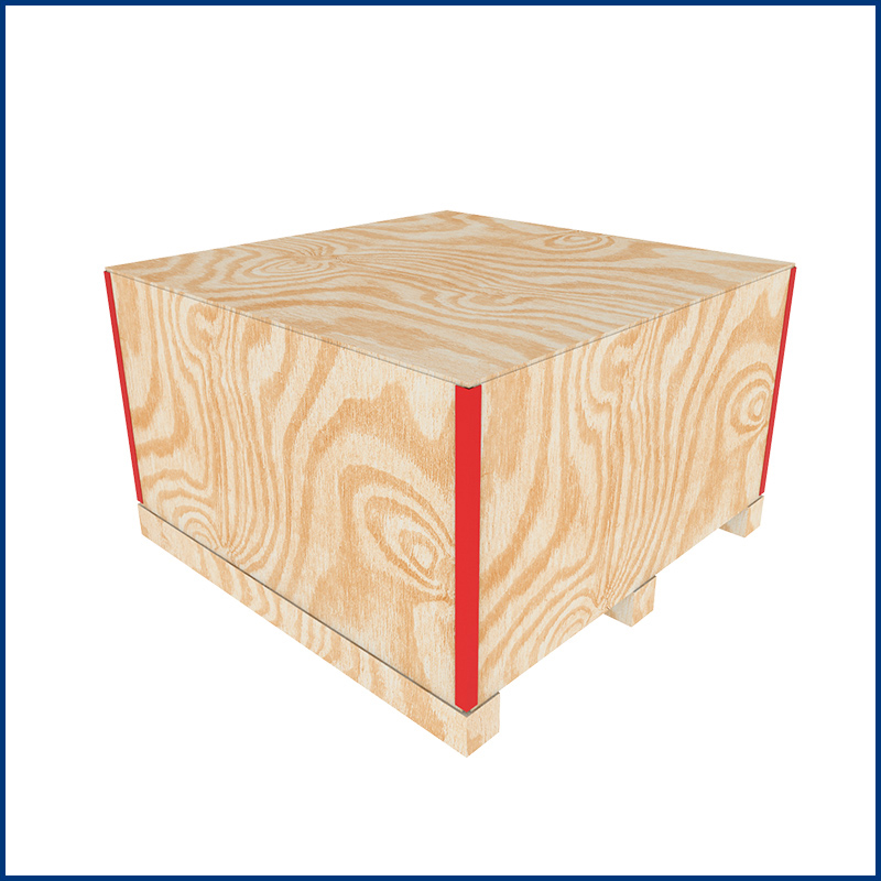
Con testate normale o ribassata sono semplici da montare ed offrono il massimo di leggerezza, resistenza, sicurezza, durata e praticità.

Possono essere prodotte in qualsiasi misura e la facilità di montaggio di questo tipo di cassa consente di risparmiare tempo e volumi nella fase di imballaggio e spedizione dei Vostri prodotti.

Il prodotto può essere personalizzato con il Vostro LOGO (optional), oltre che con simboli e/o scritte, rendendolo sia uno strumento di lavoro che un importante veicolo pubblicitario.

E' possibile rendere più resistenti le pareti ed il coperchio, applicando assi di rinforzo verticali e/o orizzontali.
Il fondo delle casse pieghevoli può essere realizzato:
  • in compensato di betulla, a 2 e 4 vie
  • in legno di abete, a 2 e 4 vie

La cassa è composta da 3 elementi: fondo, perimetrale pieghevole, coperchio. Il fondo è normalmente realizzato in multistrato o in legno di conifera, pallettizzato a 2 o 4 vie, mentre il perimetrale pieghevole ed il coperchio sono realizzati in multistrato di betulla . Il montaggio avviene ad incastro. Per il fissaggio definitivo possono essere utilizzati chiodi, viti, reggia plastica o metallica.

Sono disponibili vari modelli e allestimenti:
  • la cassa pieghevole tradizionale.
  • il modello rinforzato,adatto a forti carichi sovrapposti oppure per merci sfuse con forti sollecitazioni laterali.


24 Maggio 2019

KERABOX - Imballaggi speciali per il settore ceramico

Imballaggi speciali per il settore ceramico, standard e personalizzabili per ogni esigenza specifica


24 Maggio 2019

TIMBERPACK - Imballaggi industriali in legno e compensato


CASSE IN LEGNO

Realizzate con legno di abete, spessore 17 o 23 mm, le casse e le gabbie per le peculiari caratteristiche di resistenza, sono adattate a contenere, sopportare e proteggere i Vostri prodotti durante le operazioni di trasporto, movimentazione e stoccaggio.
Possono essere prodotte utilizzando compensati di elliottis, di betulla o in OSB, fissati alla struttura in legno di abete.
Su richiesta è possibile dotare le casse/gabbie di sacchi o cuffie in accoppiato barriera, in cartene o in polietilene con VCI anticorrosivo.

CASSE PANNELLATE IN COMPENSATO E OSB

I contenitori in legno (casse e gabbie) sono adatti al trasporto terrestre e marittimo, dimensionati e strutturati per preservare l'integraità della merce fino a destino.


GABBIE IN LEGNO CON TAVOLE SPAZIATE

Adatte per coperture di impianti di grandi dimensioni con eventuale rivestimento interno.
A richiesta possono essere realizzate con spaziature e pianali personalizzati progettati a seconda della portata.

BANCALI/PALLET

Possono essere prodotti in ogni dimensione, tipo e struttura su specifiche del cliente.
Sono realizzati principalmente in abete con materiali selezionati provenienti da segherie austriache e tedesche.


10 Maggio 2019

Certificazioni

  
03 Maggio 2019

Azienda

Da oltre 30 anni con Voi per offrirVi le migliori soluzioni di imballaggio

La TecnoPrimaF S.r.l. opera da più di 30 anni nel settore dell’imballaggio industriale.

Nell’ambito di questa attività l’azienda si è progressivamente specializzata nella produzione e vendita di alcune linee di prodotto: casse pieghevoli in compensato, reti piane e tubolari per la protezione di parti meccaniche, imballaggi industriali, prodotti anticorrosivi VCIForce e numerose soluzioni e prodotti in grado di rispondere a qualsiasi esigenza del Cliente.


1988
: TecnoPrimaF S.r.l. viene fondata a Modena su iniziativa di un gruppo di persone provenienti dal settore dell’imballaggio e si configura inizialmente come una piccola realtà artigianale atta a soddisfare le esigenze della clientela locale.
1995: trasferimento nella nuova sede in San Cesario Sul Panaro (a 8 km da Modena) grazie al quale viene raddoppiata l’area produttiva.
2002: l’azienda adotta una struttura di carattere industriale ma al tempo stesso estremamente flessibile. Cambiano i vertici aziendali, vengono effettuati consistenti investimenti nelle tecnologie di automazione dei processi produttivi e viene brevettato un sistema di casse per l’imballo.
2006: la società ottiene l’autorizzazione per la produzione di imballi a marchio IPPC/FAO, dotandosi di un proprio impianto di sterilizzazione termica.
2007: ulteriore ampliamento area produttiva (superficie coperta 5.000 mq su un totale di 12.000 mq)
2011: accordo con aziende per la produzione e distribuzione di prodotti anticorrosivi VCI a livello nazionale ed internazionale
2012: TecnoPrimaF conclude l'iter e ottiene la Certificazione di Qualità ISO UNI EN 9001:2008 da TÜV
2013: siglati importanti accordi con importanti imprese nel settore della logistica e imballaggio industriale
2014: realizzazione di una nuova linea automatizzata per la costruzione dei modelli FIT-BOX
2017: lancio ufficiale del nuovo brand VCIForce, divisione prodotti anticorrosivi (www.vciforce.com)
2017: conseguimento nuova certificazione UNI ISO 9001:2015
2018: partecipazione ad importanti fiere del settore (IPACK-IMA Milano e FACHPACK Germania)
2019: acquisizione nuova sede in via della Meccanica 16/18 +2.000 mq (con oltre 300 mq di uffici) portando a 7.000 mq la superficie coperta su un totale di oltre 17.000 mq
2020: realizzazione di una nuova linea automatica di troncatura e riorganizzazione del reparto taglio
2021: acquisizione nuova sede in via della Meccanica 5/7 +3.000 mq portando a 10.000 mq la superficie coperta su un totale di oltre 20.000 mq
2022: installato innovativo impianto semi-automatico di chiodatura a 4 postazioni con isola robotizzata per accatastamento pallet e reggiatura finale
2023: nuovo impianto di chiodatura a banco alternato con scarico e reggiatura robotizzati. Installazione impianto di sezionatura pannelli con caricatore automatico a ponte
2024: Tecnoprimaf entra a far parte del gruppo internazionale Antalis-KPP


ALCUNE REFERENZE

Divisione CERAMICA KERABOX


Divisione INDUSTRIALE TIMBERPACK


Divisione PIEGHEVOLE FOLDYBOX


Divisione ANTICORROSIVA VCIFORCE

03 Maggio 2019

Servizi

SERVIZI DI IMBALLAGGIO INDUSTRIALE, CONFEZIONAMENTO,
CONDIZIONAMENTO E CONTAINERIZZAZIONE

  • CONSULENZA riguardo alla scelta del tipo di imballo più opportuno. Valutazione del prodotto da imballare (dimensioni, peso e criticità specifiche), raccolta dati e informazioni sul trasporto.
  • PROGETTAZIONE E STESURA PREVENTIVO degli imballaggi in legno e compensato in funzione della natura e della configurazione della merce; studio del condizionamento/protezione dagli agenti atmosferici.
  • OTTIMIZZAZIONE piani di carico ai fini dell’abbattimento dei costi di trasporto e della efficacia del livello di protezione delle merci.
  • PRODUZIONE degli imballaggi in legno e compensato completi di tutti i loro elementi.
  • CONFEZIONAMENTO E IMBALLAGGIO della merce all’interno dei contenitori sia presso la sede Tecnoprimaf che presso il Cliente.
  • APPRONTAMENTO dei colli chiusi e stampigliati pronti per la spedizione. Marcatura imballi tramite simbologia internazionale e/o specifica del Cliente.

  PRESENTAZIONE CONFEZIONAMENTO PRESENTAZIONE CONFEZIONAMENTO PRESENTAZIONE CONFEZIONAMENTO

14 Aprile 2019

3rd Party Component Compatibility

This template is compatible with all the major 3rd party components available for Joomla. The following are just some of the ones available that work great with any Shape 5 template. A template itself should in no way hinder the functionality of a component. Although we haven't tested every single Joomla component available we can say quite confidently that this template will be compatible with any Joomla extension you use with it.


And many more!

14 Aprile 2019

Built In File Compression

Increase speed and performance by compressing core template CSS and Javascript files to much smaller sizes than the original! Enabling compression is a great way to boost your site's performance. It simply combines css and js into consolidated files. This reduces the downloads sizes and reduces the numbers of calls to your server, to dramatically help your site's overall performance. No data is lost during this process, just simply made smaller. Please note that this compression will only compress core template files, not third party files or files from extensions.


Note: Because this feature uses cached versions of your javascript and css this plugin should not be used while developing your site and should only be enabled after you have completed your site.

Gzip must be installed on your server and enabled in PHP in order to function.

Without Compression Enabled:

With Compression Enabled:

I like what I see! I want to JOIN TODAY.

14 Aprile 2019

Fixed Side Tabs

This template includes a "Fixed Tab" option that you can enable and publish on your site and will show in a fixed position on either the left or right side of the screen. The great feature about the fixed tabs is that you can enter any text you desire and the text is automatically flipped vertically! This is great for search engines to read your text and also saves the hassle of creating an image with vertical text and placing it on the side of your site. The tabs are published site wide and can have the following options that can be changed via the template parameters area and can link to any URL that you desire.

The following is a quick list of features:

  • Change background to any hex color
  • Change the border to any hex color
  • Change the font to any hex color
  • Set vertical position of each tab
  • Set the height of each tab
  • Set each tab to either the left or right of the screen
  • Add a class to each fixed tab to enable s5 box or perhaps a lightbox or other 3rd party extension
  • Add a URL to each fixed tab so onclick the URL loads
  • Enter any text you desire


I like what I see! I want to JOIN TODAY.
14 Aprile 2019

Google Fonts Enabled

Do you want your own custom font? Not a problem, this template comes with Google Fonts enabled, allowing you to pick from hundreds of font families for your website. In the template parameters area of the template you can choose your own custom font, and preview it from the Vertex interface. Below are some examples of the fonts available.


I like what I see! I want to JOIN TODAY.

14 Aprile 2019

Hide Article Component Area

Did you ever need to create a page where this is no article present or no component to be shown, and only load modules? This template makes it all possible! From the template configuration page you can hide the main content area on any page on the site.

Below is a screenshot of this function from the configuration page, found under the Main / Layout tab under the field "Hide Component Output?" in the middle of the screen:

14 Aprile 2019

Hide Divs, Content, and Modules

One of the biggest obstacles to overcome when designing a responsive layout site is that not all content, images and extensions were designed to work with responsive layouts. That means that sometimes you need the ability to hide a specific element on only certain sized screens, so that something doesn't break the site's layout and everything looks proportionate. We've made that all possible and very easy to do for you with hiding classes! There are three main ways to hide content on different size screens, and they are documented below. Please note that these classes are only enabled when the responsive layout is enabled.


Hide Sections of the Template via the Template Configuration

This is the simplest way to hide an area of the template is to use the template interface to easily select areas of the template that you want to hide on tablet sized screens (970px and less) or mobile screens (580px or less). Simply select the area that you want to hide and the Vertex framework takes care of the rest! These fields do work independent of each other, so if you want to hide something on both tablet and mobile sized screens you must select the same area on both fields.


IMPORTANT - If you turn off a column position such as right or right_inset something else must be in the same column or the layout will not work. For example you can turn off right_inset and keep right, but you cannot turn off both unless something is publihsed to right_top or right_bottom as well.

Hide Specific Modules via the Hide Classes

If you have only a specific module that you would like to hide at certain screen sizes, and not an entire section of the template, this is the best approach. A hide class is a class that can be applied to any element on the page and hides that particular element at certain screen sizes. Classes range in 100px increments for large screens and 50px increments for small screens. Below are some examples, and at the very bottom of this page there is a list of all the available hide classes. Use these sparingly if you can. As a recommendation, the primary target of these classes should focus on tablet and mobile sized screens. Wide screen monitors vary in size so it's much harder to use these classes correctly for large monitors. Tablet and mobile devices are much more consistent in size so it is much easier to apply the smaller hide classes.

For example, say you want to hide a specific module when the screen sizes reaches 900px wide, and remain hidden for any screen below 900px. Simply add class=hide_900 to the title of the module like this:


The class is simply put into the title of the module. There must be a space just before class= , and don't worry, the class area of the title won't actually show on the live site, it's only shown in the backend. It must be entered exactly as shown above. The title can be published or unpublished, it does not matter which. Simply adding the classes to the title will apply the classes to the entire module.

What if you want it to hide the module only for a certain range? That's easy just add _only to the end of the class name. hide_900_only will only hide that element from 900px to the next increment in the hide classes, which is 850px. So it will only be hidden from 850px to 900px. You can also add multiple classes to the title like this class=hide_900_only hide_850_only which will apply both classes to the module.

What if you want to hide the module and then show it again later? That's simple, use show_ in the class instead of hide_. This will make the module show for the specified size no matter what other settings are on the module. So if you want to hide the module from 1000px and below, but you want to show it again later then do something like the following class=hide_1000 show_600. This will hide the module from 600px to 1000px.

Is there a more simple way? Yes, of course, the above directions are for experienced users who want to tweak their content for every available screen size. If you don't want to mess around with specific window sizes simply use the following classes instead, which have preset screen sizes applied to them:

hide_all
hide_wide_screen
hide_standard_screen
hide_large_tablet
hide_small_tablet
hide_mobile
show_wide_screen
show_standard_screen
show_large_tablet
show_small_tablet
show_mobile

Why would someone use hide_all? This is a great tool for anyone wanting to show content only on a mobile or tablet sized screen but hide it on all other devices. To do this you should use class="hide_all show_mobile". The hide_all will set the content or module to display:none on all devices, and one the screen size reaches mobile size the show_mobile will override the display:none and show the content.


Hide Specific Content via the Hide Classes

If you have only specific content or images within an article or module that you want to hide then use the same hide classes described above, but wrap that specific content inside of the class instead of applying it to the entire module. For example, in the image below, the third paragraph will hide at 900px and then show again at 700px.


Available Hide Classes

All the available hide classes are listed below. Note there is a break at 970px and 580px to accommodate tablet and mobile sized screens. At the bottom of the list you will see inline calls, these calls should only be used if the default block calls cause a layout problem with your content, which can happen with applying a display:block.

/* HIDE CLASSES
----------------------------------------------------------- */

@media screen and (max-width: 1600px){
.hide_1600 {
display:none !important;
}
}

@media screen and (min-width:1500px) and (max-width: 1600px){
.hide_1600_only {
display:none !important;
}
}

@media screen and (max-width: 1550px){
.hide_1550 {
display:none !important;
}
}

@media screen and (min-width:1450px) and (max-width: 1550px){
.hide_1550_only {
display:none !important;
}
}

@media screen and (max-width: 1500px){
.hide_1500 {
display:none !important;
}
}

@media screen and (min-width:1400px) and (max-width: 1500px){
.hide_1500_only {
display:none !important;
}
}

@media screen and (max-width: 1450px){
.hide_1450 {
display:none !important;
}
}

@media screen and (min-width:1350px) and (max-width: 1450px){
.hide_1450_only {
display:none !important;
}
}

@media screen and (max-width: 1400px){
.hide_1400 {
display:none !important;
}
}

@media screen and (min-width:1300px) and (max-width: 1400px){
.hide_1400_only {
display:none !important;
}
}

@media screen and (max-width: 1350px){
.hide_1350 {
display:none !important;
}
}

@media screen and (min-width:1250px) and (max-width: 1350px){
.hide_1350_only {
display:none !important;
}
}

@media screen and (max-width: 1300px){
.hide_1300 {
display:none !important;
}
}

@media screen and (min-width:1200px) and (max-width: 1300px){
.hide_1300_only {
display:none !important;
}
}

@media screen and (max-width: 1250px){
.hide_1250 {
display:none !important;
}
}

@media screen and (min-width:1150px) and (max-width: 1250px){
.hide_1250_only {
display:none !important;
}
}

@media screen and (max-width: 1200px){
.hide_1200 {
display:none !important;
}
}

@media screen and (min-width:1100px) and (max-width: 1200px){
.hide_1200_only {
display:none !important;
}
}

@media screen and (max-width: 1150px){
.hide_1150 {
display:none !important;
}
}

@media screen and (min-width:1050px) and (max-width: 1150px){
.hide_1150_only {
display:none !important;
}
}

@media screen and (max-width: 1100px){
.hide_1100 {
display:none !important;
}
}

@media screen and (min-width:1000px) and (max-width: 1100px){
.hide_1100_only {
display:none !important;
}
}

@media screen and (max-width: 1050px){
.hide_1050 {
display:none !important;
}
}

@media screen and (min-width:950px) and (max-width: 1050px){
.hide_1050_only {
display:none !important;
}
}

@media screen and (max-width: 1000px){
.hide_1000 {
display:none !important;
}
}

@media screen and (min-width:900px) and (max-width: 1000px){
.hide_1000_only {
display:none !important;
}
}

@media screen and (max-width: 970px){
.hide_970 {
display:none !important;
}
}

@media screen and (min-width:900px) and (max-width: 970px){
.hide_970_only {
display:none !important;
}
}

@media screen and (max-width: 950px){
.hide_950 {
display:none !important;
}
}

@media screen and (min-width:900px) and (max-width: 950px){
.hide_950_only {
display:none !important;
}
}

@media screen and (max-width: 900px){
.hide_900 {
display:none !important;
}
}

@media screen and (min-width:850px) and (max-width: 900px){
.hide_900_only {
display:none !important;
}
}

@media screen and (max-width: 850px){
.hide_850 {
display:none !important;
}
}

@media screen and (min-width:800px) and (max-width: 850px){
.hide_850_only {
display:none !important;
}
}

@media screen and (max-width: 800px){
.hide_800 {
display:none !important;
}
}

@media screen and (min-width:750px) and (max-width: 800px){
.hide_800_only {
display:none !important;
}
}

@media screen and (max-width: 750px){
.hide_750 {
display:none !important;
}
}

@media screen and (min-width:700px) and (max-width: 750px){
.hide_750_only {
display:none !important;
}
}

@media screen and (max-width: 700px){
.hide_700 {
display:none !important;
}
}

@media screen and (min-width:650px) and (max-width: 700px){
.hide_700_only {
display:none !important;
}
}

@media screen and (max-width: 650px){
.hide_650 {
display:none !important;
}
}

@media screen and (min-width:600px) and (max-width: 650px){
.hide_650_only {
display:none !important;
}
}

@media screen and (max-width: 600px){
.hide_600 {
display:none !important;
}
}

@media screen and (min-width:580px) and (max-width: 600px){
.hide_600_only {
display:none !important;
}
}

@media screen and (max-width: 579px){
.hide_580 {
display:none !important;
}
}

@media screen and (min-width:550px) and (max-width: 579px){
.hide_580_only {
display:none !important;
}
}

.hide_all {
display:none ! important;
}

@media screen and (min-width:1300px) and (max-width: 50000px){
.hide_wide_screen {
display:none !important;
}
}

@media screen and (min-width:971px) and (max-width: 1299px){
.hide_standard_screen {
display:none !important;
}
}

@media screen and (min-width:750px) and (max-width: 970px){
.hide_large_tablet {
display:none !important;
}
}

@media screen and (min-width:580px) and (max-width: 750px){
.hide_small_tablet {
display:none !important;
}
}

@media screen and (min-width:580px) and (max-width: 750px){
.hide_small_tablet {
display:none !important;
}
}

@media screen and (max-width: 579px){
.hide_mobile {
display:none !important;
}
}

@media screen and (max-width: 1600px){
.show_1600 {
display:block !important;
}
}

@media screen and (min-width:1500px) and (max-width: 1600px){
.show_1600_only {
display:block !important;
}
}

@media screen and (max-width: 1550px){
.show_1550 {
display:block !important;
}
}

@media screen and (min-width:1450px) and (max-width: 1550px){
.show_1550_only {
display:block !important;
}
}

@media screen and (max-width: 1500px){
.show_1500 {
display:block !important;
}
}

@media screen and (min-width:1400px) and (max-width: 1500px){
.show_1500_only {
display:block !important;
}
}

@media screen and (max-width: 1450px){
.show_1450 {
display:block !important;
}
}

@media screen and (min-width:1350px) and (max-width: 1450px){
.show_1450_only {
display:block !important;
}
}

@media screen and (max-width: 1400px){
.show_1400 {
display:block !important;
}
}

@media screen and (min-width:1300px) and (max-width: 1400px){
.show_1400_only {
display:block !important;
}
}

@media screen and (max-width: 1350px){
.show_1350 {
display:block !important;
}
}

@media screen and (min-width:1250px) and (max-width: 1350px){
.show_1350_only {
display:block !important;
}
}

@media screen and (max-width: 1300px){
.show_1300 {
display:block !important;
}
}

@media screen and (min-width:1200px) and (max-width: 1300px){
.show_1300_only {
display:block !important;
}
}

@media screen and (max-width: 1250px){
.show_1250 {
display:block !important;
}
}

@media screen and (min-width:1150px) and (max-width: 1250px){
.show_1250_only {
display:block !important;
}
}

@media screen and (max-width: 1200px){
.show_1200 {
display:block !important;
}
}

@media screen and (min-width:1100px) and (max-width: 1200px){
.show_1200_only {
display:block !important;
}
}

@media screen and (max-width: 1150px){
.show_1150 {
display:block !important;
}
}

@media screen and (min-width:1050px) and (max-width: 1150px){
.show_1150_only {
display:block !important;
}
}

@media screen and (max-width: 1100px){
.show_1100 {
display:block !important;
}
}

@media screen and (min-width:1000px) and (max-width: 1100px){
.show_1100_only {
display:block !important;
}
}

@media screen and (max-width: 1050px){
.show_1050 {
display:block !important;
}
}

@media screen and (min-width:950px) and (max-width: 1050px){
.show_1050_only {
display:block !important;
}
}

@media screen and (max-width: 1000px){
.show_1000 {
display:block !important;
}
}

@media screen and (min-width:900px) and (max-width: 1000px){
.show_1000_only {
display:block !important;
}
}

@media screen and (max-width: 970px){
.show_970 {
display:block !important;
}
}

@media screen and (min-width:900px) and (max-width: 970px){
.show_970_only {
display:block !important;
}
}

@media screen and (max-width: 950px){
.show_950 {
display:block !important;
}
}

@media screen and (min-width:900px) and (max-width: 950px){
.show_950_only {
display:block !important;
}
}

@media screen and (max-width: 900px){
.show_900 {
display:block !important;
}
}

@media screen and (min-width:850px) and (max-width: 900px){
.show_900_only {
display:block !important;
}
}

@media screen and (max-width: 850px){
.show_850 {
display:block !important;
}
}

@media screen and (min-width:800px) and (max-width: 850px){
.show_850_only {
display:block !important;
}
}

@media screen and (max-width: 800px){
.show_800 {
display:block !important;
}
}

@media screen and (min-width:750px) and (max-width: 800px){
.show_800_only {
display:block !important;
}
}

@media screen and (max-width: 750px){
.show_750 {
display:block !important;
}
}

@media screen and (min-width:700px) and (max-width: 750px){
.show_750_only {
display:block !important;
}
}

@media screen and (max-width: 700px){
.show_700 {
display:block !important;
}
}

@media screen and (min-width:650px) and (max-width: 700px){
.show_700_only {
display:block !important;
}
}

@media screen and (max-width: 650px){
.show_650 {
display:block !important;
}
}

@media screen and (min-width:600px) and (max-width: 650px){
.show_650_only {
display:block !important;
}
}

@media screen and (max-width: 600px){
.show_600 {
display:block !important;
}
}

@media screen and (min-width:580px) and (max-width: 600px){
.show_600_only {
display:block !important;
}
}

@media screen and (max-width: 579px){
.show_580 {
display:block !important;
}
}

@media screen and (min-width:550px) and (max-width: 579px){
.show_580_only {
display:block !important;
}
}

@media screen and (min-width:1300px) and (max-width: 50000px){
.show_wide_screen {
display:block !important;
}
}

@media screen and (min-width:971px) and (max-width: 1299px){
.show_standard_screen {
display:block !important;
}
}

@media screen and (min-width:750px) and (max-width: 970px){
.show_large_tablet {
display:block !important;
}
}

@media screen and (min-width:580px) and (max-width: 750px){
.show_small_tablet {
display:block !important;
}
}

@media screen and (max-width: 579px){
.show_mobile {
display:block !important;
}
}


/* THE INLINE SHOW CALLS BELOW SHOULD BE USED SELDOMLY. THEY SHOULD ONLY BE USED IF THE BLOCK SHOW CALLS ABOVE CAUSE A LAYOUT ISSUE WHEN TRIGGERED.
----------------------------------------------------------- */

@media screen and (max-width: 1600px){
.show_1600_inline {
display:inline !important;
}
}

@media screen and (min-width:1500px) and (max-width: 1600px){
.show_1600_only_inline {
display:inline !important;
}
}

@media screen and (max-width: 1550px){
.show_1550_inline {
display:inline !important;
}
}

@media screen and (min-width:1450px) and (max-width: 1550px){
.show_1550_only_inline {
display:inline !important;
}
}

@media screen and (max-width: 1500px){
.show_1500_inline {
display:inline !important;
}
}

@media screen and (min-width:1400px) and (max-width: 1500px){
.show_1500_only_inline {
display:inline !important;
}
}

@media screen and (max-width: 1450px){
.show_1450_inline {
display:inline !important;
}
}

@media screen and (min-width:1350px) and (max-width: 1450px){
.show_1450_only_inline {
display:inline !important;
}
}

@media screen and (max-width: 1400px){
.show_1400_inline {
display:inline !important;
}
}

@media screen and (min-width:1300px) and (max-width: 1400px){
.show_1400_only_inline {
display:inline !important;
}
}

@media screen and (max-width: 1350px){
.show_1350_inline {
display:inline !important;
}
}

@media screen and (min-width:1250px) and (max-width: 1350px){
.show_1350_only_inline {
display:inline !important;
}
}

@media screen and (max-width: 1300px){
.show_1300_inline {
display:inline !important;
}
}

@media screen and (min-width:1200px) and (max-width: 1300px){
.show_1300_only_inline {
display:inline !important;
}
}

@media screen and (max-width: 1250px){
.show_1250_inline {
display:inline !important;
}
}

@media screen and (min-width:1150px) and (max-width: 1250px){
.show_1250_only_inline {
display:inline !important;
}
}

@media screen and (max-width: 1200px){
.show_1200_inline {
display:inline !important;
}
}

@media screen and (min-width:1100px) and (max-width: 1200px){
.show_1200_only_inline {
display:inline !important;
}
}

@media screen and (max-width: 1150px){
.show_1150_inline {
display:inline !important;
}
}

@media screen and (min-width:1050px) and (max-width: 1150px){
.show_1150_only_inline {
display:inline !important;
}
}

@media screen and (max-width: 1100px){
.show_1100_inline {
display:inline !important;
}
}

@media screen and (min-width:1000px) and (max-width: 1100px){
.show_1100_only_inline {
display:inline !important;
}
}

@media screen and (max-width: 1050px){
.show_1050_inline {
display:inline !important;
}
}

@media screen and (min-width:950px) and (max-width: 1050px){
.show_1050_only_inline {
display:inline !important;
}
}

@media screen and (max-width: 1000px){
.show_1000_inline {
display:inline !important;
}
}

@media screen and (min-width:900px) and (max-width: 1000px){
.show_1000_only_inline {
display:inline !important;
}
}

@media screen and (max-width: 970px){
.show_970_inline {
display:inline !important;
}
}

@media screen and (min-width:900px) and (max-width: 970px){
.show_970_only_inline {
display:inline !important;
}
}

@media screen and (max-width: 950px){
.show_950_inline {
display:inline !important;
}
}

@media screen and (min-width:900px) and (max-width: 950px){
.show_950_only_inline {
display:inline !important;
}
}

@media screen and (max-width: 900px){
.show_900_inline {
display:inline !important;
}
}

@media screen and (min-width:850px) and (max-width: 900px){
.show_900_only_inline {
display:inline !important;
}
}

@media screen and (max-width: 850px){
.show_850_inline {
display:inline !important;
}
}

@media screen and (min-width:800px) and (max-width: 850px){
.show_850_only_inline {
display:inline !important;
}
}

@media screen and (max-width: 800px){
.show_800_inline {
display:inline !important;
}
}

@media screen and (min-width:750px) and (max-width: 800px){
.show_800_only_inline {
display:inline !important;
}
}

@media screen and (max-width: 750px){
.show_750_inline {
display:inline !important;
}
}

@media screen and (min-width:700px) and (max-width: 750px){
.show_750_only_inline {
display:inline !important;
}
}

@media screen and (max-width: 700px){
.show_700_inline {
display:inline !important;
}
}

@media screen and (min-width:650px) and (max-width: 700px){
.show_700_only_inline {
display:inline !important;
}
}

@media screen and (max-width: 650px){
.show_650_inline {
display:inline !important;
}
}

@media screen and (min-width:600px) and (max-width: 650px){
.show_650_only_inline {
display:inline !important;
}
}

@media screen and (max-width: 600px){
.show_600_inline {
display:inline !important;
}
}

@media screen and (min-width:580px) and (max-width: 600px){
.show_600_only_inline {
display:inline !important;
}
}

@media screen and (max-width: 579px){
.show_580_inline {
display:inline !important;
}
}

@media screen and (min-width:550px) and (max-width: 579px){
.show_580_only_inline {
display:inline !important;
}
}

@media screen and (min-width:1300px) and (max-width: 50000px){
.show_wide_screen_inline {
display:inline !important;
}
}

@media screen and (min-width:971px) and (max-width: 1299px){
.show_standard_screen_inline {
display:inline !important;
}
}

@media screen and (min-width:750px) and (max-width: 970px){
.show_large_tablet_inline {
display:inline !important;
}
}

@media screen and (min-width:580px) and (max-width: 750px){
.show_small_tablet_inline {
display:inline !important;
}
}

@media screen and (max-width: 579px){
.show_mobile_inline {
display:inline !important;
}
}


I like what I see! I want to JOIN TODAY.

14 Aprile 2019

How To Setup the Search Box and Menus

1. Search Setup

  • For this template we don't have a specific search position but just simply publish a module to the right position.

2. Column Menu Setup

  • Publish any menu module to the main body module positions on your site.
  • There should be no menu style suffixes applied under advanced parameters.
  • The menu style should be set to list.

3. Bottom Menu Setup

  • Publish any menu to the 'bottom_menu' position.
  • There are no menu style suffixes applied under advanced parameters.
  • The menu style should be set to list
14 Aprile 2019

Info Slide

The info slide script is a great way to display your content to your customers! It will place a sliding text box over any image on the page. It can be placed inside of content or modules. It will also automatically adjust to any size screen size on window resize. See below for a demonstration. In the backend of Vertex you can pick between a javascript only version or a pure css version.


Javascript Version


Example Slide

This is dummy text. You can add any text or html markup here.

Example Slide

This is dummy text. You can add any text or html markup here.


CSS Version Default


Example Slide

This is dummy text. You can add any text or html markup here.

Example Slide

This is dummy text. You can add any text or html markup here.


CSS Version 1


Example Slide

This is dummy text. You can add any text or html markup here.

Example Slide

This is dummy text. You can add any text or html markup here.


CSS Version 2


Example Slide

This is dummy text. You can add any text or html markup here.

Example Slide

This is dummy text. You can add any text or html markup here.


CSS Version 3


Example Slide

This is dummy text. You can add any text or html markup here.

Example Slide

This is dummy text. You can add any text or html markup here.


CSS Version 4


Example Slide

This is dummy text. You can add any text or html markup here.

Example Slide

This is dummy text. You can add any text or html markup here.


CSS Version 5


Example Title

Example Title


CSS Version 6


Example Title

Example Title


CSS Version 7


image

Example Slide

You can add any text or html markup here.
image

Example Slide

You can add any text or html markup here.


CSS Version 8


Example Slide

You can add any text or html markup here.

Example Slide

You can add any text or html markup here.


CSS Version 9


Example Slide

You can add any text or html markup here.

Example Slide

You can add any text or html markup here.


CSS Version 10


+

Example Slide

You can add any text or html markup here.
+

Example Slide

You can add any text or html markup here.


I like what I see! I want to JOIN TODAY.

14 Aprile 2019

Installing The Template


  • 01Download the installation package from our download section.
  • 02Once the download is complete go to the backend of Joomla.
  • 03Navigate through your menu system to Extensions/Extensions Manager.
  • 04Once at the installation screen click the browse button and navigate to where you downloaded the template file.
  • 05Once you have the file selected click 'Upload File and Install'
  • The template is now installed, now let's set it as the default template:

  • 06Navigate through your menu system to Extensions/Template Manager.
  • 07Find the radio button next to the newly installed template.
  • 08Click on the Default button at the top right of the screen and you're done!
14 Aprile 2019

Lazy Load Images

The lazy load script is a great way to save bandwidth and load your pages much faster. Images that are not visible on the initial page load are not loaded or downloaded until they come into the main viewing area. Once an image comes into view it is then downloaded and faded into visibility. Scroll down this page to see the script in action.

Setup is very easy! By default this script is disabled, in order to enable it simply choose All Images or Individual Images from the drop down, as shown below from inside the template configuration page.


All images will load every standard image on the page with lazy load. There is no extra configuration or extra code to add with this configuration, it will just happen automatically. Individual images would be used if you want only certain images to load with this script and not all of them. To do this simply add class="s5_lazyload" to the image like so:
<img class="s5_lazyload" src="http://www.yoursite.com/image.jpg"></img>


This script is compatible with Firefox3+, IE8+, Chrome14+, Safari5.05+, Opera 11.11+

See the script in action:


14 Aprile 2019

Login and Register Setup

The S5 Box can be demo'd by clicking on either the Login button on this page.

The module allows for up to 10 different S5 Box's on one page all via 10 module positions. You simply add a class to any HTML element on your site and enable the corresponding box and you are good to go!


To enable the login and register modules:

  • 01Install the S5 Box module and publish it to all pages on your site. Try to publish it to a position where a module already exists on all pages, but don't worry it won't change the layout of your site, the script is automatically hidden on your site.
  • 02Install and publish the S5 Register module to the 'register' module position
  • 03Publish the default Joomla login module to the 'login' module position.
  • 04In your template parameters area of Joomla you can change the text for login, register and logout.
  • 05That's it, you're all done!

If you do not wish to use the S5 Box but would still like to use the Login and Register links then simply complete step 4 above and also fill out your own custom urls just below those fields in the template configuration. Filling out the custom url fields will disable the S5 Box.

The S5 Box runs off of the core Joomla jquery/mootools libraries so there will be no conflicts with third party extensions or extra javascript files to download.

Features:

  • Powered by no conflict mode jQuery Javascript or mootools
  • Choose, elastic, fade or none for the popup effect
  • Up to 10 S5 Box's throughout your site or on any one page!
  • Set the percentage of width of each box according to overall screen size

Tutorial on how to get the s5 box working and use all 10 module positions it includes:

  • 01Adding the S5 Box positions:
  • Open up the templateDetails.xml file included with the template you are using.
  • Locate the positions area.
  • Start adding new positions s5_box1, s5_box2, s5_box3, etc all the way up to s5_box10.
  • 02Adding the S5 Box classes:
  • The S5 Box class name of the corresponding position must be added to the link that will open the box. For example the following code will display a link that says Click Here and will open the S5 Box and display whatever module is published to the s5_box3 module position:


  • These classes can be added to any element, ie: divs, spans, etc., but the common use will be to add this into content with a link similar to the one shown in the picture above. To enter this link you must do so from the HTML edit screen on your content editor:

    Once you have clicked the HTML button the HTML code window will appear much like the first image.
  • You can continue adding these classes throughout your site just be sure to have published a module to the corresponding position or the box will not work correctly. So if you add the class s5box_two you will also have to publish a module to the s5_box2 position.
  • Module positions and their corresponding classes:

    s5_box1 = s5box_one
    s5_box2 = s5box_two
    s5_box3 = s5box_three
    s5_box4 = s5box_four
    s5_box5 = s5box_five
    s5_box6 = s5box_six
    s5_box7 = s5box_seven
    s5_box8 = s5box_eight
    s5_box9 = s5box_nine
    s5_box10 = s5box_ten
  • 03Lastly, publish your modules to the S5 Box positions:
  • Now that you have added the s5 box positions just go to your site modules area and publish modules to those positions
  • Make sure that you have added a class to an HTML element as described above or the s5 box will have no activation button
  • Also make sure to publish the actual s5 box to a non s5 box position, perhaps publish it to the "debug" position or a similar one in your template.

Main S5 Box Module Settings:

  • In the backend of the S5 Box module you can adjust the width of each box independent of each other.
  • Make sure that the S5 Box module is published to all pages, it can be published to any template position. Also make sure that the module opening in the box is published to the page the link is on.

14 Aprile 2019

Menu Scroll To Section

This template includes a scroll to feature that will scroll your page to a specified section of your site. All you have to do is create an external link in your menu manager and then in the URL area enter in any ID on your page. You can reference any of the following IDs in order:

  • #s5_header_area1
  • #s5_top_row1_area1
  • #s5_top_row2_area1
  • #s5_top_row3_area1
  • #s5_center_area1
  • #s5_bottom_row1_area1
  • #s5_bottom_row2_area1
  • #s5_bottom_row3_area1
  • #s5_footer_area1

Screenshot of admin area of an external menu item with DIV reference entered:

14 Aprile 2019

Module Positions and Styles


All modules are fully collapsible

What exactly is a collapsing module? It's quite simple, whenever a module is not published to a postion that position does not appear on the frontend of the template. Consider the example below:


This particular row has 6 module positions available to publish to. Let's say you only want to publish to 4 of these positions. The template will automatically collapse the modules you do not want to use and adjust the size of the modules accordingly:


If no modules are published to the row the entire row itself will not show. The best feature of this is every module can be published to its own unique pages so the layout of your site can change on every page!


Infinite Layouts

Because there are so many module positions available in so many different areas, the number of layouts you can create are limitless! For example, if you would like to show your main content area on the right side of your site but still have a column of modules, simply published your modules to the right or right_inset positions or both. The same would be true for the opposite, if you want a column on the left simply publish modules to left or left_inset. Of course you can always choose to not have a column at all. Remember, any module not published to will automatically collapse and the remaining area will automatically adjust. There is no need to choose a pre-defined layout for your entire site, simply use the power of collpasing module positions and take advantage of the numerous amount of module positions to create any layout you can dream of! Be sure to checkout the layout of modules below.


Dozens of Modules

Below is a complete list of all the module positions available for this template.


How to install and setup module styles:

    • 01 Download any module you wish to publish to your site.
    • 02In the backend of Joomla navigate to the menu item Extensions/Install Uninstall


    • 03Browse for the module's install file and click Upload File & Install.
    • 04 Once the module has be installed navigate to the menu item Extensions/Module Manager (same menu as above)
    • 05Find the Module just installed and click on it's title.
    • 06 Change any parameters that you wish and be sure to set it to published and publish it to your desired module position.
    • 07To apply a module style simply fill in the module class suffix field with any of this template's included module styles. This parameter setting is found under Module Parameters on the right side of the screen.


    • 08Assign what pages you would like the module to appear on and finally click Save.

14 Aprile 2019

Multibox


Features:

  • Supports a range of multimedia formats: images, flash, video, mp3s, html!
  • Auto detects formats or you can specify the format
  • Html descriptions
  • Enable/Disable page overlay when multibox pops up (via template parameters)
  • Enable/Disable controls (via template parameters)

Images Example

Image #1. It can support html.
  
Image #2. It can support html.
  
Image #3. It can support html.


Separate Group Images Example

Image #1. It can support html.
  
Image #2. It can support html.
  
Image #3. It can support html.


Video Example:

Youtube.com Video - CLICK ME
UP: Carl and Ellie


You can use the following video formats: flv, mov, wmv, real and swf. Just insert the URL to the videos in the href of the hyperlink, here is an example of how we did this for a Youtube video:

YouTube Tutorial: Simply right click on a youtube video and copy the embed code, then paste into a text editor and look for the embed src and use that URL in your hyperlink.


MP3 Example:

MP3 example - CLICK ME
mp3 example


iFrame:

iFrame/HTML Example - CLICK ME
getfirebug.com


I like what I see! I want to JOIN TODAY.

14 Aprile 2019

Page, Column and Row Widths


Fixed or Fluid Width

This template has the ability to set the entire width of your set to either a fixed pixel width or a fluid percentage width. You can set the width to any size you want.


Column Widths

You may also set the widths of the following positions to any width that you need to: left, left_inset, right, and right_inset. You may set them to any width you need to. Columns can either be set to a fixed px width or they can be set to a fluid percentage width. If you are enabling the responsive layout we recommend setting these to percentage width.


Row Widths

This template comes loaded with module positions, many of which appear in rows of 6 module positions. Any row that contains 6 module positions can have it's row columns set to automatic widths or manual. For example, in the picture below the first row shows 4 modules published and since it's set to automatic each is set to 25% width. The second row shows a manual calculation for each module in the row. Again, you may do this for any row that contains 6 modules. If you setup a manual calculation they must total to 100%. Not all 6 modules need to be used, as shown below.

All of this is done very easily in the template configuration.


14 Aprile 2019

Responsive Layout

Responsive design at its most elementary definition is simply the use of css media queries and some javascript to rearrange a website's layout to fit multiple screen sizes. This can range from a wide screen monitor down to the smallest of smart phones. It is done all through the same site, same installation, sharing the same files, and no extra layouts needed as in the past. Unlike many pixel grid based templates, Shape5 Vertex templates are already built on a fluid width layout based on percentages, with an optional pixel width wrapper, which is what responsive layouts require. Because of this Vertex templates do not require a responsive layout, instead it is completely optional! That's right, if you're uncomfortable with responsive layouts or it won't work with your site, then simply turn it off and use the standard fixed or fluid width layout instead!


What Makes The Vertex Responsive Layout The Best and Most Flexible?

  • The responsive layout is completely optional, don't use it if you don't want it!
  • Virtually no javascript. The only javascript used is for the mobile bar effects and to add responsive capabilites to IE7. We believe that javascript should only be used as a last resort.
  • Start with a fixed or fluid layout.
  • Every area of the template, ie: columns, row, and body; can be set to a fluid layout.
  • Automatic onclick menu functionality for small touch screens.
  • Optional IE7/8 responsive layout.
  • Very easy to understand layout, which allows you to setup your site with very little effort.
  • Fully customizable mobile bar styling.
  • Optional row re-distribution at smaller screens.
  • Hide divs, modules and content easily with hide classes at specified screen sizes.
  • Wide screen support options.
  • Multiple options for fluid width images.
  • And much more!

Easy To Understand Layout

One of the biggest advantages to the Vertex Responsive Layout is that we start the layout as if it were designed for a desktop viewer, and then simply reduce, modify, or remove certain sections or font sizes based on the size of the user's screen. This is all done through css media queries, and is all done automatically for you!

The best way to see this approach, is simply resize your browser to see it all take effect.

Some responsive designs simply use a series of floating divs that re-arrange themselves on the page and add columns as the screen width increases or decreases. The biggest con to this approach is it can become very confusing as to where your content will actually exist on any given screen; making it very hard to create a specific layout and confusing for a client; especially those with specific product and content placement needs.

Our approach is much easier to understand. The site will always keep its core layout shown here. When the screen changes it will adjust as described below. The majority of rows and columns will not change their basic styling or positions until they reach the mobile version. Again, only minor adjustments are made on varying screen sizes so that you always know what your site will look like and where content will be placed!

  • If the columns are set to use fluid widths then no changes will occur for large screens, everything will simply be percentage widths based on the availalbe area. If you are using the max-body width calculations the column widths will be based off of this setting instead of screen width.
  • Between 1050px and 600px if you have set the columns to fluid widths, you have an option to combine the inset columns, if they are shown on the page, into a single column with their adjacent column. In other words right_inset and right become one column to save space. Because each site is different, you can choose the screen size to specify this change.
  • At 580px (a standard mobile device size) the entire body will become one single column and module stack on top of each other. Some adjustments to the header and footer will occur.
  • Please note - you have an option to use either fluid or fixed width columns (right_inset, right, left_inset, and left). We highly recommend using fluid columns when responsive is enabled. If you choose fixed widths there are other responsive options available for this setting as well in the template configuration under the Layout tab.

Below are illustrations of the center columns only in the scenarios described above.


Row Re-Distribution

Each row in a Vertex template contains six module positions. If you are using a lot of modules in a particular row the content can become squished when the screen becomes too narrow, specifically on smaller seven inch tablet screens. The row re-distribution features allow you to change the layout into multiple rows with new module widths to give each position more room at specific screen sizes. You get to specify the screen width that this change will trigger at, and you can specify from several preset width options for each row indepent of each other. Single Column will set all modules in that row to 100% and one module per row. Two Columns will set all modules in that row to 50% and two modules per row. Three Columns will set all modules in that row to 33.33% and three modules per row. Redis. 33/50 will set positions 1 through 3 to 33.33% and positions 4 through 6 to 50%, this setting is meant to be used when positions 1 through 5 are in use. Redis. 50/100 will set positions 1 through 2 to 50% and positions 3 through 6 to 100%. Redis. 100/33 will set position 1 to 100% and positions 2 through 6 to 33.33%. Redis. 100/50 will set position 1 to 100% and positions 2 through 6 to 50%. This setting will override any custom row widths you set under the Row Sizes tab when the screen size reaches the selected width. All modules will always change to a single column at 580px for mobile view. This feature is NOT available for IE7 or IE8!

Below you will find a screenshot of the responsive options available in the Vertex framework. Below that you will find documentation for each feature shown.


General Layout

The general layout options are the ones starting with Enable Font Resizer? and ending with Right Inset Width. These parameters are the core layout options that apply to all templates, whether responsive is enabled or not. Configuring this area is the first step in configuring a responsive layout. You can choose to set the site to either a fixed pixel width or fluid percentage width, the responsive layout will work with either option. If you are using the fluid width option we recommend enabling the Max Body Width option so that that your site does not go above the set pixels; this helps keep your site looking proportionate across very wide screen.

Enable The Responsive Layout

If you wish to use the responsive layout simply turn on the switch and the Vertex framework will take care of the rest! It's really that simple! Notice there is a separate switch for IE7 and IE8. This browser does not support css media queries natively, which is what makes responsive layouts possible. In order to add this functionality the template must use javascript, which can affect the performance of a website. With this added javascript IE7 and IE8 will support the responsive layout, but we highly recommend leaving it turned off. Keep in mind that the primary target for responsive websites is tablet and mobile devices, where IE7 and IE8 do not exist. Please also note that some features such as the row re-distribution functions are not supported by IE7/8.

Hide Tablet and Mobile Divs

One of the biggest obstacles to overcome when designing a responsive layout site is that not all content, images and extensions were designed to work with responsive layouts. That means that sometimes you need the ability to hide a specific element on only certain sized screens, so that something doesn't break the site's layout and everything looks proportionate. We've made that all possible and very easy to do for you with hiding classes! There are three main ways to hide content on different size screens, and they are documented here.

Column Settings

Depnding on whether you have set the side columns to fixed or fluid widths, you have several options to choose from. We do highly recommend fluid columns when responsive is enabled. The first option, which pertains to both fixed and fluid, allows you to combine articles, will set modules published to middle_top and middle_bottom positions as well as articles published to the component area to a single column at the chosen screen width, this setting effects only those areas and nothing else. The settings below that are split into two sections depending on your column width setting. These settings effect combining the inset columns, creating a single column, and reducing the column widths. Be sure to read the tooltip of each section for a full description.

Mobile Bars

When the screen size reaches 750px wide (anything smaller than a standard 10 inch tablet), a navigation bar will appear across the top of the site and the bottom. This bar replaces the main menu, login, register, and search, for easier user on mobile devices. In the configuration you can choose what to enable on these bars as well as change the colors and style however you would like.


There are two layout options you can pick from: 1. A drop down layout where each item appears in an independent drop down that slides from the top of the site. 2. A off canvas sidebar option, where all items fit into a nice side slide-out area on the side of the site.


Mobile Links

Even though this is a responsive layout and there is no separate layout page for mobile devices, that does not mean that your site's viewers will understand this or even know what a responsive layout is. It has become a standard for websites that use a mobile layout to have a link to view the desktop view of the website, and this is what your site viewers will expect to see. This link simply turns off the responsive configuration using a cookie and calls the website like a standard desktop would when viewing in mobile. There is then a link to return back to the mobile view of the site presented.

I like what I see! I want to JOIN TODAY.
14 Aprile 2019

S5 Accordion Menu

The S5 Accordion menu is demo'd on this page. The styling of the module shown here is customized specifically for this template with css overrides, and cannot be used with any other template. The same module can be used on any template, but with default or other styling in its place.

The accordion can be opened or closed by default on page load. This is configured in the backend configuration.

This module is based off the Joomla main menu system module so you can still specify which Joomla menu you want to use with the S5 Accordion menu. The menu is powered off of the default mootools/jquery calls that are built directly into Joomla to avoid any javascript conflicts.

I like what I see! I want to JOIN TODAY.
14 Aprile 2019

Drop Down Panel

The S5 Drop Down Panel is a slide down panel that can be demo'd at the top of this page. The panel itself contains six module positions. You may publish any module that you wish into these positions. It comes packed with features so be sure to check out the list and screenshot below.

Note - If the responsive layout is enabled the drop down will disable when the screen size reaches 750px so that it does not interfere with the mobile menu bar


  • Customize almost everything! Shadows, borders, gradient, opacity
  • Contains 6 module positions drop_down_1, drop_down_2, drop_down_3, drop_down_4, drop_down_5 and drop_down_6
  • Auto adjust to the height of your content
  • Set your own open and close text
  • Auto collapse if no modules are published to it
  • And many more features!


Screenshot of Drop Down admin in template configuration area:


14 Aprile 2019

S5 Flex Menu - Menu System

The S5 Flex Menu system is a very powerful plugin that provides functionality far beyond what the standard Joomla menu system can provide. This plugin is intended to be as an extension of the existing menu system in Joomla to add many new features! Please see the full list of features below.

This menu system works off of the core Joomla jquery/mootools scripts so no extra javascript library is needed and keep download sizes to a minimum. Also, if you do not want to use this menu you can simply turn it it off from the template configuration page.

Take your website to the next design level by using the robust and feature rich S5 Flex Menu System. Organize your links with ease and show content in places you never could before!

Menu Features:

  • Automatic onclick functionality for tablet sized touch screens. If a device's screen is detected as touch screen and is of table size, then the menu will function with an onclick method rather than the onmouseover effect that is shown on a laptop or desktop that has a mouse for use.
  • Multiple javascript effects such as fade, slide, etc.
  • Multiple columns for menu items or modules.
  • Modules load directly into the menu.
  • Group sub menu items into the same column or fly out.
  • Optional sub texts for each menu item.
  • Optional menu icon images for each menu item.
  • Automatic multi-language menu change. If you are setting up a multi-language site, the flex menu will automatically change if your site's visitor has a language specific menu setup for their language in the menu manager.
  • And much more!


Menu Screenshot:


I like what I see! I want to JOIN TODAY.

14 Aprile 2019

S5 Image and Content Fader

This module can be viewed on this page. The styling of the module shown here is customized specifically for this template with css overrides, and cannot be used with any other template. The same module can be used on any template, but with default or other styling in its place. Publish your own content into each slide transition and for multiple slide transition effects, navigation arrows and also a drop down gallery tab that allows you to select a slide via a thumbnail. You can setup your own custom HTML for each slide or have it automatically pull from articles. This module is fully responsive as well. The S5 Image and Content Fader is powered by Mootools/Jquery. Best of all it's free!

Features at a glance

  • Pull from custom HTML or articles.
  • Responsive layout compatible
  • Choose between 4 slide transitions: Fade, Continuous Horiztonal, Fade Slide Left, Continuous Vertical
  • Zoom In Option
  • Specify height and width of module
  • Mobile size options
  • Includes a gallery tab drop down to show all images
  • Each image slide can have its own hyperlink
  • Show up to 10 images at once
  • Publish your own content to each picture slide
  • Navigation arrows
  • Not all slides require titles
  • Change delay time
  • Hide or show: Navigation arrows, thumbnail carousel and popup text


I like what I see! I want to JOIN TODAY.

14 Aprile 2019

Sample Article 1

Qui mea vix duo no lorem ipsum dolor sit amet, minim menandri eam at, usu ex modo copiosae. Cibo atomorum ocurreret ei qui, causae fabellas sapientem quo an, ut nemore aperiri appellantur nec. Lorem diceret ut vim, qui ipsum dolor sit amet, minim menandri eam at, usu ex modo copiosae. Cibo atomorum ocurreret ei qui.

Read More

14 Aprile 2019

Sample Article 2

Idque veniam pri et, no suscipit probatus voluptatibus sea. Odio laudem persius ex has. Percipit atomorum ne mea. Ad nec veniam nominavi accusata, an quo recteque assueverit, ex his vocibus accusamus. Lorem diceret ut vim, qui ipsum dolor sit amet, minim menandri eam at, usu ex modo copiosae. Cibo atomorum ocurreret ei qui.

Read More

14 Aprile 2019

Sample Article 3

Lorem diceret ut vim, qui ipsum dolor sit amet, minim menandri eam at, usu ex modo copiosae. Cibo atomorum ocurreret ei qui, causae fabellas sapientem quo an, ut nemore aperiri appellantur nec.Lorem diceret ut vim, qui ipsum dolor sit amet, minim menandri eam at, usu ex modo copiosae. Cibo atomorum ocurreret ei qui, causae fabellas sapientem quo an, ut nemore aperiri appellantur nec. Lorem diceret ut vim, qui ipsum dolor sit amet, minim menandri eam at, usu ex modo copiosae. Cibo atomorum ocurreret ei qui, causae fabellas sapientem quo an, ut nemore aperiri appellantur nec.

Read More

14 Aprile 2019

Search Engine Optimized


SEO - Get your site noticed!

Not only is this template beautifully designed but it is great for search engine optimization as well! What is SEO? It is simple the act of altering a web site so that it does well in the organic, crawler-based listings of search engines such as google.com. How does this template accomplish this? It's simple, the majority of your most valuable content is found in the main body of your site, through css we are able to alter the layout of the site and call the main content before the left and right columns are called. This allows for your content to be found first by search engines before it reaches your other content, which is vital in search engine optimization. This is a common feature this can be done with almost all of Shape 5 templates as well.


I like what I see! I want to JOIN TODAY.
14 Aprile 2019

Site Shapers


So what are Site Shapers? They are quick installs of Joomla combined with all the modules, content, etc used on our demo, excluding stock photography. Within a few minutes you can have your site up, running and looking just like our demo. No more importing SQL dumps and installing modules. Just head on over to the download section of this template and grab a Site Shaper. Simply install the Site Shaper like any other Joomla installation, it's that easy!

Note - This site is intended to imitate a live and published website and does not make any claim of any kind to the validity of non-Shape5 content, articles, images or posts published to this site.


How to setup a Site Shaper

  • 01Login to your cpanel or your server admin panel.
  • 02Locate the area where your databases are (usually labeled Mysql Databases)
  • 03Create a new database
  • 04Next create a new database user and assign it to this newly created database in the previous step
  • 05You will then need to extract the site shaper to either a folder on your server or the root directory such as WWW. NOTE: if you already have a website in the root of your WWW folder, we suggest creating a new folder and extract the site shaper there. If your cpanel does not have an extract option or you cannot find it, you may also extract the contents of your site shaper in to a folder on your desktop and upload all the files via an ftp client to your server.
  • 06Next, navigate to the url where you extracted the site shaper via your web browser.
  • 07Continue through each screen until you reach the below screenshot:

  • 08At the above screen be sure to enter localhost as shown, continue to fill in the following text fields with your newly created database and username information
  • 09Follow through the rest of the site shaper setup and click the install sample data at the last screen and the installation is complete! (be sure to rename/remove the installation directory after finishing the install)

14 Aprile 2019

Stock Photography

All content and images shown on this site is for demo, presentation purposes only. This site is intended to exemplify a live website and does not make any claim of any kind to the validity of non-Shape5 content, images or posts published. Stock photography and icons are often purchased from shutterstock.com for the demonstration purposes of Shape5.com only, and are not included with this template or any of our downloads. Occasionally open source images are used, some of which are allowed for re-distribution as per their individual licenses, eg: unsplash.com. Images that are not included in our downloads are not licensed for re-distribution and therefore not included, you may not use these items for your own use without first purchasing them from their copyright owner. Links will be provided for some of these items if you wish to purchase them from their copyright owners or download them from their sources. Image(s) or Footage (as applicable from Shutterstock), used under license from Shutterstock.com.
14 Aprile 2019

Template Specific Options

This template is built on the very powerful S5 Vertex Framework, which comes packed with amazing features! Learn More About Vertex...

Every template built on Vertex also comes with its own unique template specific options applicable to that particular template such as highlight colors, social icons, and much more. These features are in addition to the standard functions of Vertex, and are still controlled through the very user friendly interface of Vertex. This page will document the features specific to this template.

Theme Specific Configuration Interface of Vertex

Below is a screenshot that shows all the template specific features available in the user friendly Vertex admin:


Custom Highlight Colors

Stylize your site with any color you want. Set your own custom color scheme with the built in highlight color. This color control menu items, titles, buttons, hover over effects, backgrounds, and more. You can set this color to any color that you want. Below is an example so you can see how this works. In addition to these color options, Vertex itself is loaded with background color and images options under the Main / Layout page in the template configuration.


Custom Highlight Font

Choose a custom highlight font powered by Google fonts. This font is used mostly on titles, buttons, labels and more. This is used in conjunction with the default site font which is controlled under the Main / Styling tab in the Vertex template configuration, and controls many other elements as well.


Uppercase Letters

Choose to enable or disable uppercase letters on most menu items, buttons, titles and more.


Hide Menu Arrows

With this option you can disable the menu item sub menu arrows on first level parent items.


14 Aprile 2019

The Template's Settings

This template comes loaded with options that you can use to customize your site exactly how you want it. Here's how to get to these custom settings:

  • 01In the backend of Joomla go menu item Extensions/Template Manager.
  • 02Click on the title of the template.
  • 03This will bring you to the template manager screen where you can edit the template's parameters.
  • 04Click save when you are done


I like what I see! I want to JOIN TODAY.
14 Aprile 2019

Tool Tips

Note - The tool tips script is by default disabled. If you wish to use it you must enable this script in the template's configuration area. This also includes site shaper installations.


Demo 1:


Demo 2:
Demo 2 Image Tool Tip

Demo 3:
Demo 3 Image Tool Tip

14 Aprile 2019

Typography Options


Drop Caps

L orem ipsum dolor sit amet, consectetur adipiscing elit. Mauris tristique lobortis orci ac lacinia. Fusce eu purus eget diam vehicula auctor nec eu elit. Morbi consequat facilisis orci vel malesuada. Donec ultrices molestie sollicitudin. Morbi consequat facilisis orci vel malesuada. Donec ultrices molestie sollicitudin. Mauris tristique lobortis orci ac lacinia. Mauris tristique lobortis orci ac lacinia.

Apply a drop cap with a wrapping span class as follows: <span class="firstcharacter">L</span>orem ipsum

L orem ipsum dolor sit amet, consectetur adipiscing elit. Mauris tristique lobortis orci ac lacinia. Fusce eu purus eget diam vehicula auctor nec eu elit. Morbi consequat facilisis orci vel malesuada. Donec ultrices molestie sollicitudin. Morbi consequat facilisis orci vel malesuada. Donec ultrices molestie sollicitudin. Mauris tristique lobortis orci ac lacinia. Mauris tristique lobortis orci ac lacinia.

Apply a drop cap with a wrapping span class as follows: <span class="firstcharacter2">L</span>orem ipsum


Porem ipsum dolor sit amet, consectetur adipiscing elit. Mauris tristique lobortis orci ac lacinia. Fusce eu purus eget diam vehicula auctor nec eu elit. Morbi consequat facilisis orci vel malesuada. Donec ultrices molestie sollicitudin. Morbi consequat facilisis orci vel malesuada. Donec ultrices molestie sollicitudin. Mauris tristique lobortis orci ac lacinia. Mauris tristique lobortis orci ac lacinia.

Apply a drop cap with a class on a wrapping paragraph tag as follows: <p class="drop_class">Porem ipsum</a>

Porem ipsum dolor sit amet, consectetur adipiscing elit. Mauris tristique lobortis orci ac lacinia. Fusce eu purus eget diam vehicula auctor nec eu elit. Morbi consequat facilisis orci vel malesuada. Donec ultrices molestie sollicitudin. Morbi consequat facilisis orci vel malesuada. Donec ultrices molestie sollicitudin. Mauris tristique lobortis orci ac lacinia. Mauris tristique lobortis orci ac lacinia.

Apply a drop cap with a class on a wrapping paragraph tag as follows: <p class="drop_class2">Porem ipsum</a>


Video Overlay

Lorem ipsum dolor sit amet, consectetur adipiscing elit. Morbi efficitur scelerisque ligula, sit amet fermentum metus.

The Video Above Is Not Included And May Be Downloaded From: http://www.videvo.net/video/working-on-laptop-1/3517

1. Enter the url of your video in the video src area.
2. Enter your background image under the video_overlay_wrap style area. This is the background image that appears before the video loads and at 1024px. Please note that all videos disable at 1024px due to restrictions on tablets and phones.
3. Enter an optional max-height under the video_overlay_wrap style area. This will prevent the video from becoming larger than the height specified.
4. Enter an optional min-height under the video_overlay_wrap style area. This will prevent the video from becoming smaller than the height specified. This is very useful for when the video is disabled at 750px, and the background image shows in its place.
4. Enter an optional width under the video_overlay_wrap style area. This will stretch the video to a specified length, but will be cropped off by the surrounding parent div.
4. Enter your desired text in the video_overlay_text_wrap_inner area. Text should be minimal to avoid any space issues on smaller screens; videos maintain ratio and decrease on smaller devices.
<div class="video_overlay_wrap" style="max-height:700px;min-height:300px;width:1500px;background:url(images/video_preload.jpg);">
<video muted autoplay="autoplay" loop="loop" src="images/video.mp4"></video>
<div class="video_overlay_text_wrap">
<div class="video_overlay_text_wrap_inner">
Lorem ipsum dolor sit amet, consectetur adipiscing elit. Morbi efficitur scelerisque ligula, sit amet fermentum metus.
<div style="clear:both;height:0px;"></div>
</div>
</div>
</div>


Social Icons


Ion Icons must be enabled to use these icons.
<a href="" class="social_icon ion-social-facebook"></a>
<a href="" class="social_icon ion-social-twitter"></a>
<a href="" class="social_icon ion-social-googleplus"></a>
<a href="" class="social_icon ion-social-rss"></a>
<a href="" class="social_icon ion-social-pinterest"></a>


Notifications

This is a styled box. Use <div class="black_box">Your content goes here!</div>

This is a styled box. Use <div class="gray_box">Your content goes here!</div>

This is a styled box. Use <div class="red_box">Your content goes here!</div>

This is a styled box. Use <div class="blue_box">Your content goes here!</div>

This is a styled box. Use <div class="green_box">Your content goes here!</div>

This is a styled box. Use <div class="yellow_box">Your content goes here!</div>

This is a styled box. Use <div class="orange_box">Your content goes here!</div>


Images

This is an image with the "boxed" class applied:


This is an image with the "boxed_white" class applied:


This is an image with the "boxed_black" class applied:


This is an image with the "padded" class applied:


This is an image with the "full_width" class applied. This can also be done automatically in the template configuration. Be sure to review our Vertex Guide here for other full width image options.


Headings

Heading 1

Heading 2

Heading 3

Heading 4

Heading 5


Ion Icons

<div class="icon_outer_wrap">
<div class="icon_hover">
<a href="" class="ion-link icon_element"></a>
</div>
<div class="icon_non_hover">
<span class="ion-headphone icon_element"></span>
</div>
</div>

Click here for more icon examples

Dates

AUG
22
Top Sample Text When: August 22, 2014 at 7:00pm

<div class="date_outer_wrap">
<div class="date_wrapper">
<div class="date_top">
AUG
</div>
<div class="date_bottom">
22
</div>
</div>
<div class="date_text_wrap">
<span class="date_text1"><a href="">Top Sample Text</a></span>
<span class="date_text2">When: August 22, 2014 at 7:00pm</span>
</div>
<div style="clear:both"></div>
</div>


Overlay

team3

Michelle Wright
Senior Developer

Dummy Text
team3

Photos credits by Daniele Zedda, JohnONolan, Daniele Zedda, Daniele Zedda, AllansBrain, rolands.lakis
Example of code used above. Notice on the first DIV there is a "four". You can enter one, two, three, four, five and six depending on how many team members you want on one row (Be sure to keep that space before the number too):

<div class="overlay_outer four">
<div class="overlay_inner">
<div class="overlay_hover_outer">
<div class="overlay_hover_inner">
<div class="overlay_socialicons">
<a class="overlay_facebook" href="https://www.facebook.com/shape5.templates" target="_blank"></a>
<a class="overlay_twitter" href="https://twitter.com/shape_5" target="_blank"></a>
</div>
</div>
<img src="http://www.shape5.com/demo/images/general/team/team1.jpg" alt="team1"/>
</div>
<br>
Mike Summerfield
<br>
<span style="color:#a8a8a8;">CEO/Owner</span>
<br> </div>
</div>


Video Play Overlay


UP: Carl and Ellie
iphone vid


<div class="overlay_outer">
<div class="overlay_hover_outer">
<div class="overlay_hover_video">
<div class="overlay_centered">
<a href="http://www.youtube.com/v/VGiGHQeOqII" id="youtube" class="s5mb" title="Youtube.com Video">
<span class="ion-play ion-play-size"></span>
</a>
<div class="s5_multibox youtube">UP: Carl and Ellie </div>
</div>
</div>
<img src="http://www.shape5.com/demo/images/general/typography_vidplay.jpg" alt="iphone vid" />
</div>
</div>


Image Hover Zoom


Overlay Text


<div class="img_hover_zoom">
<div class="image_hover_zoom_text">
Overlay Text
</div>
<img src="http://www.shape5.com/demo/images/general/typography_vidplay.jpg" alt="" />
</div>


Misc

<a> With readon class applied:

readon

<span> With uppercase class applied:

uppercase

This is a sample blockquote. Use <blockquote><p>Your content goes here!</p></blockquote> to create a blockquote.

This is a sample code div. Use <div class="code">Your content goes here!</div> to create a code div.

#s5_code { width: 30px; color: #fff; line-height: 45px; }

  1. This is an Ordered List
  2. Congue Quisque augue elit dolor nibh.
  3. Condimentum elte quis.
  4. Opsum dolor sit amet consectetuer.

  • This is an Unordered List
  • Congue Quisque augue elit dolor nibh.
  • Condimentum elte quis.
  • Opsum dolor sit amet consectetuer.

  • This is an Unordered List with class ul_arrow
  • Congue Quisque augue elit dolor nibh.
  • Condimentum elte quis.
  • Opsum dolor sit amet consectetuer.

  • This is an Unordered List with class ul_star
  • Congue Quisque augue elit dolor nibh.
  • Condimentum elte quis.
  • Opsum dolor sit amet consectetuer.

  • This is an Unordered List with class ul_bullet
  • Congue Quisque augue elit dolor nibh.
  • Condimentum elte quis.
  • Opsum dolor sit amet consectetuer.


The following list will support plain text such as numbers of ion icons, class="ul_circle_content":

  • 01Lorem ipsum dolor sit amet, consectetur adipiscing elit. Sed ut mattis quam. Suspendisse tempor mollis porta. Quisque consequat justo risus, et venenatis erat consectetur sit amet. Curabitur varius tortor metus, non convallis felis fermentum sed. Nam varius justo nulla, et ultricies augue venenatis ut. Proin tempor aliquam dapibus. Pellentesque euismod vehicula est, a euismod lacus feugiat sit amet.
  • 02Lorem ipsum dolor sit amet, consectetur adipiscing elit. Sed ut mattis quam. Suspendisse tempor mollis porta. Quisque consequat justo risus, et venenatis erat consectetur sit amet. Curabitur varius tortor metus, non convallis felis fermentum sed. Nam varius justo nulla, et ultricies augue venenatis ut. Proin tempor aliquam dapibus. Pellentesque euismod vehicula est, a euismod lacus feugiat sit amet.
  • 03Lorem ipsum dolor sit amet, consectetur adipiscing elit. Sed ut mattis quam. Suspendisse tempor mollis porta. Quisque consequat justo risus, et venenatis erat consectetur sit amet. Curabitur varius tortor metus, non convallis felis fermentum sed. Nam varius justo nulla, et ultricies augue venenatis ut. Proin tempor aliquam dapibus. Pellentesque euismod vehicula est, a euismod lacus feugiat sit amet.
  • Lorem ipsum dolor sit amet, consectetur adipiscing elit. Sed ut mattis quam. Suspendisse tempor mollis porta. Quisque consequat justo risus, et venenatis erat consectetur sit amet. Curabitur varius tortor metus, non convallis felis fermentum sed. Nam varius justo nulla, et ultricies augue venenatis ut. Proin tempor aliquam dapibus. Pellentesque euismod vehicula est, a euismod lacus feugiat sit amet.

<li><span class="circle_item">01</span>Lorem ipsum dolor sit amet, consectetur adipiscing elit. Sed ut mattis quam. Suspendisse tempor mollis porta. Quisque consequat justo risus, et venenatis erat consectetur sit amet. Curabitur varius tortor metus, non convallis felis fermentum sed. Nam varius justo nulla, et ultricies augue venenatis ut. Proin tempor aliquam dapibus. Pellentesque euismod vehicula est, a euismod lacus feugiat sit amet.</li>

<li><span class="circle_item"><i class="ion-star"></i></span>Lorem ipsum dolor sit amet, consectetur adipiscing elit. Sed ut mattis quam. Suspendisse tempor mollis porta. Quisque consequat justo risus, et venenatis erat consectetur sit amet. Curabitur varius tortor metus, non convallis felis fermentum sed. Nam varius justo nulla, et ultricies augue venenatis ut. Proin tempor aliquam dapibus. Pellentesque euismod vehicula est, a euismod lacus feugiat sit amet.</li>


The following list will support lists up to number 9, add the following class to the UL wrapping the below LI elements, class="ul_numbers":

  • This is a sample styled number list <li class="li_number1">Your content goes here!</li>
  • This is a sample styled number list <li class="li_number2">Your content goes here!</li>
  • This is a sample styled number list <li class="li_number3">Your content goes here!</li>
  • This is a sample styled number list <li class="li_number4">Your content goes here!</li>


Price Table

Basic
$49/per month
Unlimited Space & Traffic
99.9% Server Uptime
24/7 Customer Care
30 Days Money Back
Premium
$99/per month
Unlimited Space & Traffic
99.9% Server Uptime
24/7 Customer Care
30 Days Money Back

To use the price table on your site grab the following example code below and add to your site. The price table is fully responsive and can display up to 7 price columns. Once you have determined the number of columns you will be using set the wrapper div to the number of columns that you've added. You can use the wrapping classes of "s5_pricetable_1" to "s5_pricetable_7".


<div class="s5_pricetable_3">

<div class="s5_pricetable_column">
<div class="s5_pricetable_column_padding">
<div class="s5_title">Basic</div>
<div class="s5_price_wrap">
<span class="dollarsign">$</span><span class="price">49</span><span class="month">/per month</span>
</div>
<div class="s5_options">
<div class="s5_option">
Unlimited Space &amp; Traffic
</div>
<div class="s5_option">
99.9% Server Uptime
</div>
<div class="s5_option">
24/7 Customer Care
</div>
<div class="s5_option">
30 Days Money Back
</div>
</div>

<div class="s5_horizontalrule"></div>
<div class="s5_buttoncenter"><a class="button s5_pricetable" href="#">Choose</a></div>

</div>
</div>

<div class="s5_pricetable_column recommended">
<div class="s5_pricetable_column_padding">
<div class="s5_title">Standard</div>
<div class="s5_price_wrap">
<span class="dollarsign">$</span><span class="price">79</span><span class="month">/per month</span>
</div>
<div class="s5_options">
<div class="s5_option">
Unlimited Space &amp; Traffic
</div>
<div class="s5_option">
99.9% Server Uptime
</div>
<div class="s5_option">
24/7 Customer Care
</div>
<div class="s5_option">
30 Days Money Back
</div>
<div class="s5_option">
FREE Domain Name
</div>
<div class="s5_option">
Personal Concierge
</div>
</div>

<div class="s5_horizontalrule"></div>
<div class="s5_buttoncenter"><a class="button s5_pricetable" href="#">Choose</a></div>

</div>
</div>

<div class="s5_pricetable_column">
<div class="s5_pricetable_column_padding">
<div class="s5_title">Premium</div>
<div class="s5_price_wrap">
<span class="dollarsign">$</span><span class="price">99</span><span class="month">/per month</span>
</div>
<div class="s5_options">
<div class="s5_option">
Unlimited Space &amp; Traffic
</div>
<div class="s5_option">
99.9% Server Uptime
</div>
<div class="s5_option">
24/7 Customer Care
</div>
<div class="s5_option">
30 Days Money Back
</div>
</div>

<div class="s5_horizontalrule"></div>
<div class="s5_buttoncenter"><a class="button s5_pricetable" href="#">Choose</a></div>


</div>
</div>

<div style="clear:both;"></div>
</div>


Responsive YouTube and Vimeo Videos

Make any Youtube, Vimeo, etc video you embed to your site work with responsive by wrapping with a DIV with a class of "s5_video_container". The below Youtube Video will shrink when the area its contained in gets too small for it:

14 Aprile 2019

Parallax Backgrounds

Parallax backgrounds as well as other background options are built directly into the Vertex Framework. Parallax causes the background image of an element to scroll at a different speed than your browser. For an example of this view the homepage of the Velocity template here and watch the background of the top_row1 area as you scroll down the page. This feature is found under "Backgrounds" tab in Vetex, where you can control the background for many areas of your website.

Features:

  • Set the scroll speed of the images
  • Set background repeat style
  • Set background image size, 100%, cover, contain, etc
  • Set custom backgrounds for all s5 rows in the framework.
  • Enable or disable parallax on a per row basis


Admin Area Of The Backgrounds Tab:

parallax menu admin

parallax menu admin
14 Aprile 2019

Floating Menu

The floating menu feature is a great way for your users to easily navigate your website! The floating menu will show at the top of your browser once the screen reaches a certain point. You can determine the exact point at which this occurs via the template specific area of Vertex. NOTE: This is a Vertex addition and is not guaranteed to work with all Vertex Templates. Some custom CSS may need to be adjusted per template. This feature is not supported by IE7/8.

Features at a glance:

  • Set a background image to the menu, gradient or solid color
  • Set to snap or smooth scroll in
  • Determine at which point as you scroll down your page that the menu drops in
  • and many more features, just check out the screenshot below


Admin area of the floating menu:

parallax menu admin
14 Aprile 2019

La nostra storia in sintesi


1988: TecnoPrimaF S.r.l. viene fondata a Modena su iniziativa di un gruppo di persone provenienti dal settore dell’imballaggio e si configura inizialmente come una piccola realtà artigianale atta a soddisfare le esigenze della clientela locale. 
1995: trasferimento nella nuova sede in San Cesario Sul Panaro (a 8 km da Modena) grazie al quale viene raddoppiata l’area produttiva. 
2002: l’azienda adotta una struttura di carattere industriale ma al tempo stesso estremamente flessibile. Cambiano i vertici aziendali, vengono effettuati consistenti investimenti nelle tecnologie di automazione dei processi produttivi e viene brevettato un sistema di casse per l’imballo. 
2006: la società ottiene l’autorizzazione per la produzione di imballi a marchio IPPC/FAO, dotandosi di un proprio impianto di sterilizzazione termica. 
2007: ulteriore ampliamento area produttiva (superficie coperta 5.000 mq su un totale di 12.000 mq) 
2011: accordo con aziende per la produzione e distribuzione di prodotti anticorrosivi VCI a livello nazionale ed internazionale 
2012: TecnoPrimaF conclude l'iter e ottiene la Certificazione di Qualità ISO UNI EN 9001:2008 da TÜV 
2013: siglati importanti accordi con importanti imprese nel settore della logistica e imballaggio industriale 
2014: realizzazione di una nuova linea automatizzata per la costruzione dei modelli FIT-BOX 
2017: lancio ufficiale del nuovo brand VCIForce, divisione prodotti anticorrosivi (www.vciforce.com)
2017: conseguimento nuova certificazione UNI ISO 9001:2015
2018: partecipazione ad importanti fiere del settore (IPACK-IMA Milano e FACHPACK Germania)
2019: acquisizione nuova sede in via della Meccanica +2.000 mq (con oltre 300 mq di uffici) portando a 7000 mq la superficie coperta su un totale di oltre 17.000 mq
2020: realizzazione di una nuova linea automatica di troncatura e riorganizzazione del reparto taglio
2021: acquisizione nuova sede in via della Meccanica 5/7 +3.000 mq portando a 10.000 mq la superficie coperta su un totale di oltre 20.000 mq
2022: installato innovativo impianto semi-automatico di chiodatura a 4 postazioni con isola robotizzata per accatastamento pallet e reggiatura finale
2023: nuovo impianto di chiodatura a banco alternato con scarico e reggiatura robotizzati. Installazione impianto di sezionatura pannelli con caricatore automatico a ponte
2024: Tecnoprimaf entra a far parte del gruppo internazionale Antalis-KPP

14 Aprile 2019

404 Error

This design comes with a matching 404 page for users who reach an unrecognized site url. Below is a screenshot of that link or you can see it live here.

Shape5 Vertex uses articles to display a 404 page rather than a hard coded php file that's hard to modify, like many other designs do. This means you can modify the look or wording of the page very easy without having to modify a file, and it keeps all of your site navigation in tact for ease of use for your site viewers since it uses the template and not an external file. It's as simple as editing an article through the CMS to make any desired changes, or simply leave it as shown! Our site shapers come pre-packaged with the custom 404 page article. If you are setting up a brand new site without a site shaper the easy follow instructions are below the screenshot on this page.


Setup Instructions

  • These instructions are for non site shaper installs. If you're installing with a shaper just make sure to leave the article titled "404 Error Page" published and you're done!
  • If you are installing a fresh installation with no sample data simply create an article and make sure it's titled "404 Error Page". It must be given this name for the Vertex framework to identify the page needed to be used.
  • You can put any content that you want on this new article, or we've provided the code used on this demo below.
  • Save the article to any category, just make sure it's published.
  • That's it, you're done! The site will now redirect to this article when ever an unrecognized url is detected.


The Code Used For This Demo

<div id="wrap_404">
<h3 class="title_404">404</h3>
<span class="line_1_404">Oops, sorry we can't find that page!</span>
<br />
<span class="line_2_404">Either something went wrong or the page doesn't exist anymore.</span>
<br />
<a href="" class="readon">Home Page</a>
</div>
14 Aprile 2019

Our Services

See What We Have To Offer


Fusce ac eleifend erat, cursus pretium ante. Mauris euismod luctus libero ac rutrum. Morbi ullamcorper, mauris et dapibus accumsan, turpis massa ornare metus, eget commodo neque lacus sit amet erat. Vestibulum tempus, mi eget condimentum cursus, augue urna congue justo, a accumsan nunc erat eget leo. Proin sollicitudin tortor et nibh fringilla hendrerit. Praesent vel ante suscipit nisl hendrerit eleifend. Praesent a aliquet purus.

Contact Us Today


Creative Services

Morbi nunc nunc, elementum quis tortor et, feugiat pharetra eros. Mauris mattis purus at lobortis auctor. Nullam eros velit, laoreet vel libero posuere, eleifend ornare libero.

Read More

Website Development

Morbi nunc nunc, elementum quis tortor et, feugiat pharetra eros. Mauris mattis purus at lobortis auctor. Nullam eros velit, laoreet vel libero posuere, eleifend ornare libero.

Read More

Consultant Work

Morbi nunc nunc, elementum quis tortor et, feugiat pharetra eros. Mauris mattis purus at lobortis auctor. Nullam eros velit, laoreet vel libero posuere, eleifend ornare libero.

Read More

Social Networks

Morbi nunc nunc, elementum quis tortor et, feugiat pharetra eros. Mauris mattis purus at lobortis auctor. Nullam eros velit, laoreet vel libero posuere, eleifend ornare libero.

Read More

Photo Services

Morbi nunc nunc, elementum quis tortor et, feugiat pharetra eros. Mauris mattis purus at lobortis auctor. Nullam eros velit, laoreet vel libero posuere, eleifend ornare libero.

Read More

Cloud Options

Morbi nunc nunc, elementum quis tortor et, feugiat pharetra eros. Mauris mattis purus at lobortis auctor. Nullam eros velit, laoreet vel libero posuere, eleifend ornare libero.

Read More

Code Used For This Page:

<div class="pages_highlight_box">
<h3>See What We Have To Offer</h3>
<br />
Fusce ac eleifend erat, cursus pretium ante. Mauris euismod luctus libero ac rutrum. Morbi ullamcorper, mauris et dapibus accumsan, turpis massa ornare metus, eget commodo neque lacus sit amet erat. Vestibulum tempus, mi eget condimentum cursus, augue urna congue justo, a accumsan nunc erat eget leo. Proin sollicitudin tortor et nibh fringilla hendrerit. Praesent vel ante suscipit nisl hendrerit eleifend. Praesent a aliquet purus.<br />
<p class="readmore"><a href="#" class="btn">Contact Us Today</a></p>
</div>
<br /><br />

<div class="services_outer_wrap" style="float:left;">
<div class="services_wrap">
<div class="services_wrap_inner">
<div class="icon_outer_wrap">
<div class="icon_hover">
<a href="javascript:;" class="ion-link icon_element"></a>
</div>
<div class="icon_non_hover">
<span class="ion-paper-airplane icon_element"></span>
</div>
</div>
<h3>Creative Services</h3>
Morbi nunc nunc, elementum quis tortor et, feugiat pharetra eros. Mauris mattis purus at lobortis auctor. Nullam eros velit, laoreet vel libero posuere, eleifend ornare libero.
<br />
<p class="readmore"><a href="#" class="btn">Read More</a></p>

</div>
</div>

<div class="services_wrap">
<div class="services_wrap_inner">
<div class="icon_outer_wrap">
<div class="icon_hover">
<a href="javascript:;" class="ion-link icon_element"></a>
</div>
<div class="icon_non_hover">
<span class="ion-earth icon_element"></span>
</div>
</div>
<h3>Website Development</h3>
Morbi nunc nunc, elementum quis tortor et, feugiat pharetra eros. Mauris mattis purus at lobortis auctor. Nullam eros velit, laoreet vel libero posuere, eleifend ornare libero.
<br />
<p class="readmore"><a href="#" class="btn">Read More</a></p>
</div>
</div>

<div class="services_wrap">
<div class="services_wrap_inner">
<div class="icon_outer_wrap">
<div class="icon_hover">
<a href="javascript:;" class="ion-link icon_element"></a>
</div>
<div class="icon_non_hover">
<span class="ion-aperture icon_element"></span>
</div>
</div>
<h3>Consultant Work</h3>
Morbi nunc nunc, elementum quis tortor et, feugiat pharetra eros. Mauris mattis purus at lobortis auctor. Nullam eros velit, laoreet vel libero posuere, eleifend ornare libero.
<br />
<p class="readmore"><a href="#" class="btn">Read More</a></p>
</div>
</div>
</div>

<div class="services_outer_wrap" style="float:left;">
<div class="services_wrap">
<div class="services_wrap_inner">
<div class="icon_outer_wrap">
<div class="icon_hover">
<a href="javascript:;" class="ion-link icon_element"></a>
</div>
<div class="icon_non_hover">
<span class="ion-person-stalker icon_element"></span>
</div>
</div>
<h3>Social Networks</h3>
Morbi nunc nunc, elementum quis tortor et, feugiat pharetra eros. Mauris mattis purus at lobortis auctor. Nullam eros velit, laoreet vel libero posuere, eleifend ornare libero.
<br />
<p class="readmore"><a href="#" class="btn">Read More</a></p>
</div>
</div>

<div class="services_wrap">
<div class="services_wrap_inner">
<div class="icon_outer_wrap">
<div class="icon_hover">
<a href="javascript:;" class="ion-link icon_element"></a>
</div>
<div class="icon_non_hover">
<span class="ion-camera icon_element"></span>
</div>
</div>
<h3>Photo Services</h3>
Morbi nunc nunc, elementum quis tortor et, feugiat pharetra eros. Mauris mattis purus at lobortis auctor. Nullam eros velit, laoreet vel libero posuere, eleifend ornare libero.
<br />
<p class="readmore"><a href="#" class="btn">Read More</a></p>
</div>
</div>

<div class="services_wrap">
<div class="services_wrap_inner">
<div class="icon_outer_wrap">
<div class="icon_hover">
<a href="javascript:;" class="ion-link icon_element"></a>
</div>
<div class="icon_non_hover">
<span class="ion-upload icon_element"></span>
</div>
</div>
<h3>Cloud Options</h3>
Morbi nunc nunc, elementum quis tortor et, feugiat pharetra eros. Mauris mattis purus at lobortis auctor. Nullam eros velit, laoreet vel libero posuere, eleifend ornare libero.
<br />
<p class="readmore"><a href="#" class="btn">Read More</a></p>
</div>
</div>
</div>

<div style="clear:both"></div>
14 Aprile 2019

Pricing Table

24 Day Money Back Gaurantee


We accept all major credit cards. No hidden fees.

Basic
$49/per month
Unlimited Space & Traffic
99.9% Server Uptime
24/7 Customer Care
30 Days Money Back
Premium
$99/per month
Unlimited Space & Traffic
99.9% Server Uptime
24/7 Customer Care
30 Days Money Back

All Plans Include


  • Free Email Addresses
  • 24/7 security monitoring
  • Flexible, easy-to-use control panel
  • Free Month of Support
  • 10 Fotolia Photo Credits
  • *Money-back guarantee

Fusce ac eleifend erat, cursus pretium ante. Mauris euismod luctus libero ac rutrum. Morbi ullamcorper, mauris et dapibus accumsan, turpis massa ornare metus, eget commodo neque lacus sit amet erat. Vestibulum tempus, mi eget condimentum cursus, augue urna congue justo, a accumsan nunc erat eget leo. Proin sollicitudin tortor et nibh fringilla hendrerit. Praesent vel ante suscipit nisl hendrerit eleifend. Praesent a aliquet purus.

Signup Today


To use the price table on your site grab the following example code below and add to your site. The price table is fully responsive and can display up to 7 price columns. Once you have determined the number of columns you will be using set the wrapper div to the number of columns that you've added. You can use the wrapping classes of "s5_pricetable_1" to "s5_pricetable_7".


<div class="s5_pricetable_3">

<div class="s5_pricetable_column">
<div class="s5_pricetable_column_padding">
<div class="s5_title">Basic</div>
<div class="s5_price_wrap">
<span class="dollarsign">$</span><span class="price">49</span><span class="month">/per month</span>
</div>
<div class="s5_options">
<div class="s5_option">
Unlimited Space &amp; Traffic
</div>
<div class="s5_option">
99.9% Server Uptime
</div>
<div class="s5_option">
24/7 Customer Care
</div>
<div class="s5_option">
30 Days Money Back
</div>
</div>

<div class="s5_horizontalrule"></div>
<div class="s5_buttoncenter"><a href="#" class="button s5_pricetable">Choose</a></div>

</div>
</div>

<div class="s5_pricetable_column recommended">
<div class="s5_pricetable_column_padding">
<div class="s5_title">Standard</div>
<div class="s5_price_wrap">
<span class="dollarsign">$</span><span class="price">79</span><span class="month">/per month</span>
</div>
<div class="s5_options">
<div class="s5_option">
Unlimited Space &amp; Traffic
</div>
<div class="s5_option">
99.9% Server Uptime
</div>
<div class="s5_option">
24/7 Customer Care
</div>
<div class="s5_option">
30 Days Money Back
</div>
<div class="s5_option">
FREE Domain Name
</div>
<div class="s5_option">
Personal Concierge
</div>
</div>

<div class="s5_horizontalrule"></div>
<div class="s5_buttoncenter"><a href="#" class="button s5_pricetable">Choose</a></div>

</div>
</div>

<div class="s5_pricetable_column">
<div class="s5_pricetable_column_padding">
<div class="s5_title">Premium</div>
<div class="s5_price_wrap">
<span class="dollarsign">$</span><span class="price">99</span><span class="month">/per month</span>
</div>
<div class="s5_options">
<div class="s5_option">
Unlimited Space &amp; Traffic
</div>
<div class="s5_option">
99.9% Server Uptime
</div>
<div class="s5_option">
24/7 Customer Care
</div>
<div class="s5_option">
30 Days Money Back
</div>
</div>

<div class="s5_horizontalrule"></div>
<div class="s5_buttoncenter"><a href="#" class="button s5_pricetable">Choose</a></div>

</div>

<div style="clear:both;"></div>
</div>
14 Aprile 2019

Sample Blog Post 1

Lorem ipsum dolor sit amet, consectetur adipiscing elit. Sed dictum dolor ac turpis porttitor condimentum. Morbi diam dui, venenatis ac massa id, ultrices pharetra nisl. Lorem ipsum dolor sit amet, consectetur adipiscing elit. Curabitur quis tellus quis enim viverra vulputate ac sed dui. Phasellus molestie tempus purus, quis tempus sem pharetra varius. Morbi nisi dui, iaculis et accumsan ac, aliquet id velit. Nullam convallis imperdiet lacus id sodales.

Read More

14 Aprile 2019

Sample Blog Post 2

Lorem ipsum dolor sit amet, consectetur adipiscing elit. Sed dictum dolor ac turpis porttitor condimentum. Morbi diam dui, venenatis ac massa id, ultrices pharetra nisl. Lorem ipsum dolor sit amet, consectetur adipiscing elit. Curabitur quis tellus quis enim viverra vulputate ac sed dui. Phasellus molestie tempus purus, quis tempus sem pharetra varius. Morbi nisi dui, iaculis et accumsan ac, aliquet id velit. Nullam convallis imperdiet lacus id sodales.

Read More

14 Aprile 2019

Sample Blog Post 3

Lorem ipsum dolor sit amet, consectetur adipiscing elit. Sed dictum dolor ac turpis porttitor condimentum. Morbi diam dui, venenatis ac massa id, ultrices pharetra nisl. Lorem ipsum dolor sit amet, consectetur adipiscing elit. Curabitur quis tellus quis enim viverra vulputate ac sed dui. Phasellus molestie tempus purus, quis tempus sem pharetra varius. Morbi nisi dui, iaculis et accumsan ac, aliquet id velit. Nullam convallis imperdiet lacus id sodales.

Read More

14 Aprile 2019

Sample Blog Post 4

Lorem ipsum dolor sit amet, consectetur adipiscing elit. Sed dictum dolor ac turpis porttitor condimentum. Morbi diam dui, venenatis ac massa id, ultrices pharetra nisl. Lorem ipsum dolor sit amet, consectetur adipiscing elit. Curabitur quis tellus quis enim viverra vulputate ac sed dui. Phasellus molestie tempus purus, quis tempus sem pharetra varius. Morbi nisi dui, iaculis et accumsan ac, aliquet id velit. Nullam convallis imperdiet lacus id sodales.

Read More

14 Aprile 2019

Sample Blog Post 5

Lorem ipsum dolor sit amet, consectetur adipiscing elit. Sed dictum dolor ac turpis porttitor condimentum. Morbi diam dui, venenatis ac massa id, ultrices pharetra nisl. Lorem ipsum dolor sit amet, consectetur adipiscing elit. Curabitur quis tellus quis enim viverra vulputate ac sed dui. Phasellus molestie tempus purus, quis tempus sem pharetra varius. Morbi nisi dui, iaculis et accumsan ac, aliquet id velit. Nullam convallis imperdiet lacus id sodales.

Read More

14 Aprile 2019

FAQs

Find Our Most Frequent Questions Below


Fusce ac eleifend erat, cursus pretium ante. Mauris euismod luctus libero ac rutrum. Morbi ullamcorper, mauris et dapibus accumsan, turpis massa ornare metus, eget commodo neque lacus sit amet erat. Vestibulum tempus, mi eget condimentum cursus, augue urna congue justo, a accumsan nunc erat eget leo. Proin sollicitudin tortor et nibh fringilla hendrerit. Praesent vel ante suscipit nisl hendrerit eleifend. Praesent a aliquet purus.

Contact Us


Product Related Questions

Lorem ipsum dolor sit amet, consectetur adipiscing elit. Donec mattis gravida justo, a rhoncus sem volutpat in. Pellentesque lacinia lacinia ligula, eget tempor elit sagittis non. Vestibulum pellentesque lorem nec diam interdum pellentesque.

Etiam tempus facilisis ultrices. Nam adipiscing nunc nec est dapibus, eget eleifend velit mattis. Curabitur facilisis a rhoncus sem volutpat in condimentum augue at viverra. Ut ut tortor feugiat, dignissim nulla non, venenatis leo.

Morbi nunc nunc, elementum quis tortor et, feugiat pharetra eros. Mauris mattis purus at lobortis auctor. Nullam eros velit, laoreet vel libero posuere, a rhoncus sem volutpat in eleifend ornare libero. Cras iaculis interdum dui.


Customer Support Questions

Lorem ipsum dolor sit amet, consectetur adipiscing elit. Donec mattis gravida justo, a rhoncus sem volutpat in. Pellentesque lacinia lacinia ligula, eget tempor elit sagittis non. Vestibulum pellentesque lorem nec diam interdum pellentesque.

Etiam tempus facilisis ultrices. Nam adipiscing nunc nec est dapibus, eget eleifend velit mattis. Curabitur facilisis a rhoncus sem volutpat in condimentum augue at viverra. Ut ut tortor feugiat, dignissim nulla non, venenatis leo.

Morbi nunc nunc, elementum quis tortor et, feugiat pharetra eros. Mauris mattis purus at lobortis auctor. Nullam eros velit, laoreet vel libero posuere, a rhoncus sem volutpat in eleifend ornare libero. Cras iaculis interdum dui.


Code Used For This Page:

<div class="pages_highlight_box">
<h3>Find Our Most Frequent Questions Below</h3>
<br />
Fusce ac eleifend erat, cursus pretium ante. Mauris euismod luctus libero ac rutrum. Morbi ullamcorper, mauris et dapibus accumsan, turpis massa ornare metus, eget commodo neque lacus sit amet erat. Vestibulum tempus, mi eget condimentum cursus, augue urna congue justo, a accumsan nunc erat eget leo. Proin sollicitudin tortor et nibh fringilla hendrerit. Praesent vel ante suscipit nisl hendrerit eleifend. Praesent a aliquet purus.
<br />
<p class="readmore"><a href="#" class="btn">Contact Us</a></p>
</div>
<br /><br />
<div class="faq_wrap">
<h3>Product Related Questions</h3>
<section class="ac-container">
<div>
<input id="ac-1" name="accordion-1" type="radio" checked="">
<label for="ac-1">1. When will I receive my products?</label>
<article class="ac-small">
<p> Lorem ipsum dolor sit amet, consectetur adipiscing elit. Donec mattis gravida justo, a rhoncus sem volutpat in. Pellentesque lacinia lacinia ligula, eget tempor elit sagittis non. Vestibulum pellentesque lorem nec diam interdum pellentesque.</p>
</article>
</div>
<div>
<input id="ac-2" name="accordion-1" type="radio">
<label for="ac-2">2. Where are your products manufactured?</label>
<article class="ac-medium">
<p>Etiam tempus facilisis ultrices. Nam adipiscing nunc nec est dapibus, eget eleifend velit mattis. Curabitur facilisis a rhoncus sem volutpat in condimentum augue at viverra. Ut ut tortor feugiat, dignissim nulla non, venenatis leo.</p>
</article>
</div>
<div>
<input id="ac-3" name="accordion-1" type="radio">
<label for="ac-3">3. Is there a warranty on your products?</label>
<article class="ac-large">
<p> Morbi nunc nunc, elementum quis tortor et, feugiat pharetra eros. Mauris mattis purus at lobortis auctor. Nullam eros velit, laoreet vel libero posuere, a rhoncus sem volutpat in eleifend ornare libero. Cras iaculis interdum dui. </p>
</article>
</div>
</section>
<br />
<h3>Customer Support Questions</h3>
<section class="ac-container2">
<div>
<input id="ac2-1" name="accordion2-1" type="radio" checked="">
<label for="ac2-1">1. Where is your company located?</label>
<article class="ac-small2">
<p> Lorem ipsum dolor sit amet, consectetur adipiscing elit. Donec mattis gravida justo, a rhoncus sem volutpat in. Pellentesque lacinia lacinia ligula, eget tempor elit sagittis non. Vestibulum pellentesque lorem nec diam interdum pellentesque.</p>
</article>
</div>
<div>
<input id="ac2-2" name="accordion2-1" type="radio">
<label for="ac2-2">2. What are your hours of operation?</label>
<article class="ac-medium2">
<p>Etiam tempus facilisis ultrices. Nam adipiscing nunc nec est dapibus, eget eleifend velit mattis. Curabitur facilisis a rhoncus sem volutpat in condimentum augue at viverra. Ut ut tortor feugiat, dignissim nulla non, venenatis leo.</p>
</article>
</div>
<div>
<input id="ac2-3" name="accordion2-1" type="radio">
<label for="ac2-3">3. How can I submit for a return?</label>
<article class="ac-large2">
<p> Morbi nunc nunc, elementum quis tortor et, feugiat pharetra eros. Mauris mattis purus at lobortis auctor. Nullam eros velit, laoreet vel libero posuere, a rhoncus sem volutpat in eleifend ornare libero. Cras iaculis interdum dui. </p>
</article>
</div>
</section>
</div>
<div style="clear:both;height:0px"></div>
14 Aprile 2019

404 Error Page


404

Oops, sorry we can't find that page!
Either something went wrong or the page doesn't exist anymore.
Home Page


14 Aprile 2019

S5 Live Search

The S5 Live Search module is demo'd on this page and can be used on any Joomla template. The styling of the module shown here is customized specifically for this template with css overrides, and cannot be used with any other template. The same module can be used on any template, but with default or other styling in its place.

Allow your users to search quickly and without loading or refreshing pages with our amazing ajax search module! Simply publish the module to the 'search' position.


I like what I see! I want to JOIN TODAY.
14 Aprile 2019

Scroll Reveal

Our Scroll Reveal feature is powered by the script found here: https://github.com/julianlloyd/scrollReveal.js. The script allows you to add "data-sr" to HTML elements for on page scroll animations. We recommend adding to DIVs over SPAN etc as DIVs can move vs SPAN tags just fading in. Once you add the code to a DIV refresh a page or scroll down and it will animate in. It will only do this once until you refresh the page again. The great feature about the script is you can use plain English to describe how you'd like to animate your HTML element.

Example of this in action (refresh this page if you didn't see it already):

enter left, over 1.33s, move 100px
enter bottom, wait 1s, move 100px
enter left move 500px, over 1.33s, wait 2.5s


Code used for the above:

<div data-sr="enter left, over 1.33s, move 100px">enter left, over 1.33s, move 100px</div>
<div data-sr="enter bottom, wait 1s, move 100px">enter bottom, wait 1s, move 100px</div>
<div data-sr="enter left move 500px, over 1.33s, wait 2.5s">enter left move 500px, over 1.33s, wait 2.5s</div>

Usage:

For a lengthier explanation on this visit the following page: https://github.com/julianlloyd/scrollReveal.js
14 Aprile 2019

Our Team


We are a dedicated team, passionate about making your dreams a reality.

"I am dedicated to making you happy about the product that you get from my company because it's so great. I promise you will be pleased!"
- Frank Basefield

Our Head Honchos

These Guys Run the Place

team5

Frank Basefield
CEO/Co-Owner

team6

Jeremy Westfend
Manager


Our Dedicated Team

Of Awesome Web Developers

team1

Mike Summerfield
GUI Design

team2

Joel Lasdingo
Lead Designer

team3

Michelle Wright
Senior Developer

team4

Frank Hammard
Marketing


We want to hear from you!


Fusce ac eleifend erat, cursus pretium ante. Mauris euismod luctus libero ac rutrum. Morbi ullamcorper, mauris et dapibus accumsan, turpis massa ornare metus, eget commodo neque lacus sit amet erat. Vestibulum tempus, mi eget condimentum cursus, augue urna congue justo, a accumsan nunc erat eget leo. Proin sollicitudin tortor et nibh fringilla hendrerit. Praesent vel ante suscipit nisl hendrerit eleifend. Praesent a aliquet p


Photos credits by Daniele Zedda, JohnONolan, Daniele Zedda, Daniele Zedda, AllansBrain, rolands.lakis


Code Used For This Page:

<div style="border-bottom:1px solid #ebe8e8;padding-bottom:70px;margin-bottom:70px;">
<h1 class="pages_center_text">
We are a dedicated team, passionate about making your dreams a reality.
<br><br>
</h1>
<div class="pages_center_text">
<div class="s5_title">"I am dedicated to making you happy about the product that you get from my company because it's so great. I promise you will be pleased!" <br>- Frank Basefield </div>
</div>
</div>

<h1 class="s5_centerit">Our Head Honcho's</h1>
<span class="s5_centerit overlay_subtitle">These Guys Run the Place</span>
<br><br>
<div class="overlay_outer two">
<div class="overlay_inner">
<div class="overlay_hover_outer">
<div class="overlay_hover_inner">
<div class="overlay_socialicons">
<a class="overlay_facebook" href="https://www.facebook.com/shape5.templates" target="_blank"></a>
<a class="overlay_twitter" href="https://twitter.com/shape_5" target="_blank"></a>
</div>
</div>
<img src="http://www.shape5.com/demo/images/general/team/team5.jpg" alt="team5"/>
</div>
<br>
Frank Basefield
<br>
<span style="color:#a8a8a8;">CEO/Co-Owner</span>
<br><br>
</div>
</div>

<div class="overlay_outer two">
<div class="overlay_inner">
<div class="overlay_hover_outer">
<div class="overlay_hover_inner">
<div class="overlay_socialicons">
<a class="overlay_facebook" href="https://www.facebook.com/shape5.templates" target="_blank"></a>
<a class="overlay_twitter" href="https://twitter.com/shape_5" target="_blank"></a>
</div>
</div>
<img src="http://www.shape5.com/demo/images/general/team/team6.jpg" alt="team6"/>
</div>
<br>
Jeremy Westfend
<br>
<span style="color:#a8a8a8;">Manager</span>
<br><br>
</div>
</div>
<div style="clear:both;"></div>
<br>
<h1 class="s5_centerit">Our Dedicated Team</h1>
<span class="s5_centerit overlay_subtitle">Of Awesome Web Developers</span>
<br><br>
<div class="overlay_outer four">
<div class="overlay_inner">
<div class="overlay_hover_outer">
<div class="overlay_hover_inner">
<div class="overlay_socialicons">
<a class="overlay_facebook" href="https://www.facebook.com/shape5.templates" target="_blank"></a>
<a class="overlay_twitter" href="https://twitter.com/shape_5" target="_blank"></a>
</div>
</div>
<img src="http://www.shape5.com/demo/images/general/team/team1.jpg" alt="team1"/>
</div>
<br>
Mike Summerfield
<br>
<span style="color:#a8a8a8;">GUI Design</span>
<br><br>
</div>
</div>

<div class="overlay_outer four">
<div class="overlay_inner">
<div class="overlay_hover_outer">
<div class="overlay_hover_inner">
<div class="overlay_socialicons">
<a class="overlay_facebook" href="https://www.facebook.com/shape5.templates" target="_blank"></a>
<a class="overlay_twitter" href="https://twitter.com/shape_5" target="_blank"></a>
</div>
</div>
<img src="http://www.shape5.com/demo/images/general/team/team2.jpg" alt="team2"/>
</div>
<br>
Joel Lasdingo
<br>
<span style="color:#a8a8a8;">Lead Designer</span>
<br><br>
</div>
</div>

<div class="overlay_outer four">
<div class="overlay_inner">
<div class="overlay_hover_outer">
<div class="overlay_hover_inner">
<div class="overlay_socialicons">
<a class="overlay_facebook" href="https://www.facebook.com/shape5.templates" target="_blank"></a>
<a class="overlay_twitter" href="https://twitter.com/shape_5" target="_blank"></a>
</div>
</div>
<img src="http://www.shape5.com/demo/images/general/team/team3.jpg" alt="team3"/>
</div>
<br>
Michelle Wright
<br>
<span style="color:#a8a8a8;">Senior Developer</span>
<br><br>
</div>
</div>

<div class="overlay_outer four">
<div class="overlay_inner">
<div class="overlay_hover_outer">
<div class="overlay_hover_inner">
<div class="overlay_socialicons">
<a class="overlay_facebook" href="https://www.facebook.com/shape5.templates" target="_blank"></a>
<a class="overlay_twitter" href="https://twitter.com/shape_5" target="_blank"></a>
</div>
</div>
<img src="http://www.shape5.com/demo/images/general/team/team4.jpg" alt="team4"/>
</div>
<br>
Frank Hammard
<br>
<span style="color:#a8a8a8;">Marketing</span>
<br><br>
</div>
</div>
<div style="clear:both;"></div>
<br><br>
<div class="pages_highlight_box">
<h3 class="s5_centerit">We want to hear from you!</h3>
<br>
Fusce ac eleifend erat, cursus pretium ante. Mauris euismod luctus libero ac rutrum. Morbi ullamcorper, mauris et dapibus accumsan, turpis massa ornare metus, eget commodo neque lacus sit amet erat. Vestibulum tempus, mi eget condimentum cursus, augue urna congue justo, a accumsan nunc erat eget leo. Proin sollicitudin tortor et nibh fringilla hendrerit. Praesent vel ante suscipit nisl hendrerit eleifend. Praesent a aliquet p
</div>
14 Aprile 2019

Portfolio


Our Amazing Projects

Great design comes with understanding our clients needs

image

Example Slide

This is dummy text. You can add any text or html markup here.
image

Example Slide

This is dummy text. You can add any text or html markup here.
image

Example Slide

This is dummy text. You can add any text or html markup here.
image

Example Slide

This is dummy text. You can add any text or html markup here.
image

Example Slide

This is dummy text. You can add any text or html markup here.
image

Example Slide

This is dummy text. You can add any text or html markup here.
image

Example Slide

This is dummy text. You can add any text or html markup here.
image

Example Slide

This is dummy text. You can add any text or html markup here.
image

Example Slide

This is dummy text. You can add any text or html markup here.
image

Example Slide

This is dummy text. You can add any text or html markup here.
image

Example Slide

This is dummy text. You can add any text or html markup here.
image

Example Slide

This is dummy text. You can add any text or html markup here.


Example of code used above. It is a combination of Info Slide CSS and Multibox, so those must be turned on in the template configuration. You can actually use any of the info slide styles below just be sure to wrap with the 2 pages DIVs which are "pages_portfolio three" and if you want padding between each image the "pages_padding" DIV. Notice on the first DIV there is a "three". You can enter one, two, three, four, five and six depending on how many portfolio items you want on one row (Be sure to keep that space before the three too):

<div class="pages_portfolio three">
<div class="pages_padding">
<div class="s5_is_css_7">
<div class="s5_is_css_wrap_7">
<div class="s5_is_css_hidden">
<a class="button darkcolor s5mb" id="mb1" title="A4 Paper Project" href="http://www.shape5.com/demo/images/general/portfolio/image5.jpg" rel="[me]">Zoom Image</a>
<a class="button">View Project</a>
</div>
</div>
<img src="http://www.shape5.com/demo/images/general/portfolio/image5.jpg" alt="image"/>
<div class="s5_is_slide_css"></div>
<div class="s5_is_slide_7_css">
<div class="s5_is_slide_padding">
<h3>Example Slide</h3>
This is dummy text. You can add any text or html markup here.
</div>
</div>
</div>
</div>
</div>

Code Used For This Page:

<h1 class="s5_centerit">Our Amazing Projects</h1>
<span class="s5_centerit ourteam_subtitle">Great design comes with understanding our clients needs</span>
<br>
<br>
<div class="pages_portfolio three">
<div class="pages_padding">
<div class="s5_is_css_7">
<div class="s5_is_css_wrap_7">
<div class="s5_is_css_hidden">
<a class="button darkcolor s5mb" id="mb1" title="A4 Paper Project" href="http://www.shape5.com/demo/images/general/portfolio/image5.jpg" rel="[me]">Zoom Image</a>
<a class="button">View Project</a>
</div>
</div>
<img src="http://www.shape5.com/demo/images/general/portfolio/image5.jpg" alt="image"/>
<div class="s5_is_slide_css"></div>
<div class="s5_is_slide_7_css">
<div class="s5_is_slide_padding">
<h3>Example Slide</h3>
This is dummy text. You can add any text or html markup here.
</div>
</div>
</div>
</div>
</div>
<div class="pages_portfolio three">
<div class="pages_padding">
<div class="s5_is_css_7">
<div class="s5_is_css_wrap_7">
<div class="s5_is_css_hidden">
<a class="button darkcolor s5mb" id="mb2" title="A4 Paper Project" href="http://www.shape5.com/demo/images/general/portfolio/images2.jpg" rel="[me]">Zoom Image</a>
<a class="button">View Project</a>
</div>
</div>
<img src="http://www.shape5.com/demo/images/general/portfolio/images2.jpg" alt="image"/>
<div class="s5_is_slide_css"></div>
<div class="s5_is_slide_7_css">
<div class="s5_is_slide_padding">
<h3>Example Slide</h3>
This is dummy text. You can add any text or html markup here.
</div>
</div>
</div>
</div>
</div>
<div class="pages_portfolio three">
<div class="pages_padding">
<div class="s5_is_css_7">
<div class="s5_is_css_wrap_7">
<div class="s5_is_css_hidden">
<a class="button darkcolor s5mb" id="mb3" title="A4 Paper Project" href="http://www.shape5.com/demo/images/general/portfolio/image3.jpg" rel="[me]">Zoom Image</a>
<a class="button">View Project</a>
</div>
</div>
<img src="http://www.shape5.com/demo/images/general/portfolio/image3.jpg" alt="image"/>
<div class="s5_is_slide_css"></div>
<div class="s5_is_slide_7_css">
<div class="s5_is_slide_padding">
<h3>Example Slide</h3>
This is dummy text. You can add any text or html markup here.
</div>
</div>
</div>
</div>
</div>
<div style="clear:both;"></div>
<div class="pages_portfolio three">
<div class="pages_padding">
<div class="s5_is_css_7">
<div class="s5_is_css_wrap_7">
<div class="s5_is_css_hidden">
<a class="button darkcolor s5mb" id="mb4" title="A4 Paper Project" href="http://www.shape5.com/demo/images/general/portfolio/image4.jpg" rel="[me]">Zoom Image</a>
<a class="button">View Project</a>
</div>
</div>
<img src="http://www.shape5.com/demo/images/general/portfolio/image4.jpg" alt="image"/>
<div class="s5_is_slide_css"></div>
<div class="s5_is_slide_7_css">
<div class="s5_is_slide_padding">
<h3>Example Slide</h3>
This is dummy text. You can add any text or html markup here.
</div>
</div>
</div>
</div>
</div>
<div class="pages_portfolio three">
<div class="pages_padding">
<div class="s5_is_css_7">
<div class="s5_is_css_wrap_7">
<div class="s5_is_css_hidden">
<a class="button darkcolor s5mb" id="mb5" href="http://www.shape5.com/demo/images/general/portfolio/image1.jpg" rel="[me]">Zoom Image</a>
<a class="button">View Project</a>
</div>
</div>
<img src="http://www.shape5.com/demo/images/general/portfolio/image1.jpg" alt="image"/>
<div class="s5_is_slide_css"></div>
<div class="s5_is_slide_7_css">
<div class="s5_is_slide_padding">
<h3>Example Slide</h3>
This is dummy text. You can add any text or html markup here.
</div>
</div>
</div>
</div>
</div>
<div class="pages_portfolio three">
<div class="pages_padding">
<div class="s5_is_css_7">
<div class="s5_is_css_wrap_7">
<div class="s5_is_css_hidden">
<a class="button darkcolor s5mb" id="mb6" title="A4 Paper Project" href="http://www.shape5.com/demo/images/general/portfolio/image6.jpg" rel="[me]">Zoom Image</a>
<a class="button">View Project</a>
</div>
</div>
<img src="http://www.shape5.com/demo/images/general/portfolio/image6.jpg" alt="image"/>
<div class="s5_is_slide_css"></div>
<div class="s5_is_slide_7_css">
<div class="s5_is_slide_padding">
<h3>Example Slide</h3>
This is dummy text. You can add any text or html markup here.
</div>
</div>
</div>
</div>
</div>
<div style="clear:both;"></div>
<div class="pages_portfolio three">
<div class="pages_padding">
<div class="s5_is_css_7">
<div class="s5_is_css_wrap_7">
<div class="s5_is_css_hidden">
<a class="button darkcolor s5mb" id="mb1" title="A4 Paper Project" href="http://www.shape5.com/demo/images/general/portfolio/image7.jpg" rel="[me]">Zoom Image</a>
<a class="button">View Project</a>
</div>
</div>
<img src="http://www.shape5.com/demo/images/general/portfolio/image7.jpg" alt="image"/>
<div class="s5_is_slide_css"></div>
<div class="s5_is_slide_7_css">
<div class="s5_is_slide_padding">
<h3>Example Slide</h3>
This is dummy text. You can add any text or html markup here.
</div>
</div>
</div>
</div>
</div>
<div class="pages_portfolio three">
<div class="pages_padding">
<div class="s5_is_css_7">
<div class="s5_is_css_wrap_7">
<div class="s5_is_css_hidden">
<a class="button darkcolor s5mb" id="mb2" title="A4 Paper Project" href="http://www.shape5.com/demo/images/general/portfolio/image8.jpg" rel="[me]">Zoom Image</a>
<a class="button">View Project</a>
</div>
</div>
<img src="http://www.shape5.com/demo/images/general/portfolio/image8.jpg" alt="image"/>
<div class="s5_is_slide_css"></div>
<div class="s5_is_slide_7_css">
<div class="s5_is_slide_padding">
<h3>Example Slide</h3>
This is dummy text. You can add any text or html markup here.
</div>
</div>
</div>
</div>
</div>
<div class="pages_portfolio three">
<div class="pages_padding">
<div class="s5_is_css_7">
<div class="s5_is_css_wrap_7">
<div class="s5_is_css_hidden">
<a class="button darkcolor s5mb" id="mb3" title="A4 Paper Project" href="http://www.shape5.com/demo/images/general/portfolio/image9.jpg" rel="[me]">Zoom Image</a>
<a class="button">View Project</a>
</div>
</div>
<img src="http://www.shape5.com/demo/images/general/portfolio/image9.jpg" alt="image"/>
<div class="s5_is_slide_css"></div>
<div class="s5_is_slide_7_css">
<div class="s5_is_slide_padding">
<h3>Example Slide</h3>
This is dummy text. You can add any text or html markup here.
</div>
</div>
</div>
</div>
</div>
<div style="clear:both;"></div>
<div class="pages_portfolio three">
<div class="pages_padding">
<div class="s5_is_css_7">
<div class="s5_is_css_wrap_7">
<div class="s5_is_css_hidden">
<a class="button darkcolor s5mb" id="mb1" title="A4 Paper Project" href="http://www.shape5.com/demo/images/general/portfolio/image5.jpg" rel="[me]">Zoom Image</a>
<a class="button">View Project</a>
</div>
</div>
<img src="http://www.shape5.com/demo/images/general/portfolio/image5.jpg" alt="image"/>
<div class="s5_is_slide_css"></div>
<div class="s5_is_slide_7_css">
<div class="s5_is_slide_padding">
<h3>Example Slide</h3>
This is dummy text. You can add any text or html markup here.
</div>
</div>
</div>
</div>
</div>
<div class="pages_portfolio three">
<div class="pages_padding">
<div class="s5_is_css_7">
<div class="s5_is_css_wrap_7">
<div class="s5_is_css_hidden">
<a class="button darkcolor s5mb" id="mb2" title="A4 Paper Project" href="http://www.shape5.com/demo/images/general/portfolio/images2.jpg" rel="[me]">Zoom Image</a>
<a class="button">View Project</a>
</div>
</div>
<img src="http://www.shape5.com/demo/images/general/portfolio/images2.jpg" alt="image"/>
<div class="s5_is_slide_css"></div>
<div class="s5_is_slide_7_css">
<div class="s5_is_slide_padding">
<h3>Example Slide</h3>
This is dummy text. You can add any text or html markup here.
</div>
</div>
</div>
</div>
</div>
<div class="pages_portfolio three">
<div class="pages_padding">
<div class="s5_is_css_7">
<div class="s5_is_css_wrap_7">
<div class="s5_is_css_hidden">
<a class="button darkcolor s5mb" id="mb3" title="A4 Paper Project" href="http://www.shape5.com/demo/images/general/portfolio/image3.jpg" rel="[me]">Zoom Image</a>
<a class="button">View Project</a>
</div>
</div>
<img src="http://www.shape5.com/demo/images/general/portfolio/image3.jpg" alt="image"/>
<div class="s5_is_slide_css"></div>
<div class="s5_is_slide_7_css">
<div class="s5_is_slide_padding">
<h3>Example Slide</h3>
This is dummy text. You can add any text or html markup here.
</div>
</div>
</div>
</div>
</div>
<div style="clear:both;"></div>
14 Aprile 2019

Ion Icons Integrated

Ion Icons is an iconic font that gives you scalable vector icons that can be customized by any font css command, such as size, color, backgrounds, hover effects and more. Below you will see several examples of this feature in action, but please visit http://ionicons.com/ for a full list of all icons available.

Round icon example:

<div class="icon_outer_wrap">
<div class="icon_hover">
<a href="" class="ion-link icon_element"></a>
</div>
<div class="icon_non_hover">
<span class="ion-headphone icon_element"></span>
</div>
</div>


Icon Examples:

<span class="ion-camera" style="display: inline-block;font-size:2.5em;"></span>


View Full Cheatsheet (all CSS classes)

14 Aprile 2019

S5 Masonry Module

The Masonry module is demo'd on this page, and is a powerful module that pulls your article from a category or categories and can display them in masonry style format. The module automatically changes on screen resize to fit the screen a user is viewing them on. You can choose to output a "load more" button that will load a set number of articles you define via AJAX. The second method to load articles is "scroll to load" which will load articles once you scroll to the bottom of your screen. You simply assign an intro image under your "Image and Links" parameters area of your article and then if you choose to show it in the module it will show up. The intro text will show up if you've added text to your article before your read more button.

Features:

  • Choose to enable scroll to load or load more or neither
  • Show or hide category elector
  • Show or hide read more
  • Set how many articles are to be shown
  • Set how many articles are to load via AJAX button or scroll methods
  • Order articles by publish date, created date, random or ordering
  • Show or hide hits
  • Standard layout or hover layout
  • Responsive ready and more, view the below admin screenshot to see all the features


Admin Area Features:

admin
14 Aprile 2019

Custom Code Used For This Design

Occasionally we need to use custom HTML to obtain the layouts shown on our demos in specific modules. The code below is what was used on this template. It is best to enter this code directly into the HTML editor function of your editor. Some area may require that you enable the Ion Icons (Under General) and Scroll Reveal (Under Javascripts) features in the template configuration.

Social Icons and Top Info:

This area consists of the custom_1 and custom_2 module position. The phone number and email addresss on the left are in a custom html module published to custom_1. The social icons are also a custom html module published to custom_2. The font resizer, and login options are controlled in the template configuration. And the search icon will appear if a module is published to the "search" position. Ion Icons must be enabled in the template configuration for the icons to show.


Custom_1:
<div class="top_icon">
<i class="ion-ios-telephone"></i>1-800-555-1212
</div>
<div class="top_icon">
<i class="ion-ios-email"></i><a href="/hexa_corp/">contact@email.com</a>
</div>

Custom_2:
<div class="social_icons">
<a href="" target="_blank" class="social_icon ion-social-facebook"></a>
<a href="" target="_blank" class="social_icon ion-social-twitter"></a>
<a href="" target="_blank" class="social_icon ion-social-googleplus"></a>
<a href="" target="_blank" class="social_icon ion-social-pinterest"></a>
<a href="" target="_blank" class="social_icon ion-social-linkedin"></a>
</div>

Video and Text:

This area consists custom_3 and custom_4. The video is published to custom_3 and custom_4 contains the text, which will always show on top of custom_3. Both modules are custom html modules. In the video code, you may adjust your max and min heights, as well as the file name for the background image and video file. You may publish any module to custom_3 that you would like, such as our S5 Image and Content Fader module as well.


Video:
<div class="video_wrap" style="max-height:980px;min-height:550px;background: url('images/video_preload.jpg');">
<video muted autoplay="autoplay" loop="loop" src="images/video.mp4"></video>
<div class="video_overlay"></div>
</div>

Video Text:
<div class="video_text">
<div class="video_text_large">Business Done Right</div>
<div class="video_text_sub">Nullam elementum ante sit amet fringilla facilisis. Donec tincidunt veht.
Proin tincidunt interdum risus, id imperdiet urna. Sed pulvinar vitae enim hendrerit conse
Pellentesque pharetra eu tellus sed aliquam.</div>
<a href="index.php/features-mainmenu-47/template-specific-features" class="readon readon_highlight2">Read More</a>
<a href="index.php/features-mainmenu-47/template-specific-features" class="readon readon_highlight_dark">Features</a>
<div style="clear:both;height:0px;"></div>
</div>

Start Your Business Off Right:

This is a custom html module that is published to the custom_5 position.


<div class="large_text">
Start your business off right with our support. Contact us today.
<a href="/hexa_corp/index.php/features-mainmenu-47/template-specific-features" class="readon readon_white">Read More</a>
</div>

About Our Company:

This is a custom html module that is published to the top_row1_1 position. It uses the class suffix "large_title". Scroll Reveal must be enabled for the slide in transition to appear.


Quisque non nibh sed metus commodo convallis. Duis a tellus ut neque laoreet fermentum. Sed ante sapien, aliquam dignissim ex eu, dapibus pellentesque velit. Fusce vestibulum porta turpis eu aliquet.
<br><br>
Nullam elementum ante sit amet fringilla facilisis. Donec tincidunt vehicula tincidunt. Proin tincidunt interdum risus, id imperdiet urna. Sed pulvinar vitae enim hendrerit consequat. Pellentesque pharetra eu tellus sed aliquam. Nunc mollis nibh et odio posuere, id semper eros pulvinar.
<br>
<div style="clear:both;height:0px;"></div>
<img src="/hexa_corp/images/signature.png" alt="" class="signature_image">
 

Top Boxes:

This area uses the S5 Tab Show module, which is published to top_row1_1. For setup instructions for S5 Tab Show please visit: http://www.shape5.com/documentation/Joomla/Extensions/S5-Tab-Show. The custom html used for each slide is shown below and does require Ion Icons to be enabled. Scroll Reveal must be enabled for the slide in transition to appear.


<div class="icon_image_box_wrap">
<div class="icon_image_box_outer icon_image_box_light" data-sr="move 16px scale up 20%, over 0.7s">
<div class="icon_image_box">
<img alt="" src="images/top1.jpg" />
<div class="icon_outer_wrap">
<div class="icon_hover">
<a class="ion-link icon_element" href="index.php/features-mainmenu-47/template-specific-features"></a>
</div>
<div class="icon_non_hover">
<span class="ion-cloud icon_element"></span>
</div>
</div>
<h3>Cloud Solutions</h3>
<span class="icon_image_box_text">Eiusmod tempor incid dunt ut labore et dolore magna aliqua Lorem ipsum dolor sit amet, consectetur adipi icing elit sed do.</span>
</div>
</div>
<div class="icon_image_box_outer icon_image_box_medium" data-sr="move 16px scale up 20%, over 0.7s, wait 0.2s">
<div class="icon_image_box">
<img alt="" src="images/top2.jpg" />
<div class="icon_outer_wrap">
<div class="icon_hover">
<a class="ion-link icon_element" href="index.php/features-mainmenu-47/template-specific-features"></a>
</div>
<div class="icon_non_hover">
<span class="ion-clock icon_element"></span>
</div>
</div>
<h3>Quick Results</h3>
<span class="icon_image_box_text">Lorem ipsum dolor sit amet, consectetur adipi icing elit sed do eiusmod tempor incid dunt ut labore et lorem dolore mag.</span>
</div>
</div>
<div class="icon_image_box_outer icon_image_box_dark" data-sr="move 16px scale up 20%, over 0.7s, wait 0.4s">
<div class="icon_image_box">
<img alt="" src="images/top3.jpg" />
<div class="icon_outer_wrap">
<div class="icon_hover">
<a class="ion-link icon_element" href="index.php/features-mainmenu-47/template-specific-features"></a>
</div>
<div class="icon_non_hover">
<span class="ion-ios-cog icon_element"></span>
</div>
</div>
<h3>Professional Work</h3>
<span class="icon_image_box_text">Aliquam ut mollis mi, id congue augue. Morbi diam ipsum, dictum vel erat et, interdum bibendum ipsum. In a laci lorem.</span>
</div>
</div>
<div style="clear:both;height:0px;"></div>
</div>

Customer Testimonials:

This area uses the S5 Tab Show module, which is published to top_row2_2. For setup instructions for S5 Tab Show please visit: http://www.shape5.com/documentation/Joomla/Extensions/S5-Tab-Show. The custom html used for each slide is shown below. The large picture of a woman is a custom html module published to top_row2_1, that module also uses the following hide class to hide the module at 1100px screen width: class=hide_1100. Scroll Reveal must be enabled for the slide in transition to appear.


Picture:
<div class="testimonials_img_wrap">
<img data-sr="move 16px scale up 20%, over 0.7s" class="testimonials_img" src="images/testimonials.png" alt="" />
<div style="clear:both;height:0px;"></div>
</div>

Tab Show Testimonial Content:
<div class="testimonial_wrap">
<img class="testimonial_image" src="images/testimonial1.jpg" alt="" />
<span class="testimonial_name">Brandon Daniels</span>
<span class="testimonial_title">Kline and Precept Lmtd.</span>
<span class="testimonial_text">Donec elementum ligula et metus fermentum molestie. Aenean vehicula ullamcorper libero sed efficitur. Sed in ornare mauris, a tempus.</span>
<div style="clear:both;height:0px;"></div>
</div>

Content and Accordion:

This area contains the default article area, and a custom html module accordion published to the right_inset position. Scroll Reveal must be enabled for the slide in transition to appear.


<div class="faqs_wrap_detail_text_wrap" data-sr="move 16px scale up 20%, over 0.7s">
<div class="faqs_wrap_detail_text_wrap_inner">
<section class="ac-container">
<div><input id="ac-1" name="accordion-1" checked="checked" type="radio" /> <label for="ac-1">1. How can I contact a consultant to review my business?</label>
<article class="ac-small">
<p>Lorem ipsum dolor sit amet, consectetur adipiscing elit. Donec mattis gravida justo, a rhoncus sem volutpat in. Pellentesque lacinia lacinia ligula, eget tempor elit sagittis non. Vestibulum pellentesque lorem nec diam interdum pellentesque.</p>
</article>
</div>
<div><input id="ac-2" name="accordion-1" type="radio" /> <label for="ac-2">2. What will a consultant tell me about my business practices?</label>
<article class="ac-small">
<p>Etiam tempus facilisis ultrices. Nam adipiscing nunc nec est dapibus, eget eleifend velit mattis. Curabitur facilisis a rhoncus sem volutpat in condimentum augue at viverra. Ut ut tortor feugiat, dignissim nulla non, venenatis leo.</p>
</article>
</div>
<div><input id="ac-3" name="accordion-1" type="radio" /> <label for="ac-3">3. How often would you suggest having corporate meetings?</label>
<article class="ac-small">
<p>Morbi nunc nunc, elementum quis tortor et, feugiat pharetra eros. Mauris mattis purus at lobortis auctor. Nullam eros velit, laoreet vel libero posuere, a rhoncus sem volutpat in eleifend ornare libero. Cras iaculis interdum dui.</p>
</article>
</div>
<div><input id="ac-4" name="accordion-1" type="radio" /> <label for="ac-4">4. Do I have to be local to the Seattle area to use all of your services?</label>
<article class="ac-small">
<p>Etiam tempus facilisis ultrices. Nam adipiscing nunc nec est dapibus, eget eleifend velit mattis. Curabitur facilisis a rhoncus sem volutpat in condimentum augue at viverra. Ut ut tortor feugiat, dignissim nulla non, venenatis leo.</p>
</article>
</div>
</section>
</div>
</div>
 

Learn More About Us:

This area is a custom html module that is published to custom_6. The images and text can be adjusted in the code below. The image on the left side will disappear on smaller screens. Ion Icons must be enabled in the template configuration for the icons to appear. Scroll Reveal must be enabled for the slide in transition to appear.


<div class="learn_about_us_wrap">

<div class="learn_about_us_img_wrap" style="background: url(/hexa_corp/images/learn_left.jpg);"></div>

<div class="learn_about_us_text_wrap" style="background: url(/hexa_corp/images/learn_right.jpg);">
<div class="learn_about_us_text_wrap_inner">
<div class="large_split_title">
<h3>Learn More About Us</h3>
<span>Let us help you make you make your business a success</span>
</div>
Lorem ipsum dolor sit amet, consectetur adipiscing elit. Integer ut pellentesque velit, a dictum tortor. Donec euismod posuere diam, at imperdiet felis rhoncus at. Donec vitae ante odio. Nullam vel solliin mi. Proin ante magna, interdum lacinia interdum in, tristique pulvinar purus.
<br><br><br>

<div class="learn_about_us_icon_group_item" style="visibility: visible; ">
<div class="learn_about_us_icon_group_icon">
<i class="ion-cloud"></i>
</div>
<div style="overflow:hidden">
<span class="learn_about_us_icon_group_title">Cloud Solutions</span>
Lorem ipsum dolor sit amet, velit.
</div>
</div>

<div class="learn_about_us_icon_group_item" style="visibility: visible; ">
<div class="learn_about_us_icon_group_icon">
<i class="ion-android-chat"></i>
</div>
<div style="overflow:hidden">
<span class="learn_about_us_icon_group_title">Customer Support</span>
Morbi quis egestas lorem etus.
</div>
</div>

<div class="learn_about_us_icon_group_item" style="visibility: visible; ">
<div class="learn_about_us_icon_group_icon">
<i class="ion-clock"></i>
</div>
<div style="overflow:hidden">
<span class="learn_about_us_icon_group_title">Professional Service</span>
Praesent vel convallis, aliquam.
</div>
</div>

<div class="learn_about_us_icon_group_item" style="visibility: visible; ">
<div class="learn_about_us_icon_group_icon">
<i class="ion-ios-cog"></i>
</div>
<div style="overflow:hidden">
<span class="learn_about_us_icon_group_title">Custom Services</span>
Cras efficitur congue lacinia nunc.
</div>
</div>

</div>
</div>

<div style="clear:both;height:0px;"></div>
</div>

Meet Our Professional Team:

This area is a custom html module that is published to bottom_row1_1. The images and text can be adjusted in the code below. Scroll Reveal must be enabled for the slide in transition to appear.


<div class="team_wrap">

<div class="team_item" style="visibility: visible; ">
<div class="team_item_inner">
<span class="team_image">
<a href="/hexa_corp/index.php/features-mainmenu-47/template-specific-features">
<img src="/hexa_corp/images/team1.jpg" alt="">
</a>
</span>
<div class="team_details" style="min-height: 181px;">
<span class="team_name">Jason Smith</span>
<span class="team_title">CEO &amp; Founder</span>
<span class="team_text">Lorem ipsum dolor sit amet, consectur adipiscing elit. Vestibulum malesuada eu velit</span>
</div>
</div>
</div>

<div class="team_item" style="visibility: visible; ">
<div class="team_item_inner">
<span class="team_image">
<a href="/hexa_corp/index.php/features-mainmenu-47/template-specific-features">
<img src="/hexa_corp/images/team2.jpg" alt="">
</a>
</span>
<div class="team_details" style="min-height: 181px;">
<span class="team_name">Kathy Saunder</span>
<span class="team_title">Operations Director</span>
<span class="team_text">Vestibulum malesuada eu velit. Lorem ipsum dolor sit amet, consectur adipiscing elit.</span>
</div>
</div>
</div>

<div class="team_item" style="visibility: visible; ">
<div class="team_item_inner">
<span class="team_image">
<a href="/hexa_corp/index.php/features-mainmenu-47/template-specific-features">
<img src="/hexa_corp/images/team3.jpg" alt="">
</a>
</span>
<div class="team_details" style="min-height: 181px;">
<span class="team_name">Matthew Peroni</span>
<span class="team_title">Customer Service</span>
<span class="team_text">Lorem ipsum dolor sit amet, consectur adipiscing elit. Vestibulum malesuada eu velit</span>
</div>
</div>
</div>

<div class="team_item" style="visibility: visible; ">
<div class="team_item_inner">
<span class="team_image">
<a href="/hexa_corp/index.php/features-mainmenu-47/template-specific-features">
<img src="/hexa_corp/images/team4.jpg" alt="">
</a>
</span>
<div class="team_details" style="min-height: 181px;">
<span class="team_name">Stacey Fries</span>
<span class="team_title">Communications Manager</span>
<span class="team_text">Vestibulum malesuada eu velit. Lorem ipsum dolor sit amet, consectur adipiscing elit.</span>
</div>
</div>
</div>

<div class="clear:both;height:0px;"></div>
</div>

Newsletter:

This area uses the S5 Mailchimp module, which published to the custom_7 position. The code given below is entered int othe pre-text field in the module's backend. For setup instructions of this extension please visit: https://www.shape5.com/documentation/Joomla/Extensions/S5-MailChimp-Signup


<span class="large_text">Stay in touch with us through our newsletter.</span>

Stats Row:

This is a custom html module that is published to the custom_8 position. Ion Icons must be enabled in the template configuration for the icons to appear. Scroll Reveal must be enabled for the slide in transition to appear.


<div class="stats_row">
<div class="stats_light stats_item" style="visibility: visible; ">
<span class="ion-ios-speedometer-outline stats_icon"></span>
<span class="stats_text">Successful Starts</span>
<span class="stats_number">523</span>
</div>
<div class="stats_dark stats_item" style="visibility: visible; ">
<span class="ion-ios-person-outline stats_icon"></span>
<span class="stats_text">Clients Helped</span>
<span class="stats_number">213</span>
</div>
<div class="stats_light stats_item" style="visibility: visible; ">
<span class="ion-ios-folder-outline stats_icon"></span>
<span class="stats_text">Projects Completed</span>
<span class="stats_number">587</span>
</div>
<div class="stats_dark stats_item" style="visibility: visible; ">
<span class="ion-ios-alarm-outline stats_icon"></span>
<span class="stats_text">Hours of Work</span>
<span class="stats_number">4715</span>
</div>
<div style="clear:both;height:0px;"></div>
</div>

S5 Masonry:

This module does not use custom code, but is listed here for reference. It is published to bottom_row2_1.

For setup instructions of this extension please visit https://www.shape5.com/documentation/Joomla/Extensions/S5-Masonry


S5 Map and Bottom Information:

This area consists of two modules. S5 Map is published to custom_9. All instructions for the S5 Map It module are found in it's backend. The bottom information is a custom html module published to bottom_row3_1. Whenever the bottom row 3 is published in conjunction with custom_9, it will overlap custom_9. If custom_9 is not present this overlap will not occur.


<div class="our_location">
<div class="location_text">Mauris dictum, diam vel gravida fringilla, tellus velit vulputate augue, non cursus erat est ac ipsum pellentesque porta massa maximus mauris auctor maximus.
<br>
<br>
<a class="readon readon_highlight2" href="/hexa_corp/index.php/pages/contact-us">Contact Us Today</a>
</div>
<div class="location_column_wrap">
<span class="location_title">HexaCorp Business Center</span>
<span class="location_address">
10 Meyer Avenue<br>
Bigtown, WA 12731<br>
USA
<span class="location_phone">1-800-555-1212</span>
</span>
</div>
<div style="clear:both;height:0px;"></div>
</div>
14 Aprile 2019

Full Page Scroll

The full page scroll option takes each row of Vertex and sets it to the height of your screen. With the arrow buttons of your keyboard or the vertical scrolling of your mouse the screen will jump to the next section. Each row that has modules published to it will show as the full height of your screen. To demo this check out the homepage of this demo. You can enable on the homepage only or have it show on all pages. We recommend that it shows only on the homepage.

You can place the below code on any DIV directly as a child to <div id="s5_body_padding"> and it will make it show up full screen.

class="s5_slidesection"


The below screenshot shows the admin area under the "layout" area of Vertex. You simply start adding names for the row names and then it will be enabled. Be sure to separate them by commas. You can enable the full page scroll to just show on the homepage only.


Fullscreen scroll navigation that shows on the right hand side of yoursite:

14 Aprile 2019

S5 Disqus Comments

This plugin adds Disqus comments and links to any Joomla article or blog view, it can be demo'd at the bottom of this page. Disqus is a powerful and free comment system that will integrate into any website.

Features at a glance

  • Specify your Disqus shortname
  • Select a language
  • Specify which categories will use the plugin
  • Specify individual pages to use the plugin
  • Enable or disable the comments link on the category listing
  • Enable or disable the comments link on the full article
  • Enable or disable the comments link on the featured articles

I like what I see! I want to JOIN TODAY.

14 Aprile 2019

S5 MailChimp

The Mail Chimp Signup module is demo'd on this homepage. The module is AJAX powered and allows your users to instantly signup and get added to your MailChimp list that you specify in the module admin. All you need to do is enter your MailChimp API Key and Unique List ID. The styling of the module shown here is customized specifically for this template with css overrides, and cannot be used with any other template. The same module can be used on any template, but with default or other styling in its place.
14 Aprile 2019

S5 Tab Show

The S5 Tab Show can be demo'd on this page. The styling of the module shown here is customized specifically for this template with css overrides, and cannot be used with any other template. The same module can be used on any template, but with default or other styling in its place.

The S5 Tab Show will display up to 20 modules in various styles within sliding tabs, and is compatible with responsive sites. Simply publish the S5 Tab Show module to your desired module position and pages. Then start publishing modules to the positions in the Tab Show (s5_tab1, s5_tab2, etc); these modules will become the slides. This is a great way to organize and showcase your site's content or images. Version 3 of this module is incredibly powerful, below is a list of all of its features.

  • Transitions are powered by CSS3, so no javascript conflicts
  • Optional custom classes
  • Up to 10 copies of the module on the same pages; each individually controlled
  • Use up to 20 slides
  • Select on mouseover or on click for activation
  • Set the loation of the tabs or arrows
  • Center the tabs or arrows
  • Hide the tabs or arrows until mouseover
  • Force the tabs or arrows to be shown for tablets and mobile devices
  • Select your transition effect
  • Set your duration speed
  • Add extra padding in between slides or no padding at all
  • Optional button text for tabs
  • Optional images for tab buttons
  • Set a background color or image for each slide or the entire module
  • Enter pre-text and post-text
14 Aprile 2019

S5 Map it With Google

The Map it with Google module is displayed on this page. Simply enter your address and the module uses the Google API to display a map with a marker to the address. A user simply clicks the marker and they are prompted with a popup box to get directions. Clicking "Get Directions" will take you to google maps with your business address already entered so all they have to do is enter their address to get directions. You can also specify the size of the map and whether or not to enable or disable certain controls.
14 Aprile 2019

VCIFORCE GREENPLUS: la nuova linea di prodotti ECO

La nuova linea di prodotti VCIFORCE GREENPLUS nasce dall’abbinamento tra i migliori politeni rigenerati e il nostro MasterBatch VCIFORCEBIO per garantire un’ ottima protezione anticorrosiva a costi contenuti.

VCIFORCE GREENPLUS è realizzato inserendo il principio attivo VCI nella massa fusa durante la fase di estrusione del film.
Successivamente il VCI è in grado di sublimare dalla plastica garantendo la protezione dalla corrosione dei particolari metallici imballati.
E’ disponibile in varie forme di confezionamento tipo film piano, fogli, buste, cuffie, tubolari, monopiega, sacchi soffiettati. Possibilità di personalizzazione e stampa loghi speciali.
14 Aprile 2019

FACHPACK 2018: Occhi puntati sui prodotti anticorrosivi VCIFORCE

Ringraziamo tutti coloro che hanno visitato il nostro stand alla fiera FachPack 2018 di Norimberga (Germania) e mostrato grande interesse verso i nostri prodotti.

Particolare attenzione ha suscitato il nuovissimo VCIFORCE Green plus, prodotto anticorrosivo BIO, GREEN e LOW COST

I visitatori hanno inoltre voluto conoscere nel dettaglio tutta la gamma dei prodotti VCIFORCE, ideali per prevenire la corrosione:

VCI FILM, VCI PAPER, VCI EMITTER, le RETI TUBOLARI E PIANE e PACKIT, la soluzione anticorrosiva completa e modulare per spedizioni in totale sicurezza.

Ringraziamo ancora tutti e arrivederci alla prossima edizione!

30 Settembre 2018

IPACK-IMA 2018: grande successo per i prodotti anticorrosivi VCIFORCE

Ringraziamo tutti coloro che hanno visitato il nostro stand alla fiera Ipack-Ima 2018 e mostrato grande interesse verso i nostri prodotti anticorrosivi VCIFORCE e PACKIT.

Particolare successo hanno avuto appunto i prodotti della gamma  VCI, ideali per prevenire la corrosione. Anche la nostra gamma di RETI TUBOLARI E PIANE ha attirato l’attenzione di molti visitatori in quanto completamente integrabile con PACKIT, soluzione completa e modulare per spedizioni in totale sicurezza.

Ringraziamo ancora tutti e arrivederci alla prossima edizione!